Concept
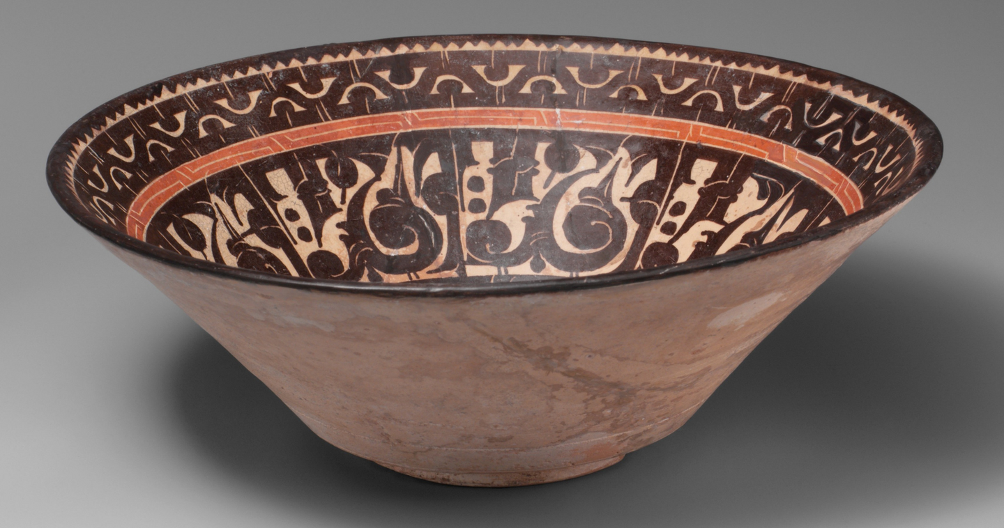
A bowl is typically seen as a container for food, while writing is viewed as a message to be read. In the ceramics of Iran and Central Asia from the 9th to 11th centuries, these roles intersect: the inscription circles the rim, the letters stretch toward the base, and several dark strokes hold the nearly unfilled surface. The image arises from the relationships between the sign, the space, and the object’s volume.
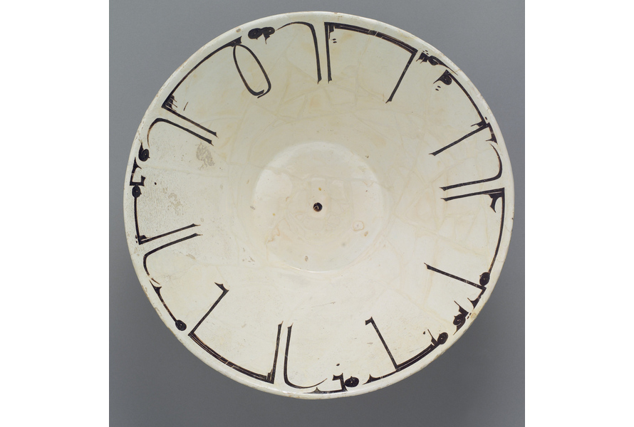
A bowl with Arabic inscription. X century.
This study addresses the question: through what compositional techniques does the inscription transform into the vessel’s primary ornament? The working hypothesis links its expressiveness to circular movement, the alternation of long and short elements, contrast, and negative space. However, a circular form does not necessarily require a circular text, nor does the decorative treatment of letters automatically obliterate their meaning. Exceptions allow for a refinement of the initial assumption.
The main body consists of bowls and two pitchers from the collections of the Metropolitan Museum of Art, the Walters Art Museum, and the Cleveland Museum of Art. Museum dating places the pieces between the 9th and 11th centuries, predominantly the 10th century. Seventeen items are displayed, including one unscribed bowl for comparative control. The geographical attributions maintain museum caution: an object found in Nineveh might have been crafted in a different center. Decorative similarity alone is not proof of common origin.
The selection is based on the diversity of composition and the availability of photographs. Continuous bands versus discrete groups, fine verticals versus broad letters, light fields versus dark fields, inscription on the edge versus text in the center are compared. The vases illustrate the inscription on the exterior convex surface. General views are supplemented by details that are difficult to discern at the page scale. The methodology involves comparative visual analysis, cross-referenced with museum labels and Charles Wilkinson’s catalogue of Nishapur ceramics. First, visible relationships are documented: where the line runs, the direction of elongated elements, and the distribution of dense areas and gaps.
The observation is then correlated with the attribution and established reading. Russian translations rely on museum publications; illegible script is not deemed meaningless. Presumptive readings, unread inscriptions, and confirmed pseudoinscriptions are considered separately. Photography conveys form with limitations: tilt alters the cup’s proportions, lighting affects the glaze’s hue, and restoration reveals losses. Therefore, color is evaluated primarily within a single photograph, and an unfilled field is distinguished from an absent fragment. Conclusions pertain to the selected corpus, not to the intentions of all masters.
These four chapters develop the question from form to meaning. The first compares different methods of arranging text on a vessel. The second illustrates how letters create rhythm and divide a surface. The third examines the role of negative space, including the inverse case—dense figural painting. The fourth considers the convergence of script with botanical and avian motifs, and subsequently, the boundary between text and its imitation. This is not a history of the gradual transformation of readable letters into patterns, but rather a comparison of different solutions to a single artistic problem.
Research Trajectory
01. The line selects the direction
The edge, center, and exterior surface dictate different methods of letter placement.
02. Letters set the rhythm
Stroke weight and the spacing between groups become compositional devices.
03. Text on an open field
The unfilled surface enhances the inscription, but it is not a prerequisite for its expressiveness.
04. Between text and pattern
Floral and avian forms approach the letters; similarity to text does not yet prove the presence of writing.
Select a direction
Bowl with Arabic inscription. 10th century.
The side view reveals what the top view obscures: the line is positioned on an inclined wall. From the narrow base, the surface expands toward the rim, which allows the main masses of the letters to gather near the edge and the strokes to extend inward. The decoration is applied using engobe—a liquid clay mixture—under a transparent glaze. Wilkinson connects this arrangement of the script to the opening form of the bowl.
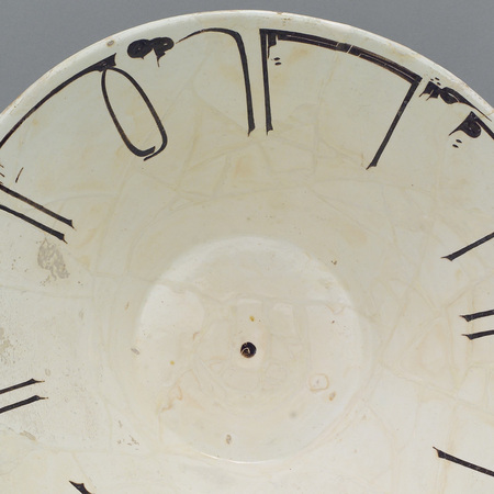
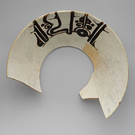
A bowl with Arabic inscription. 10th century and a bowl inscribed «Power belongs to God.» Late 9th — early 10th century.
To the left, the letterbases run along the edge, while the longer elements point toward the center. On the right, the direction is reversed: the stroke rests on the inner edge of the bar and rises toward the outer edge. The circle accommodates both solutions. The hole on the right represents a missing base, not an open space intentionally left by the artisan.
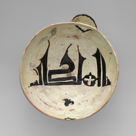
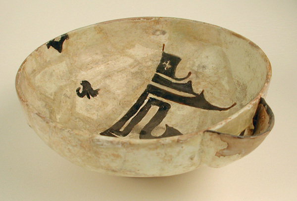
A chalice with a spout inscribed with «Authority belongs to God.» Late 10th century. Views from above and three-quarter.
The pitcher’s spout disrupts the circular motion: the inscription «Authority belongs to God» runs across the interior surface. The overall horizontal line gathers the letters into a unified silhouette, and the tall terminals extend above it. The religious formula becomes the central image; the circle frames the line rather than dictating its trajectory.
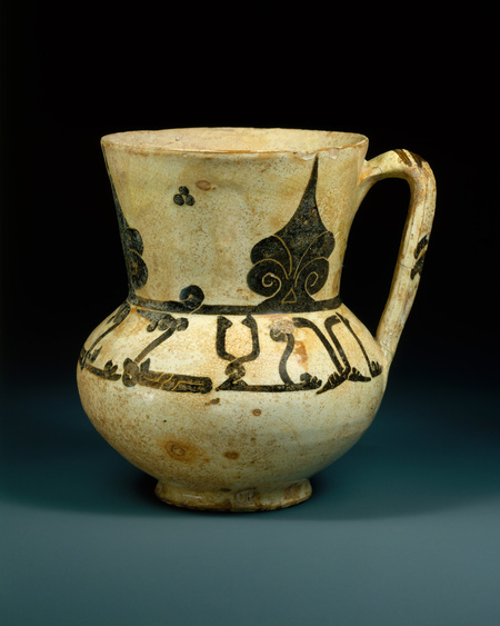
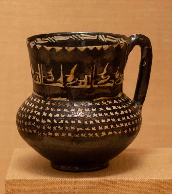
Vase with an Arabic saying. 10th century. And a vase with the repetition of the word «blessing.» 10th century.
On the vases, the inscription wraps around the convex surface: on the left, it runs below the neck, and on the right, it occupies the neck itself. Some of the text inevitably goes beyond the curve of the body. Therefore, a separate angle shows only a segment of the waist—to capture it entirely, the viewpoint must be changed. Alongside the lettering, there remain independent areas of vegetal and small, repetitive decorative elements.
Letters set the rhythm
Bowl of Blessings. Late 10th–11th century.
On this bowl, wide black letters alternate with sections of fine cross-hatching. They are similar in scale and thus create an even band around the central weave. The museum interprets these as well-wishes and notes the extraneous, unfinished «al"—decorative balance here even influences the composition of the line.
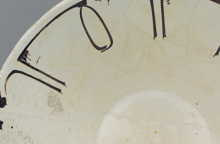
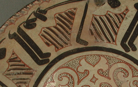
Bowl with Arabic inscription. 10th century. and Bowl with blessings. late 10th–11th century.
In the first detail, fine parallel lines are separated by wide, light spaces. In the second, the dark line thickens, and the space is filled with dense cross-hatching. The circular pattern remains consistent, but its tempo shifts: distinct accents on the left, almost continuous dense sections on the right. This difference is in the construction, not in the tonal values of the museum photographs.
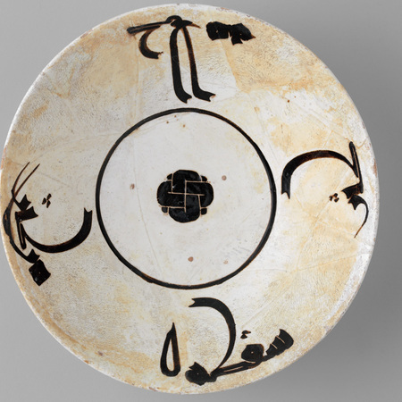
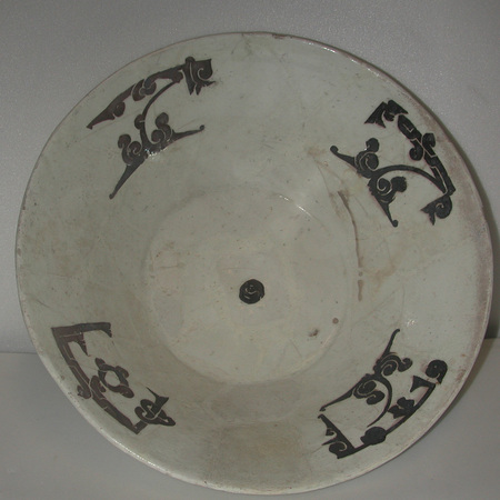
Cup with an inscription and a knot in the center. X in. and Cup with a blooming kufi. X in.
In both bowls, the continuous line gives way to four dispersed groups. The first is linked by a thin inner circle; the second lacks such a line between its elements. The museum interprets the second bowl as wishing blessing and prosperity to the owner and specifically notes: the division is subservient to the visual composition, not to grammar.
A cup with an inscription and a knot in the center. X in.
At the center of the first bowl, a small node is denser than the surrounding ornamentation. Light lines within the dark spot dissect it, and a delicate ring separates it from the large letter groupings. This way, the script gains visual support: the eye can move from the periphery to the center and back, without following the reading order.
Bowl with Kufic inscription. 9th–10th centuries.