«Maria» is a local Irkutsk brand with a history dating back to 1997. Associations: home, family, tradition, comfort.
On the carrier: Bus rear window
Условия восприятия: высокая скорость, дефицит времени, «экономика внимания»
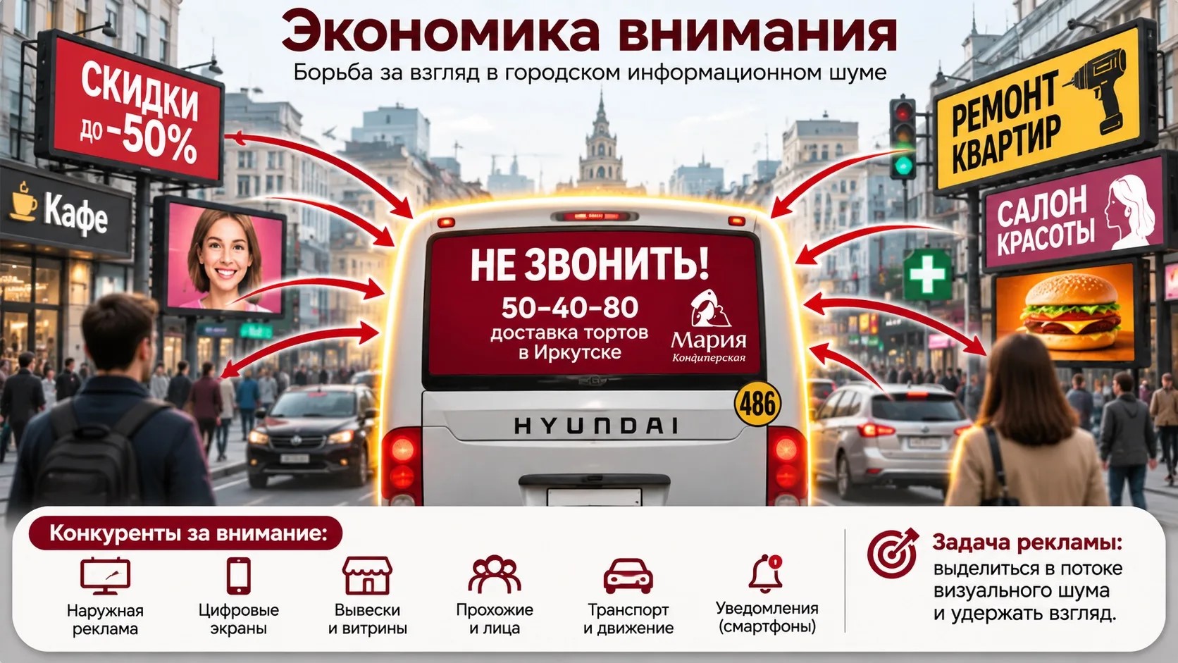
Every advertisement competes not with ads for similar products,
but with all the surrounding advertising
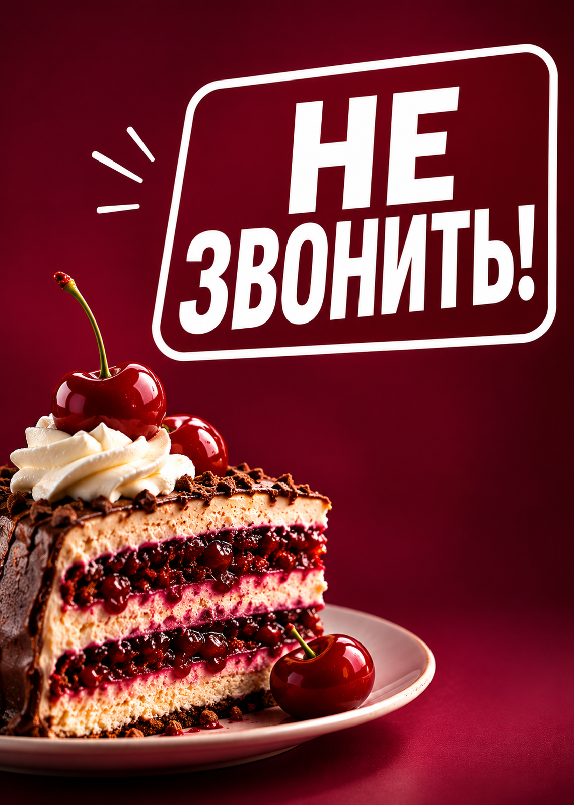
Research Hypothesis: The use of the aggressive imperative «DO NOT CALL!» on a conservative burgundy background is an effective technique for shock value and cognitive dissonance. This technique deliberately violates the familiar visual and verbal code of a patisserie in order to penetrate «banner blindness» and activate the memory mechanism.
PART 1. PSYCHOLOGICAL ANALYSIS
«The Influence Machine» and the Zajonc Effect
A raspberry (burgundy?) background and the logo “Maria”—this is a familiar pattern (brand recognition). However, the phrase «DON’T CALL!» breaks the pattern. This creates the Zeigarnik effect (alertness), but because the brand is familiar, it doesn’t repel; it intrigues.
Cognitive Dissonance and the «Trojan Horse»
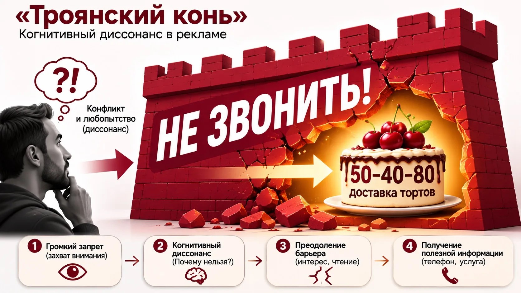
«DON’T CALL!» is an aggressive hook (a lure). A person reads it and experiences dissonance: «Why shouldn’t I call? It’s an advertisement.» To relieve this tension, the brain is compelled to read the fine print: «cake delivery 50-40-80.» This is a classic «Trojan Horse»: an aggressive wrapper conceals valuable information.
Nothing focuses the mind quite like surprise.
Fascination and Information
Title — it is pure fascination (it stops the eye, it paralyzes). It carries no semantic load (information). The information (phone number) is hidden. This is an example of how fascination suppresses information in favor of attracting attention.
Psychological Buttons: Safety and Fear
The phrase «DO NOT CALL!» (used as a prohibition or traffic sign) activates the instinct for self-preservation and alertness. It is a «button» for negative emotion. However, because the context (a cake, a pastry shop) is safe, the negative feeling quickly shifts to a smile and relief.
Oscillating Axes of the Psyche
The brand «Maria» typically occupies the «coward» zone (stability, safety, classicism). This creative direction, however, is a step toward the «adventurer» zone (risk, provocation). The brand is intentionally balancing on the edge to achieve distinction.
PART 2. VISUAL ANALYSIS
Color and Contrast
The deep crimson is the color of «flavor,» of pastry, of status. White text on the burgundy ensures maximum readability. The color doesn’t shout, but it feels «premium.» This creates a contrast between the calm background color and the assertive text.
Typography
The typeface is sans-serif, bold, and straightforward. It is maximally utilitarian. The simpler the font, the more effective it is. There are no decorative serifs or script elements (which are typically used for cakes). The font conveys a directive, not a treat.
Composition and Zoning
The imperative is central. The logo and phone number are on the right. The left side (the past) depicts the urban environment. The right side (the future) shows the solution (buying a cake). The headline is shifted to the left (the entry point for the eye), which forces it to be read first. The logo is placed on the right side, where the gaze naturally settles after reading.
Interaction with the frame
The mockup is adhered to the back window of the bus. This is not merely a frame—it is a «window» into another world. The text «DO NOT CALL!» is perceived almost like a warning placed on the bus itself (such as «Caution, Children!» or «Driver, pay attention!»). A dual-coding effect arises: it is an advertisement, but it mimics an official service decal.