Основа концепции выставки — сюжетные тропы из фильмов о живых мертвецах. Через исследование визуальных метафор и переноса их на типографический язык, раскрывается идея о противостоянии двух сторон: защищающей (как стремление к порядку и структуре) и нападающей (как внесение беспорядка, хаотичность).
Погружение типографики в нетипичный контекст апокалипсиса поставит под вопрос главное назначение шрифтов и верстки — быть удобочитаемыми и разборчивыми для передачи информации читателю.
Нападающая сторона.
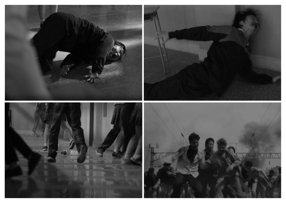
Метафора ломанного движения (1—выламывание тела, 2—выкручивание при заражении, 3—хождение с кривой ногой, 4—столкновение с другими)
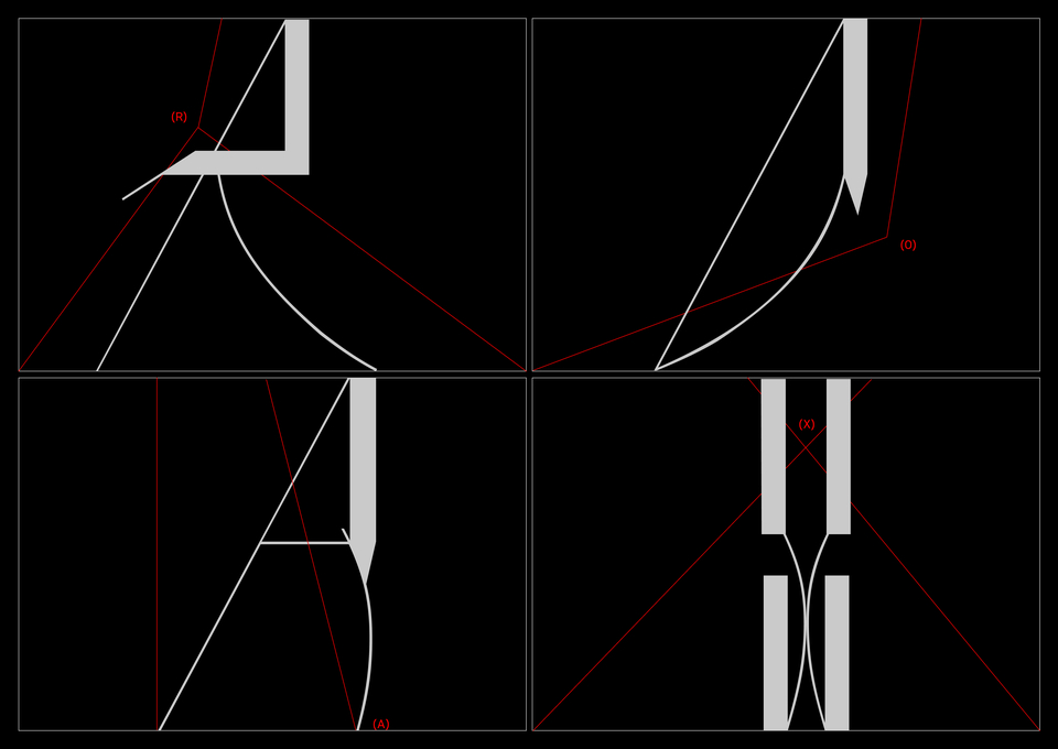
Характер шрифта: ®—колкий, (O)—опасный, (A)—нестабильный, (X)—надавливающий
Нападающий шрифт (латиница, обычное начертание)
Пункты нападающих глифов
Архитектура колких элементов
Вирусное начертание. В массе стабильного алфавита появляются неправильные глифы, которые нарушают заданную логику форм.
Вирусное начертание нападающего шрифта
Пассивная фаза поиска (обычное начертание)
Активная фаза атаки (вирусное начертание)
Защищающая сторона.
Метафора напряженной щели (1,2,3,4—борьба двух сторон и минимальное ограждающее пространство между ними)
Формообразование букв (минимум внутрибуквенного пространства, наклон и давление крупных брусков с двух сторон)
Защищающий шрифт (латиница, обычное начертание)
Пункты защищающих глифов
Вирусное начертание.
Вирусное начертание защищающего шрифта
Формирование ограждения обычным начертанием
Нарушение ограждения вирусными глифами
Вирусное и обычное начертание нападающего и защищающего шрифта
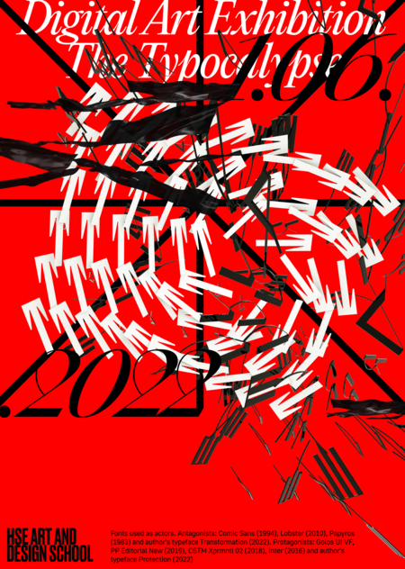
Типопостеры. Шрифтовые композиции, которые отражают уровни погруженности типографики в среду апокалипсиса.
Для постеров собрана типобаза шрифтов-протагонистов (сохраняют разборчивость, поясняющие): Golos UI VF, PP Editorial New (2019), CSTM Xprmntl 02 (2018), Inter (2016) и авторский Protection (2022).
Криошрифты-антагонисты (непредсказуемы на плоскости, неправильные): Comic Sans (1994), Lobster (2010), Papyros (1983) и авторский Transformation (2022).
1—Ритмическое столкновение двух шрифтов, 2—Первое нарушение расположения букв
3—Дисбаланс кеглей и слоев, 4—Нулевой интерлиньяж и хаотичность букв
5—Смешение множества вирусных шрифтов, 6—Вытягивание букв внутри модуля
7—Вирусный модуль с переизбытком хаотичных букв, 8—Распространение вирусных глифов
Выставка в AR как способа размещения постеров в условиях апокалипсиса.
Столкновение сторон посредством размещения постеров в углах
Заполнение четырех углов пространства
Вход на выставку постеров через сканирование кода. Хранилище AR контента: https://readymag.com/u177385953/3691741/
Шрифтовая лаборатория, в которой живут криошрифты. Сейчас они заморожены для использования в дизайн-проектах, поэтому за ними ведется секретное наблюдение в модулях трехколоночной сетки.
Понаблюдать за поведением шрифтов: https://readymag.com/u791065472/2489644/


