Concept
Despite the active participation of women in the book trade throughout history, the work of many of them in the field of typeface design has not received the recognition it deserves. Currently, there are very few comprehensive works that contain in-depth information about women who created typefaces. This has led to gaps in understanding the role of women in contemporary print culture, and consequently, gaps in the broader understanding of the history of typography.
One of the objectives of this research is to create an additional resource in the Russian-language segment that reveals a «lost» part of the history of book printing.
This work aims to provide more information not only about the typefaces created by women but also about the lives of those whose names have not firmly entered history. Individual stories spark interest and inspiration in both academic and public spheres. This interest can help engage with the issues raised by historians advocating for women’s rights, taking into account the intersections of different social groups. Furthermore, a broader study of this topic contributes to uncovering truths that were concealed behind the curtain of capitalism.
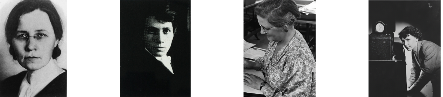
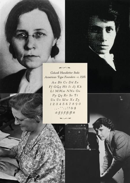
Galina Andreevna Bannikova / Elizabeth Colwell / Dora Lang / Patricia Sanders
Despite the fact that it was more difficult for women to obtain specialized education before World War II, significant female names in typography date back to the late 19th century. Undoubtedly, gender restrictions profoundly influenced women’s entry into the profession, and moreover, they continued to play a role in forming the stereotypical perception of what fonts designed by women—representing the ideal wife, mother, and homemaker—"should» look like.
This research is aimed at shedding light on the influence of gender on font design through an analysis of the work of female typographers.
The hypothesis is the assumption that there exists a certain «female archetype» in 20th-century font design. The research does not seek to assert the existence of exclusively «feminine» or «masculine» typefaces, but rather to identify potential correlations between the designer’s gender and stylistic choices.
The particularities of the era, the established norms, and the stereotypes directly influenced the identification of potential archetypal associations related to the design decisions in fonts created by women.
Sometimes we don’t even suspect that the designer of the typeface we use almost every day might be a woman who was overlooked in her time. But what if we could learn about this by understanding the characteristics of the feminine archetype in typography?
There are questions that will never have a single definitive answer, but this only signifies how multifaceted the subject we aim to explore can be. The stories of Hildegard Henning, Elizabeth Colwell, Elizabeth Friedlander, and Galina Andreevna Bannikova share some commonalities and some striking differences, just like their typefaces. However, the fact that their lives, their journeys, and their creative work deserve attention—that is undeniably true.
Navigation
[1] The Gender Aspect in Type Design [2] Unseen Creators, or About the First Typefounders — Hildegard Hening — Elizabeth Colwell — Elizabeth Friedlander — Galina Andreevna Bannikova [3] Untold Stories [4] Female Archetypes in Type Design
GENDER PERSPECTIVE IN DESIGN
The gender aspect is a topic relevant not only to the design profession. The issue of discrimination against female labor is an indelible fact of history; otherwise, this research, which aims to illuminate women’s contributions to typography, would not be so timely.
One of the main reasons why entry into the design profession remained closed to women for so long was the inaccessibility of education.
Nevertheless, observing a related field of practice, we see that the world of calligraphy was more welcoming to women’s work than the world of typeface design. This will become clear in the following discussion, as three out of four women in this study had more experience in art or calligraphy than in other activities.
The fact is that handwriting had entered one part of «women’s domestic life» long ago—a sphere that was respected and encouraged in society.
What can be said about working with metal glyphs when they emerged and became more relevant in the world of books? This was undoubtedly something more «masculine.»
Yet, why was physical activity involving writing directly on paper a more acceptable pursuit for women than drawing letters for casting in metal?
There is an explanation for this situation: the gender divide between decorative and industrial design. Type designer Sibilla Hagmann points out that the historical participation of women in the profession was more geared toward the decorative. Hagmann explains that decorative work can be seen in contrast to male-dominated fields, such as lead type design, which focuses on mass-produced, manufacturable goods, and is therefore more firmly situated within the dominant patriarchal order of mass production and industrialization.
Beyond gender constraints, the research into roles leads us to understand how gender compelled women to fit their work into a gendered design narrative based on «dominant notions of femininity and masculinity.»
Based on «dominant perceptions of femininity, ” it can be concluded that women were subjected to pressure not only regarding the expectation of „feminine“ design but also in relation to fulfilling their social roles (wife, mother).
Canonical academic discussions of typeface design, including Robert Bringhurst’s „The Elements of Typographic Style“ and Alexander Lawson’s „The Anatomy of Type, ” reflect this situation to some extent: in Bringhurst’s chapter „Wandering through Book Samples, ” women accounted for approximately nine percent of the individual typeface designs presented, whereas Lawson’s book mentions only one female typeface designer, and only in connection with her husband’s work, not her own.
UNSEEN CREATORS OR ON THE FIRST TYPOGRAPHERS
The women selected for this study challenged orthodox notions of women’s work, and some even challenged societal roles. They managed to carve out a space for themselves within the capitalist world of industry.
Hildegard Henning (1888)
Hildegard Henning was born on November 5, 1888, in Greiz, Germany. She came from a prominent family. Her father, Dr. Juris Clemens Gotthold Henning, was born in Greiz on October 15, 1861. He was a Tonkunstler (musician), Musikschriftsteller (music theorist/writer), and a professor of music. Henning’s birth certificate indicated that her father was the owner of the princely court printing house («Hofbuchdruckerei-Besitzer») in Greiz. Information about Henning’s mother could not be found, except that her name was Liddy Elisabeth Henning (née Walter). The entire family belonged to the Evangelical Lutheran Church.
In 1908, Henning was enrolled at the Royal Academy for Graphic Arts and Book Trade in Leipzig (Königliche Akademie für graphische Künste und Buchgewerbe), and it appears her path to becoming the first woman to design a typeface began there.
In 1914, Henning participated in BUGRA, an international fair for the book and graphic arts held from May to October in Leipzig, a city that was then a center of German book trade.
At that time, Hildegard Henning’s typeface design—Belladonna—was presented alongside other fonts produced by the Klinkhardt factory.
1. Studies with Professor Hermann Delich at the Royal Academy in Leipzig, 1913. 2. Entry into BUGRA
Few women exhibited outside of Frau’s House (a building dedicated solely to women’s contributions to book trade) at BUGRA, but Professor and Design Historian Dan Reynolds, noticing the presence of Henning’s work in the main exhibition area of BUGRA’s foundry, commented:
One hundred eighty-three font families are displayed from German type foundries at the Typographic Production Exhibition in BUGRA. Among these, Belladonna is the sole typeface design created by a woman.
Belladonna Printed using 20-point metal type.
As previously mentioned, Hildegard Henning is the first woman credited with typeface design. Her Belladonna font was released by the Julius Klinhardt foundry around 1912.
In an undated brochure, issued around 1910, the Belladonna font is described as «a commercial typeface for the most exquisite printed works.» The brochure also names the designer and provides detailed information on pricing, available sizes, a sample sheet showing the font in various weights, and four business cards as examples of its use.
Brochures. German National Library in Leipzig. No date, but likely around 1910.
At the bottom of the page, the brochure displays capital letters and numbers from «Belladonna» along with dimensional guides—a rarity for casting production samples of that era.
Klinkhardt sample brochure for Belladonna. These are more like experimental designs than actual projects using the typeface.
Sample brochure for Belladonna. More experimental developments than real projects using the typeface.
Sample Brochure for Belladonna. These are more experimental designs than actual projects utilizing the typeface.
Advertisement for the Kartenschrift Belladonna font in Klimt’s Yearbook, Vol. 16 (1921–1922), p. 138. Size approximately 5⅛ × 3⅝ in.
Elizabeth Colwell (1881–1961)
Elizabeth Colwell is one of the most prominent figures when discussing women in typography design. Beyond being the only well-known American female designer of her generation, she stands out for other reasons: unlike many other women in printing history who came from artistic, wealthy families or whose male relatives were involved in the book trade, Colwell came from a family of agricultural workers. For most of her life, she was alone or lived with her widowed mother in rented homes. It is also known that she never had children.