VALERIA K.
GRAPHIC DESIGNER
Branding, Visual Identity, Typography, Packaging
I am a graphic designer focused on branding and visual systems. I develop strong concepts into distinctive identities that work across physical and digital touchpoints.
Jewelry Brand Identity
Student Project
A playful jewelry brand that brings color, irony and a sense of mischief into everyday life without losing its visual sophistication.
THE CHALLENGE
Trueshkowski needed a stronger way to communicate with its audience. The previous branding lacked a consistent visual system and a recognizable identity.The goal was to create a flexible language that could work across products, packaging, social media and brand communication.
THE IDEA
Jewelry is designed to become an accent.Since Trueshkowski pieces are built around round natural stones, the circle became the core visual element of the identity.A simple geometric form became a tool for creating accents, rhythm and recognition.
CUSTOM TYPEFACE
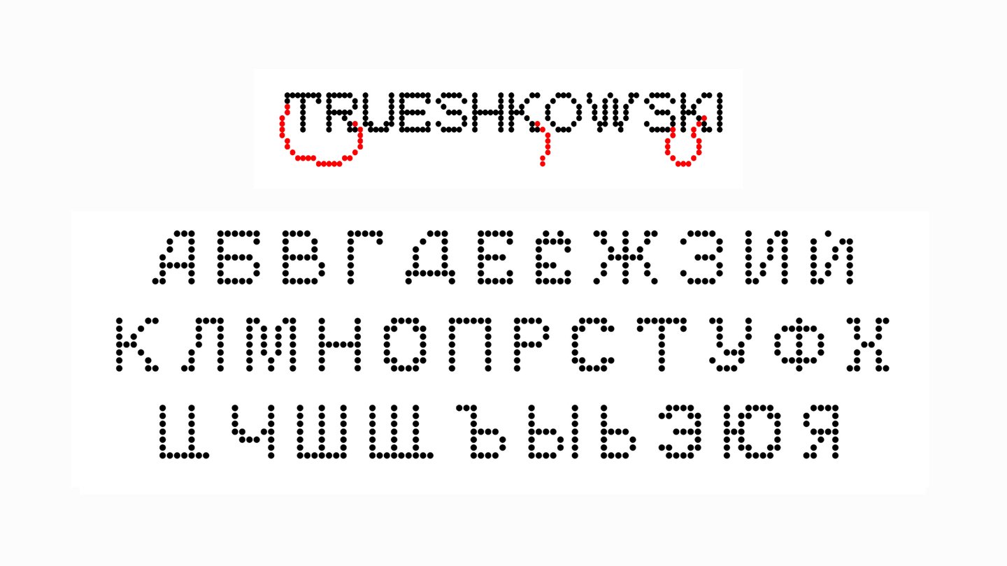
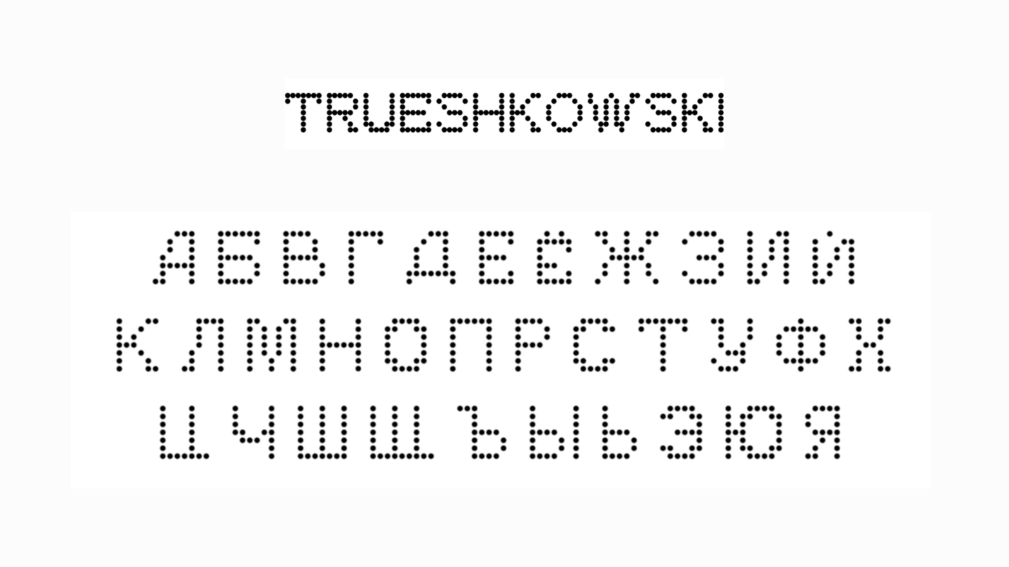
A custom display typeface extends the circular logic of the identity into typography.Rounded details and playful proportions echo the shapes of the jewelry and bring the brand’s ironic character into its visual language.THE SYSTEM
The identity is built around three main elements:Custom typography
Circular grid
Accent systemTogether, they create a flexible visual language that can adapt to different formats while remaining recognizable.
Сultural institution’s brand identity
Student Project
about the museum
The collection focuses on folk textile traditions rather than canonical works of art.Every object carries the story of the person who made it, used it or preserved it.The museum turns traditional craft into a personal and human experience.
THE CHALLENGE
The identity had two goals:Attract travelers looking for unusual cultural destinations and lesser-known routes.Create a visual system simple enough to be used independently by the local museum team.The identity needed to feel culturally specific without becoming visually outdated or difficult to reproduce.THE IDEA
The visual language is based on traditional Udmurt costume patterns.Their geometric forms, repetition and rhythm became the starting point for an identity that connects cultural heritage with a contemporary graphic language.
THE SYSTEM
The identity combines:Custom display typeface
Symbol system
Square modular gridThe grid makes the system flexible and easy to reproduce across different formats while maintaining a consistent visual character.
The same visual principles adapt to different materials and contexts without losing their connection to the museum’s cultural roots.
Student Project
A display typeface inspired by the visual structure of Chinese characters and the experience of encountering an unfamiliar writing system.
IDEA: LOST IN TRANSLATION
Foreign-language tattoos are often chosen for their appearance without fully understanding their meaning.Nonnative Script explores this gap between visual attraction and linguistic understanding.Instead of using an unfamiliar language as decoration, it creates a new typographic system for familiar words.