Original size 3200x1356
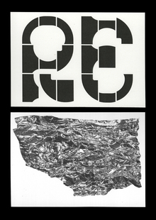
Tearing’s font consists of the shapes that are <laco; damaged» : parts of the letters stretch, break, acquire a new shape, mimic the collapse of the nerve fibers. The name sends not only to the structure, but and x the tense, depressed nature of the letters.

Original size 1200x675

Original size 3200x2631
Original size 3200x1800
Original size 3200x1800
Lots of font letters have dents, marks from blows that refer to stress, physical and emotional violence that become frequent causes of mental problems.
Original size 3200x1800
Different parts of letters have different densities, compressing into thick lumps — neurons die in a similar way.
Original size 3200x3151
Original size 3200x1544
Original size 3200x3586
Original size 1200x675
Original size 3200x1800
Original size 3200x2798
Original size 3200x1049
The font letters are connected because all the neurons are also connected.
Original size 3200x2111
Original size 3200x1800
Original size 3200x1800
Original size 3200x3366