My name is Ekaterina Povolotskaya, and I am a graphic designer from Moscow. I excel at working according to briefs and technical specifications, and I am meticulous about details and deadlines. I am seeking a designer position where I can apply my knowledge to real-world projects and grow within a team of professionals. My portfolio features work in identity design, print, and digital—from initial concept to final mock-up.
01. REBRANDING THE «TANAIS» ARCHAEOLOGICAL MUSEUM-RESERVE
Ребрендинг [2026]
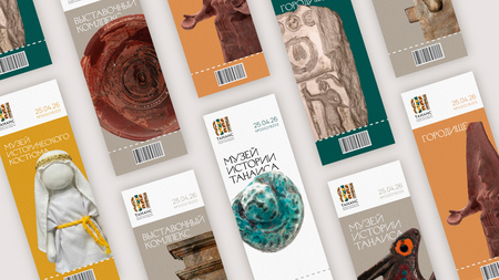
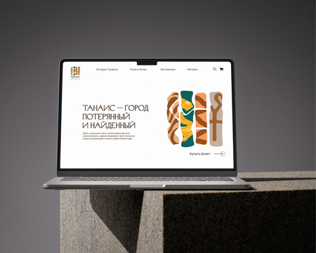
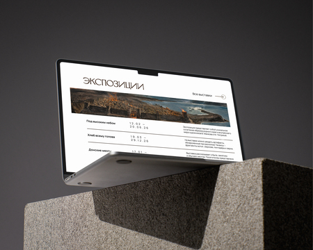
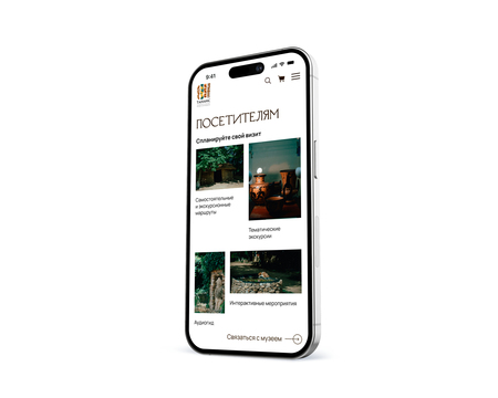
The core concept of the brand is «Thanis—the city where worlds meet.» The visual metaphor is four vertical stripes, each symbolizing a people who inhabited Thanis. These stripes are arranged like archaeological cross-sections—layers of history frozen in the earth.
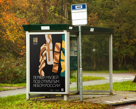
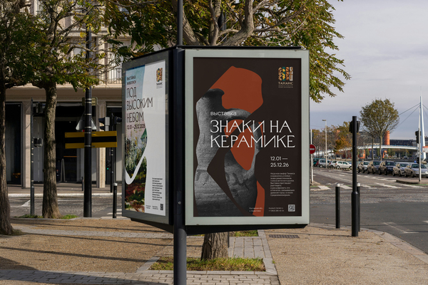
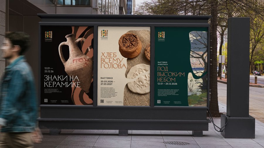
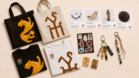
The ornamental stripes in the logo reference specific ethno-cultural layers of Tanais—the Greeks, Sarmatians, Meots, and Tanaites. The graphics are based on archaeological excavations of the city: the Greek palmette, borrowed from ceramics, the Sarmatian animal style, Meot rhombi, and the stamp of King Rimitalka. This design choice allows the historical complexity to be translated into a structural principle of the identity, where brand identification occurs through quoting the cultural codes of the place.
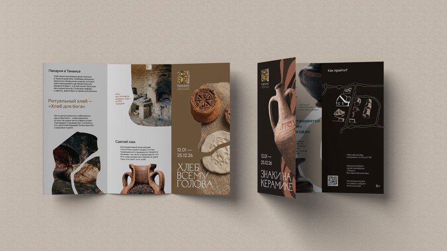
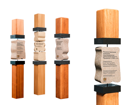
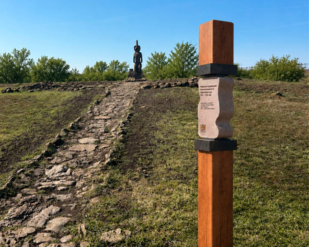
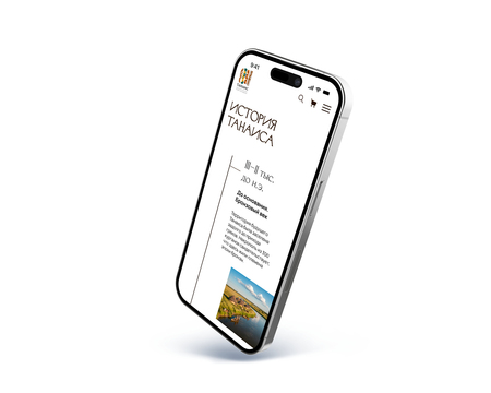
The stripes are scaled as a systemic element of the corporate identity—they function as masks, modular grids, and navigation modules, ensuring the unity of all touchpoints.
Adobe Illustrator, Adobe Photoshop, Adobe InDesign, Figma, 3ds Max.
02. «TSVET» JOURNAL
Верстка многостраничного издания [2026]
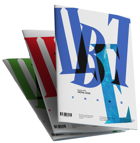
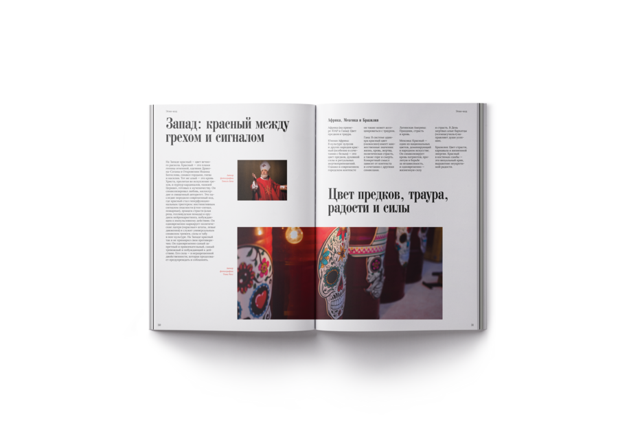
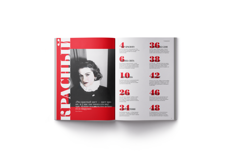
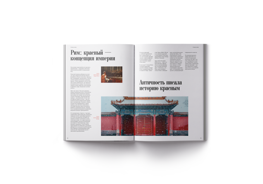
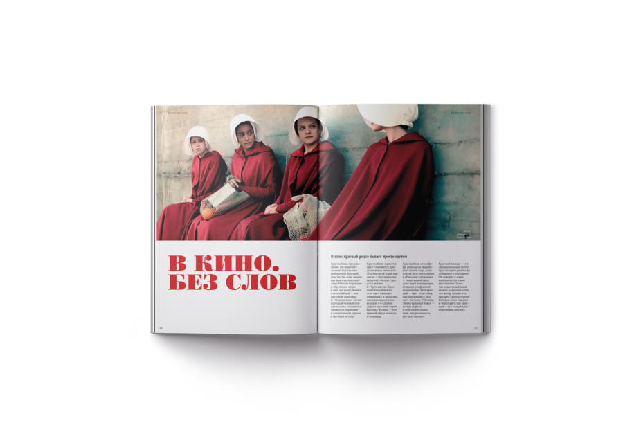
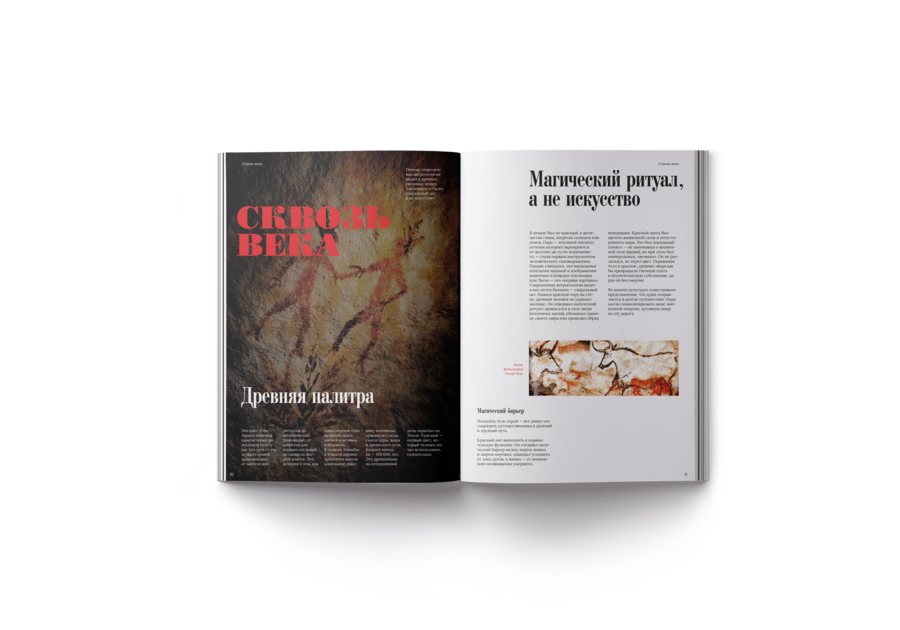
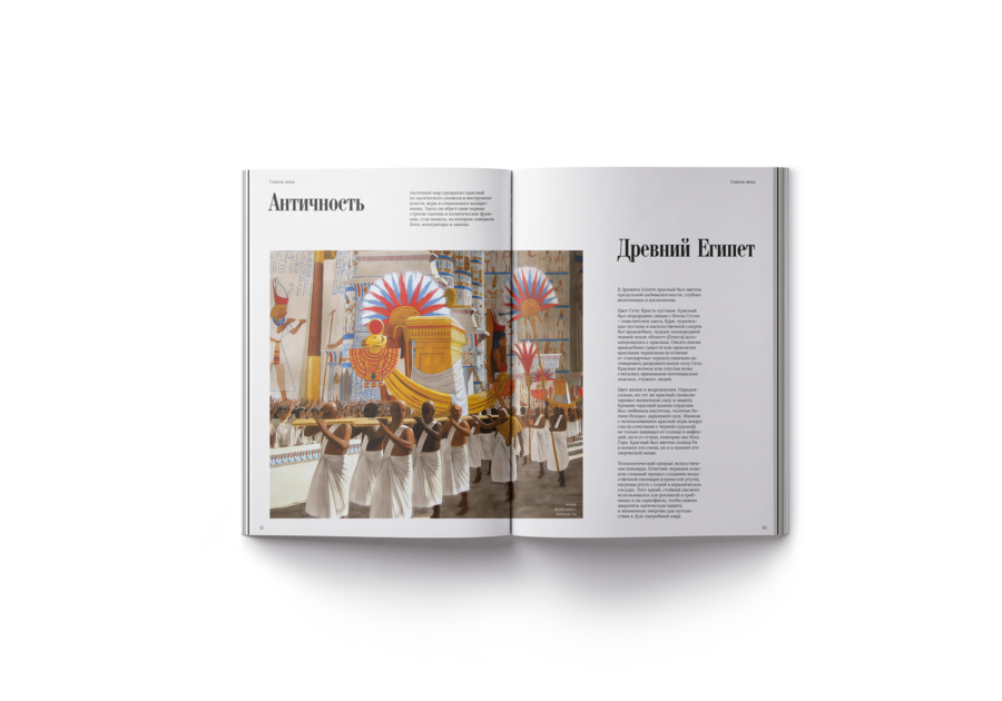
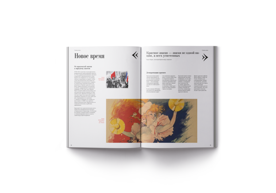
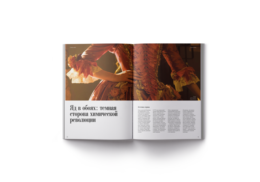
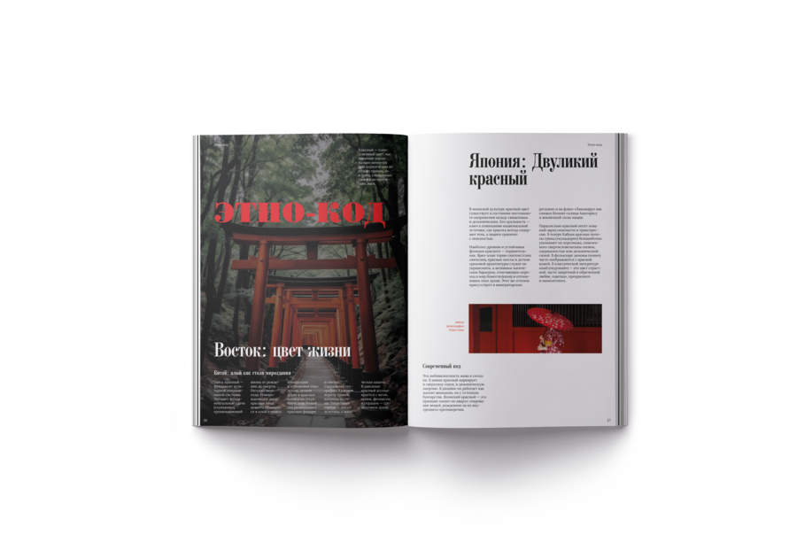
The journal explores the hue not as mere decoration, but as a driving force in history. Each issue is dedicated to a single color—from pigment chemistry to brain function.
The layout is built around a single color that permeates the typography, grid, and composition. The act of reading itself transforms into an exploration of how color becomes a cipher for cultural codes, social structures, and unconscious impulses.
Adobe Illustrator, Adobe InDesign.
03. BRAND BOOK «FIR COON»
Разработка визуальной идентификации кемпинг-отеля [2024]
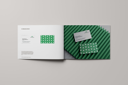
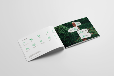
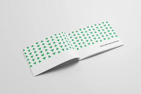
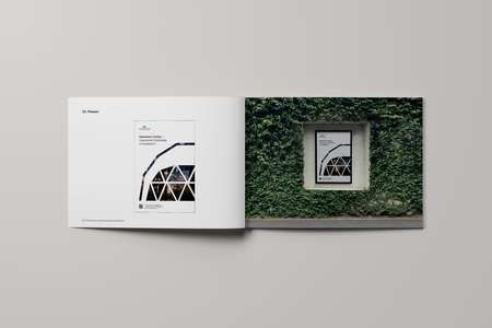
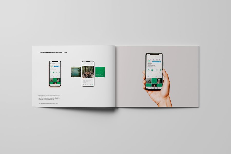
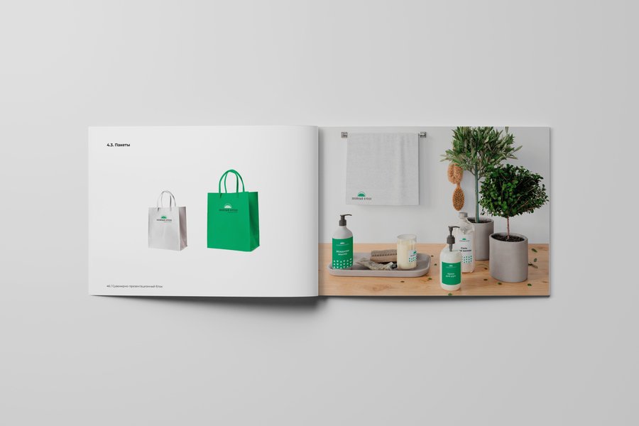
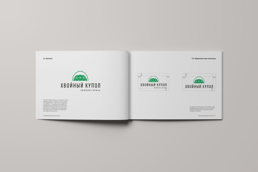
The foundation of the brand style is one of the types of houses for this type of vacation—a geodesic dome. The combination of geometric symbolism in green and white evokes associations with nature and tranquility.
Adobe Illustrator, Adobe InDesign.