You need to enable JavaScript to run this app.
creativecity.
academy
создать место
карта
резиденты
образование
конкурсы
маркетплейс
блоги
о проекте
создать место
карта
резиденты
образование
конкурсы
маркетплейс
блоги
о проекте
RU
EN
Добавить проект
Вход
Мария Цебоева
Исходный размер
1190x1684
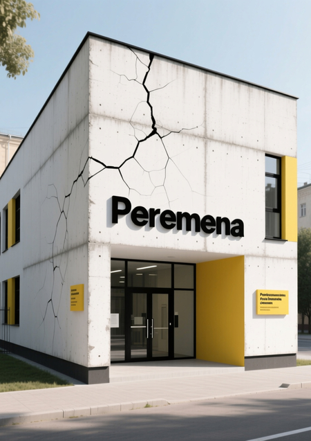
Peremena. AI
искусственный интеллект
PROTECT STATUS: not protected
0
Peremena. AI
Мария Цебоева
искусственный интеллект
0
Проект создан 30.12.2025
Мы используем файлы cookies для улучшения работы сайта НИУ ВШЭ и большего удобства его использования. Более подробную...
Показать больше