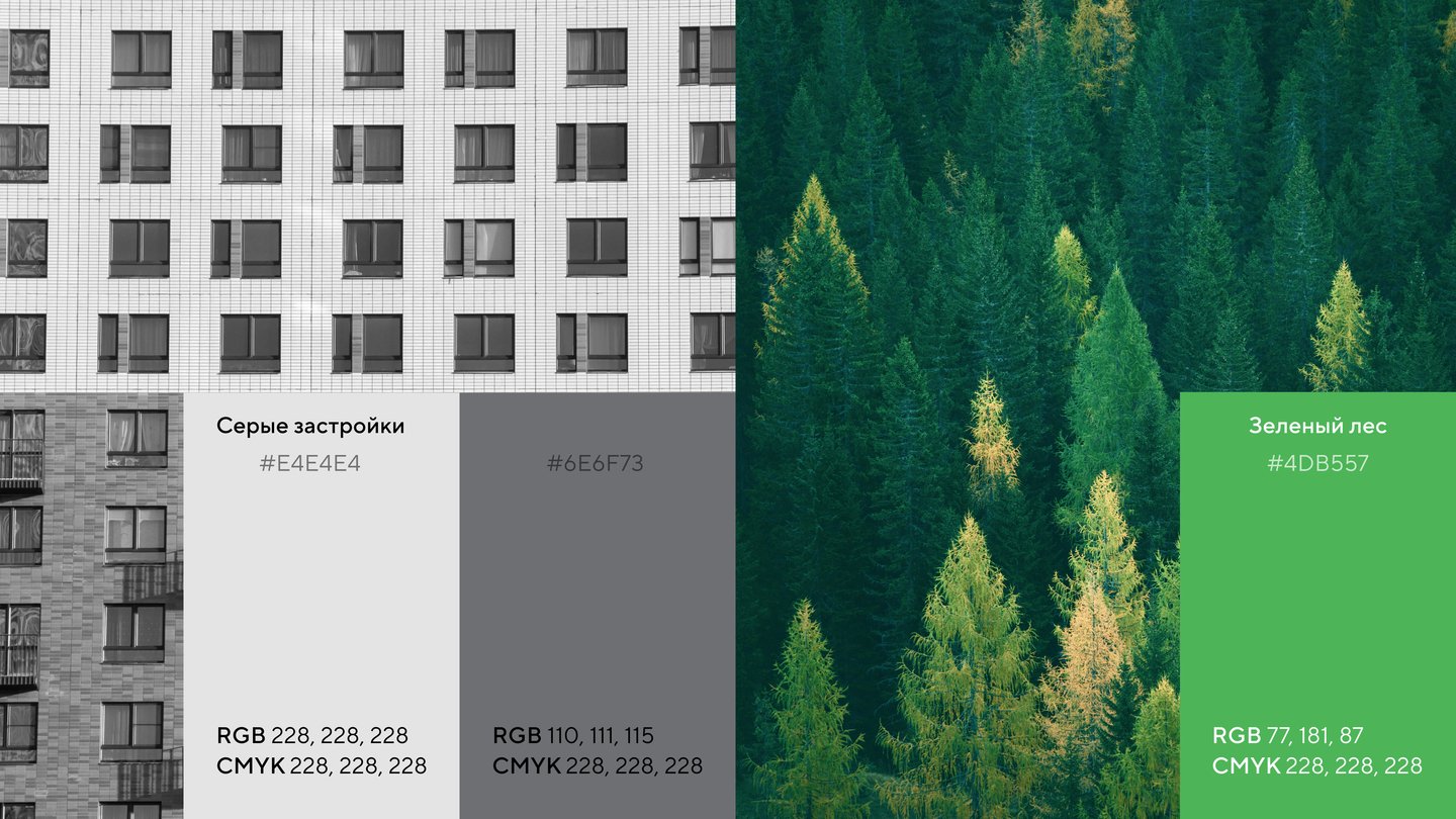
Фирменный стиль «Новой Москвы» сосредотачивается на очевидных преимуществах территории: экологии и динамичном расширении не только границ, но и возможностей, которые этот рост открывает для жителей ТиНАО
Исходный размер 3840x2160
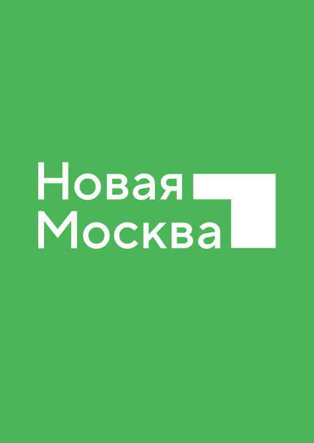
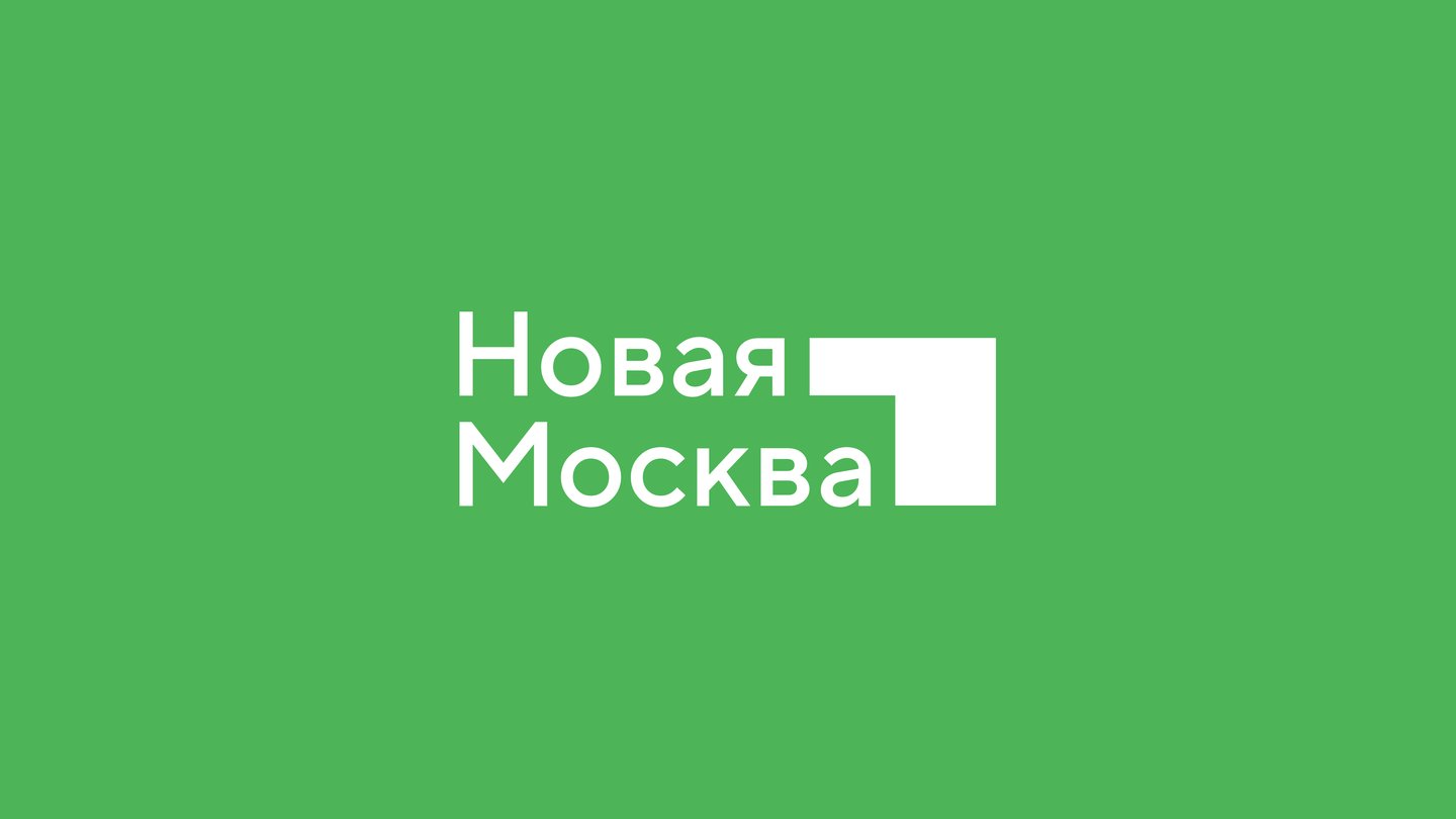
Логотип Новой Москвы — это не столько пристройка к уже существующей территории (если мы говорим о Москве), сколько новая деталь, образующая полноценную, монументальную конструкцию, новое строение.
Уголок напоминает собой стрелку, направленную вверх и стремящуюся к развитию, а также создает в основном логотипе ощущение пространства
Исходный размер 3840x2160
Исходный размер 3840x2160


Исходный размер 3840x2160
Исходный размер 3840x2160
Исходный размер 3840x2160
Исходный размер 3840x2160
Исходный размер 3840x2160
Исходный размер 3840x2160
Исходный размер 3840x2160
Исходный размер 3840x2160
Исходный размер 3840x2160
Исходный размер 3840x2160
Исходный размер 3840x2160
Исходный размер 3840x2160
Исходный размер 3840x2160
Исходный размер 3840x2160
Исходный размер 3840x2160
Исходный размер 3840x2160
Исходный размер 3840x2160
Исходный размер 3840x2160
Исходный размер 3840x2160
Исходный размер 3840x2160
Исходный размер 3840x2160
Исходный размер 2880x1620


