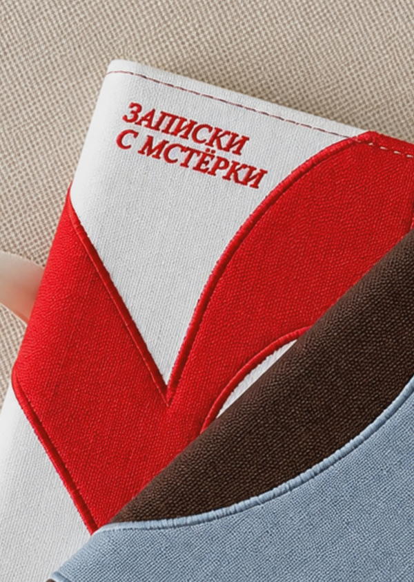
The project was created as part of an expedition to the Vladimir region under the Rossmolodezh program, «More Than a Journey.»The goal was to develop branding for Mstyora, a small village in the Vladimir region situated on the Mstyorka River, which is part of the expanded routes of Russia’s Golden Ring.
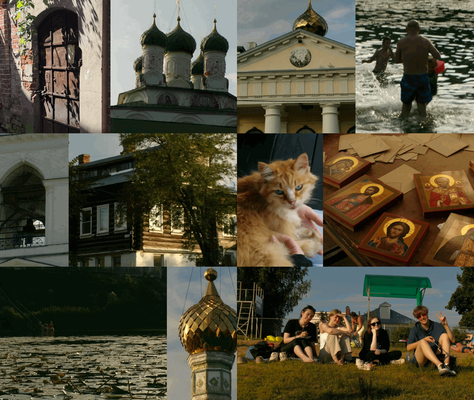
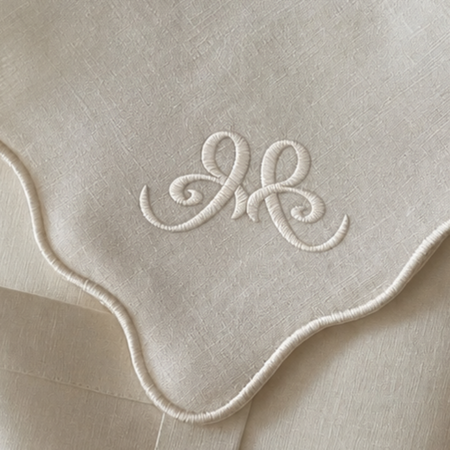
Mstyora is a settlement in the Vladimir Oblast located on the banks of the Mstyorka River, and it is included in the extended routes of the Golden Ring of Russia. The village is known as one of the four centers of Russian lacquer miniature, as well as for its traditions in icon painting, the delicate embroidery known as «Mstyora white satin stitch, ” and artistic metalworking.
A cozy world of creativity where you want to linger.
The village is known as one of four centers of Russian lacquer miniature, as well as for its traditions of icon painting, the delicate embroidery style known as «Mstera white satin stitch, ” and artistic metalworking.
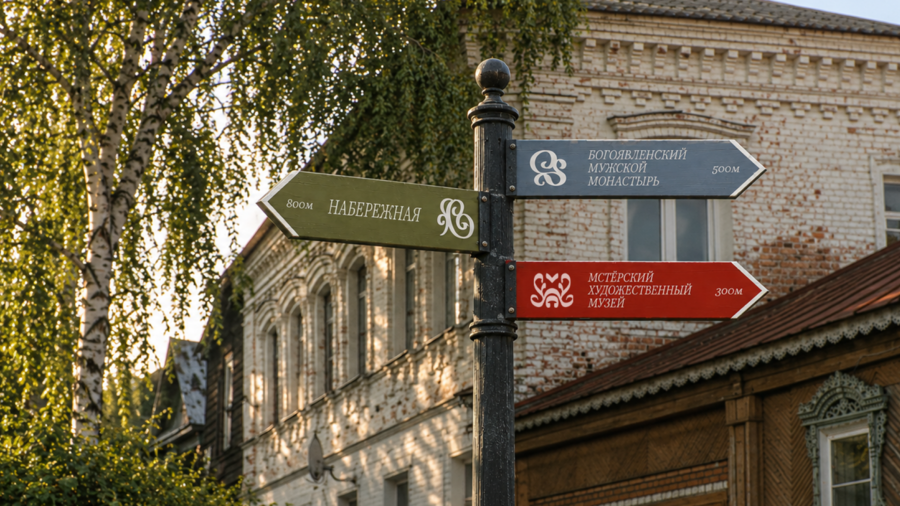
The concept behind „Mstera Code“ is built by extracting simple graphic signs from complex traditional forms—iconography, filigree, lacquer miniatures, and embroidery.
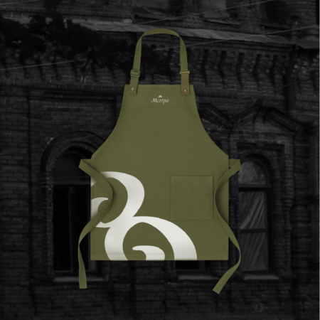
The brand style is constructed around the four creative directions of Mstera. Additional graphics reference the village’s architecture and nature, tying the system together. Each direction has its own mark and color. The signs have a particular feature: the contours intentionally possess an unevenness—this captures the feeling of the master’s „living hand, ” a slight imperfection that makes the object truly handcrafted.
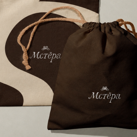
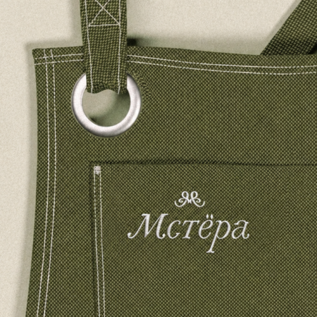
The signature font «Mster»
The typeface is inspired by the live, imperfect stroke of handcrafted work—the trace left by an artisan or artist during the creation process.

