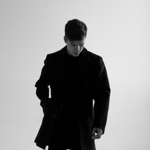
ABOUT ME
Hi, I’m Max.
I am an editorial designer. I lay out magazines and books and work with typography and photography.
I help readers find their way through complex material, shape the rhythm, and keep one visual language from the first spread to the last.
I respect the author’s text and know how to work on tight deadlines.
MY APPROACH
A good text can die on a bad page.
I make sure it never does.
01 / BOOK DESIGN & VISUAL RESEARCH
5.18 — Echo of Freedom
THE CHALLENGE
How do you guide a reader through a complex historical event?
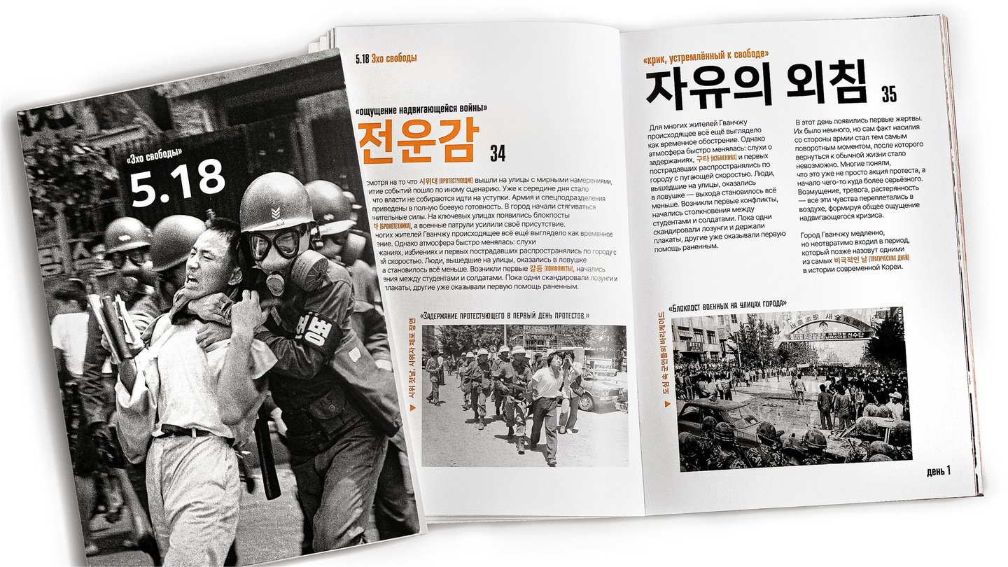
This publication explores the Gwangju Uprising of May 1980 through archival photography and a chronological narrative. My task was to organise the material into a clear sequence while preserving the emotional weight of the images.
THE APPROACH
A chronology to follow
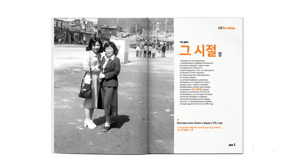
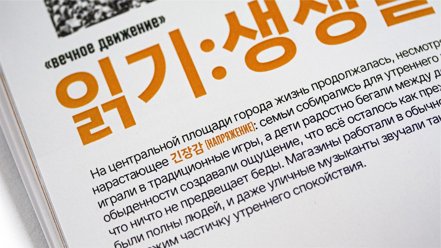
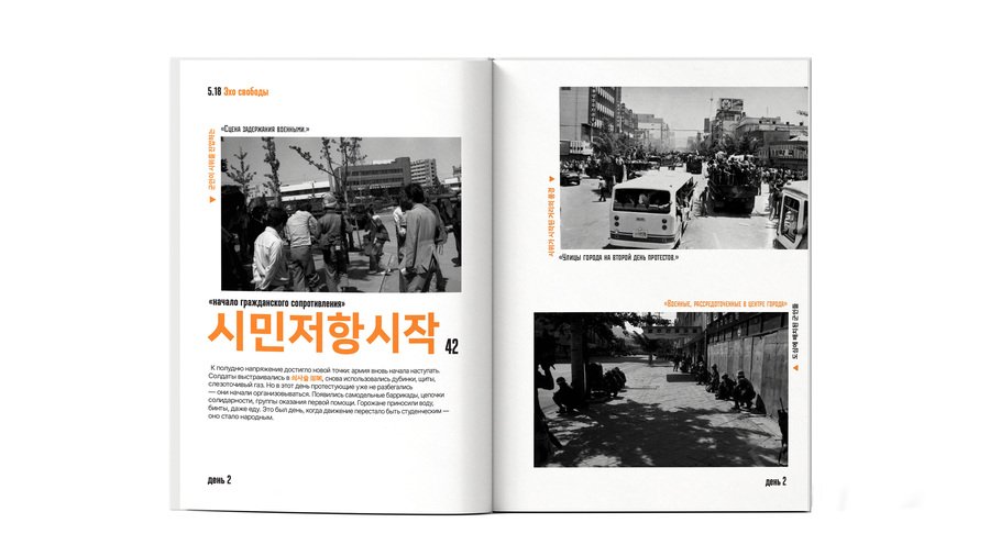
I organised the publication chronologically. Day markers guide readers through the events, while headings, captions, and highlighted terms establish a clear hierarchy.
Korean headings appear alongside Russian text, connecting the publication’s visual language to its subject.
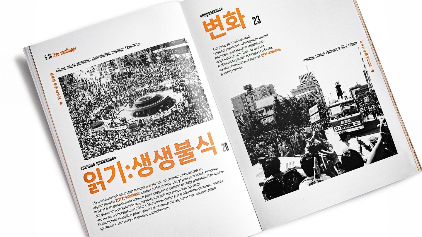
READING RHYTHM
Between facts and photographs
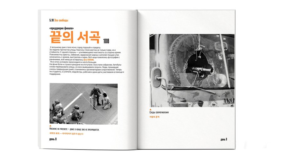
I alternate text-led spreads with large archival photographs. The text provides context; the photographs create pauses within the chronology. Changes in scale and density shape the pace of reading while recurring headings and day markers keep the narrative connected.
THE OUTCOME
A clear sequence.
Space to reflect.
Chronology, commentary, and archival images form one visual system. Readers can follow events and pause over photographs without losing their place in the story.
View full project ↗02 / MAGAZINE DESIGN
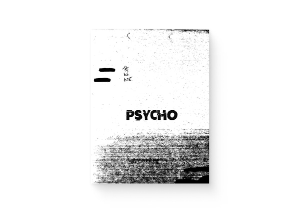
PSYCHO
THE CHALLENGE
What if a magazine felt like a case file?
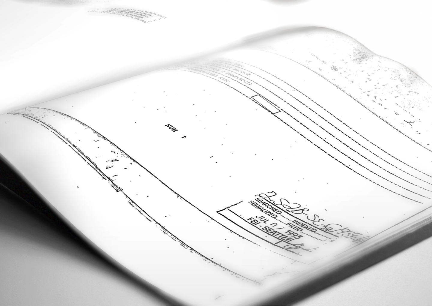
PSYCHO is a true crime magazine about criminal cases, psychology, and their representation in cinema. I needed to give four different sections a shared identity and make long articles engaging to read. The challenge was to create the atmosphere of an investigation while keeping the material clearly organised.
THE APPROACH
The case file as a design system
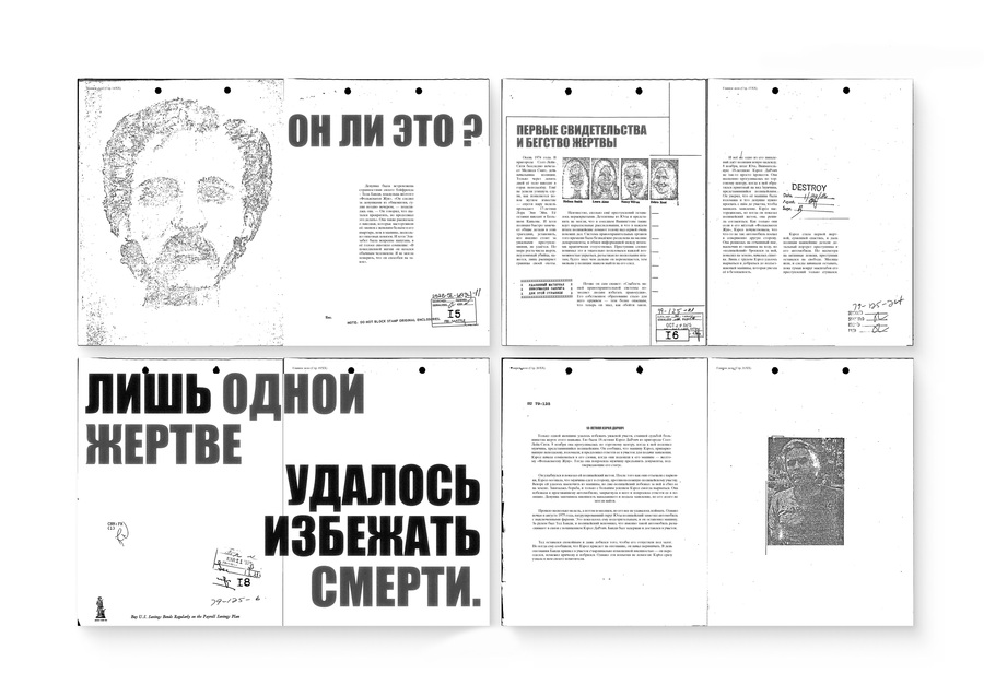
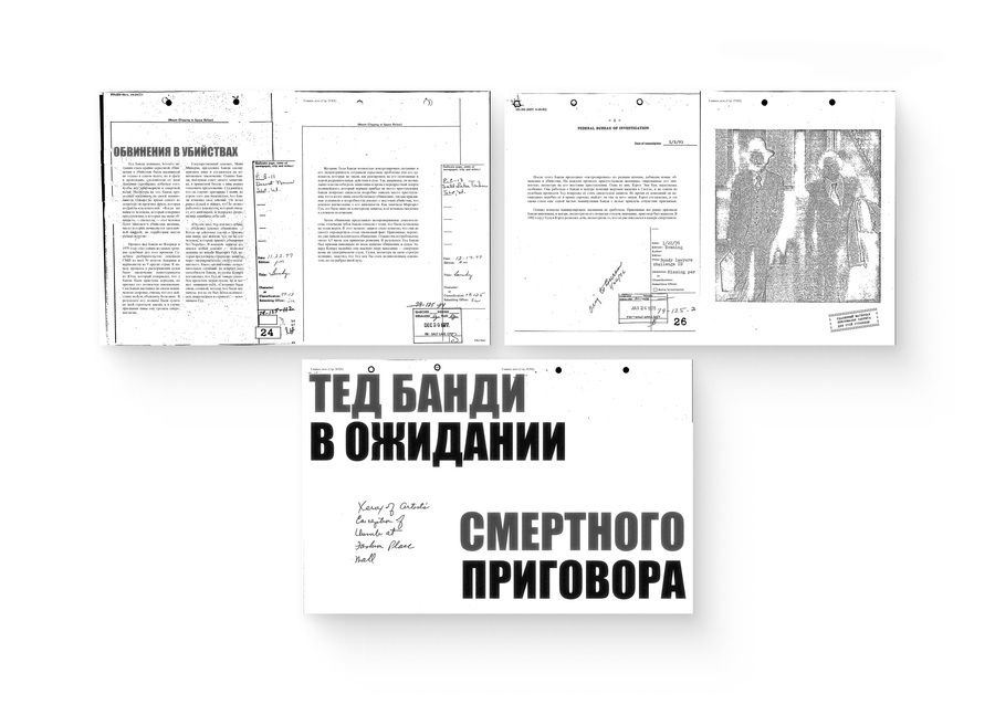
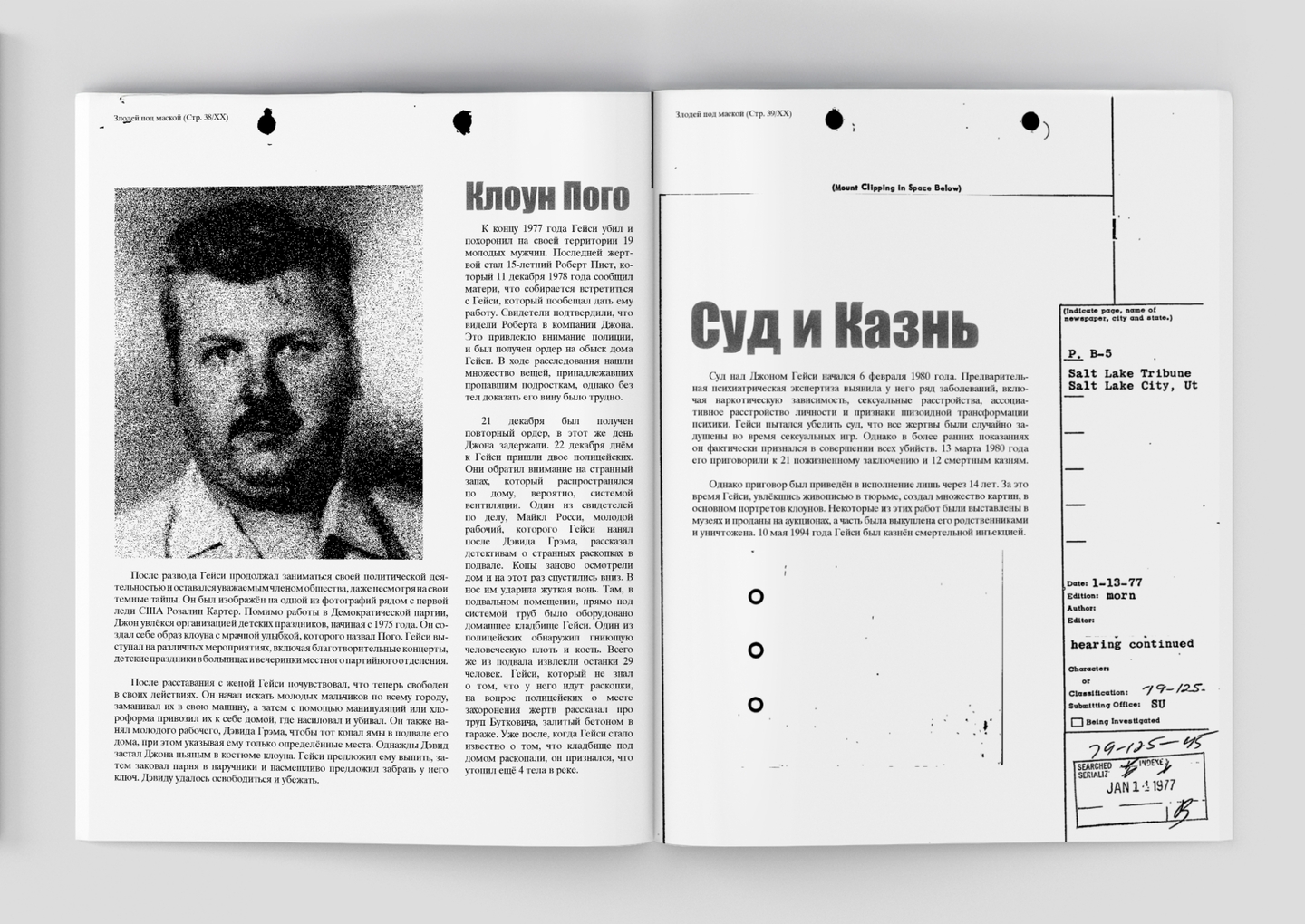
I built the visual language around filing marks, stamps, handwritten notes, and photocopy textures. These elements recur across the issue, making each article feel part of a larger dossier.
Condensed headlines establish emphasis, while serif body text supports longer reading. Section labels and page numbers provide navigation within the deliberately rough graphic language.
READING RHYTHM
From close reading to a sudden pause
I alternate dense text columns with large portraits, open space, and short statements set across entire spreads. Each change in scale shifts the reader’s attention and creates a different pace.
Oversized phrases interrupt the flow at key moments. The following pages return to detailed reading, creating a rhythm of information, tension, and pause.
THE OUTCOME
Four sections.
One editorial identity.
Case histories, criminal profiles, discussions of myth and reality, and film reviews share one visual system. The layout adapts to long articles and expressive typographic spreads while retaining the character of a case file.
View full project ↗03 / ZINE DESIGN
Suzdal — A Timeline
THE CHALLENGE
One city.
Different moments in time.
Suzdal — A Timeline is a personal guide to a city where past and present coexist. I brought together photographs from different periods, selected locations, and personal reflections. My task was to connect these materials into a coherent publication while preserving the intimate tone of a personal account.
THE APPROACH
A route through place and time
A numbered map connects the locations, while dates beneath the photographs guide readers between different periods. The publication can be explored both as a route through the city and as a sequence of comparisons.
A shared blue palette unifies the images. Handwritten headings introduce a personal voice alongside the more structured typography.
READING RHYTHM
Space for a slower reading
Short passages and generous white space give the photographs room to lead. Changes in scale move the reader from individual buildings to views that extend across a spread.
Personal observations sit beside architectural images, creating a quiet rhythm that reflects the experience of walking through the city.
MY APPROACH
Different stories.
Care for every page.
LET’S WORK TOGETHER
Your text deserves
a considered layout.
I work with typography, photography, and page structure to give each publication a visual language shaped by its content.
I am open to working with magazine editors, art directors, small publishing houses, cultural projects, and independent authors who need a designer to handle their material with care.
GET IN TOUCH
Have a magazine or a book
that needs a layout?
Write to me. Let’s discuss your publication.
Email ↗Telegram ↗