Original size 3000x4234
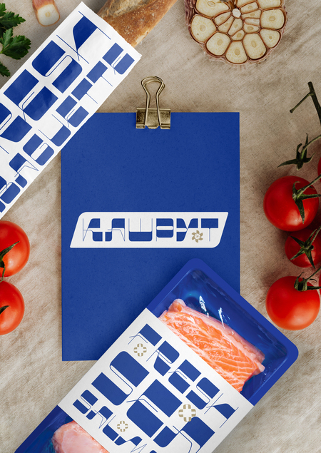
«Cashrut», brand package
The project is taking part in the competition
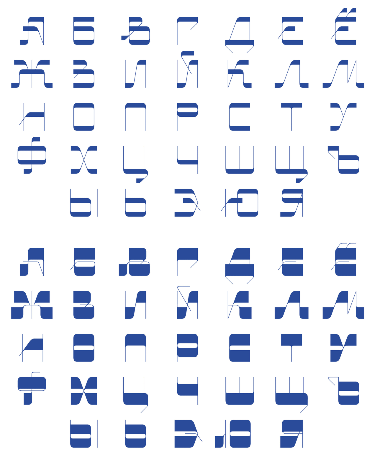
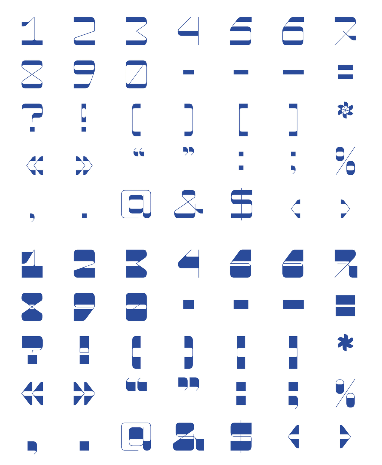
The project focuses on the development of an excise font called «Cashrut», designed to handle the packing of kosher foodstuffs. Inspired by Hebrew aesthetics
Original size 1920x1168
«Cashrut» is a different typeface. Broad horizontal touches contrast with narrow vertical and diagonal, creating a sense of Hebrew rhythm. This contrast makes the font dynamic and visualally attractive.
Original size 1920x1168
Original size 1920x900
Original size 1800x663
Original size 1800x663
Original size 1920x900
Original size 2050x1366
Original size 2050x1366
Original size 2050x1366
Original size 2050x1366
Original size 2050x1366
Original size 2050x1366
The «Cashrut» font is ideal to create an emphasis on the package, the name of the product, the brand, or the key messages. It gives the package visual strength and expression, making it visible on the shelf.
Original size 2050x1366
Original size 2050x1366
Original size 2527x1965
Original size 2050x1366
Original size 2050x1366
More projects in font
We use cookies to improve the operation of the HSE website and to enhance its usability. More detailed information on the use of cookies can be fou...
Show more
