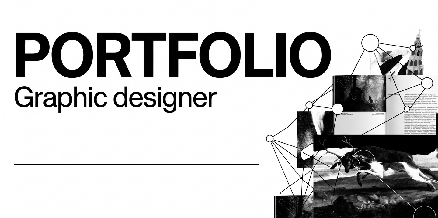
Designing Visual Systems for Culture, Art, and Print I partner with cultural institutions, galleries, and independent publishers to translate complex historical and artistic narratives into structured contemporary identities and tactile editorial objects.
ТHE АPPROACH
Culture Needs Clarity, Not Decoration
Cultural and academic projects often fall into one of two traps: they either appear overly conservative and dated, or lose their intellectual depth behind fleeting visual trends. My practice bridges this gap by treating graphic design as a curatorial tool.
EXHIBITION IDENTITY & CATALOGUE
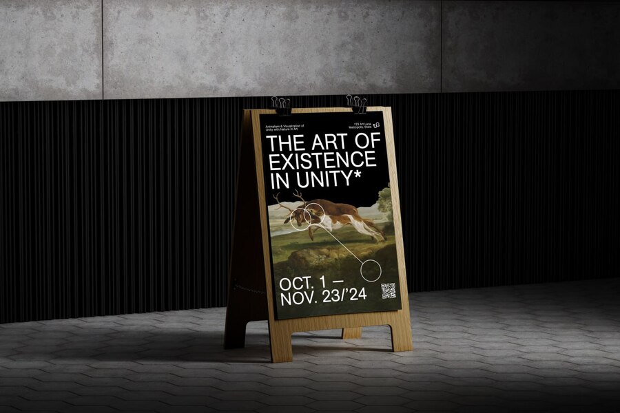
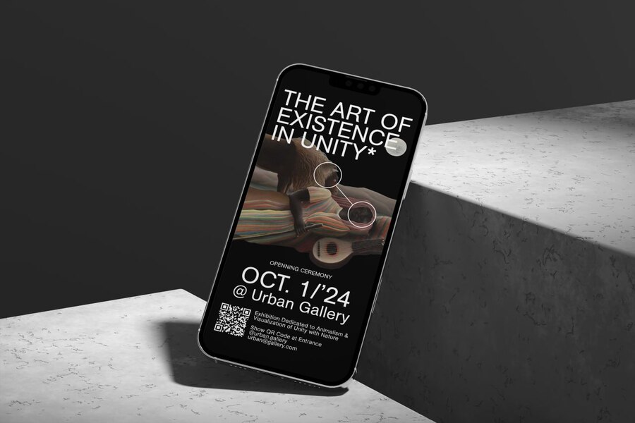
THE ART OF EXISTENCE IN UNITY
The Challenge. How do we attract a contemporary urban audience to an exhibition dedicated to animalism and classical landscape painting — including iconic 19th-century masterpieces — without making the visual communication feel like a dusty museum archive?
THE IDEA & VISUAL IDENTITY
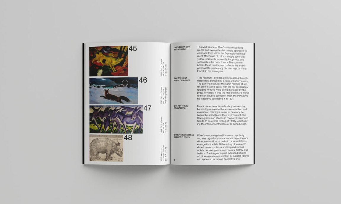
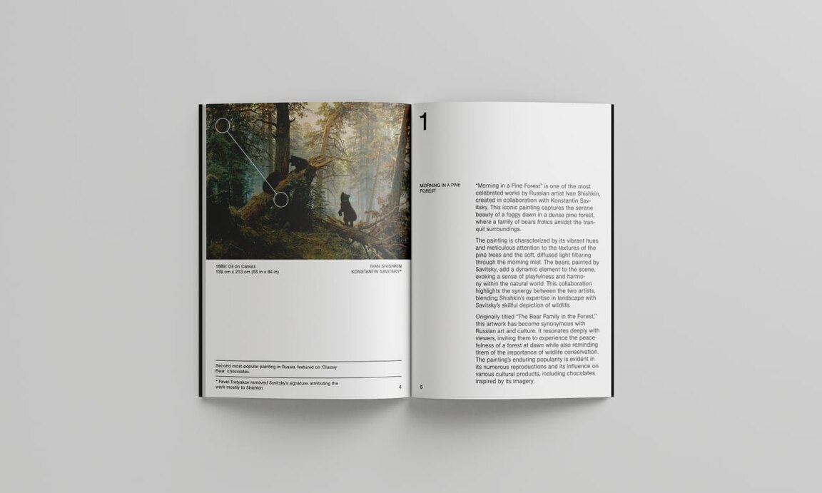
The Idea Mapping the Invisible Bond. The exhibition explores the fragile harmony between humans, wildlife, and nature. To visualize this concept, I introduced a contemporary graphic layer — thin white vector lines and circular nodes — superimposed directly onto classical canvases. Acting as an analytical lens, these nodes map out points of interaction, shared gaze, and physical unity between living beings.The Solution: Outdoor & Digital. Across street A-frames and mobile invitations, the delicate vector diagrams contrast sharply with bold, all-caps neo-grotesque typography. The recurring asterisk in the title «The Art of Existence in Unity» acts as a visual anchor, inviting viewers to look closer and read the hidden footnotes of art history.
EDITORIAL SYSTEM & IMPACT
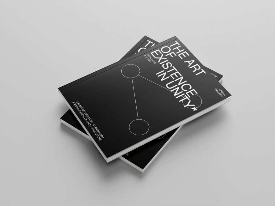
The Solution: Catalogue & Guide On the matte black cover of the exhibition catalogue, the connecting nodes step away from the paintings to form a pure, abstract constellation. Inside, the layout follows a disciplined multi-column grid that separates visual contemplation from historical context:
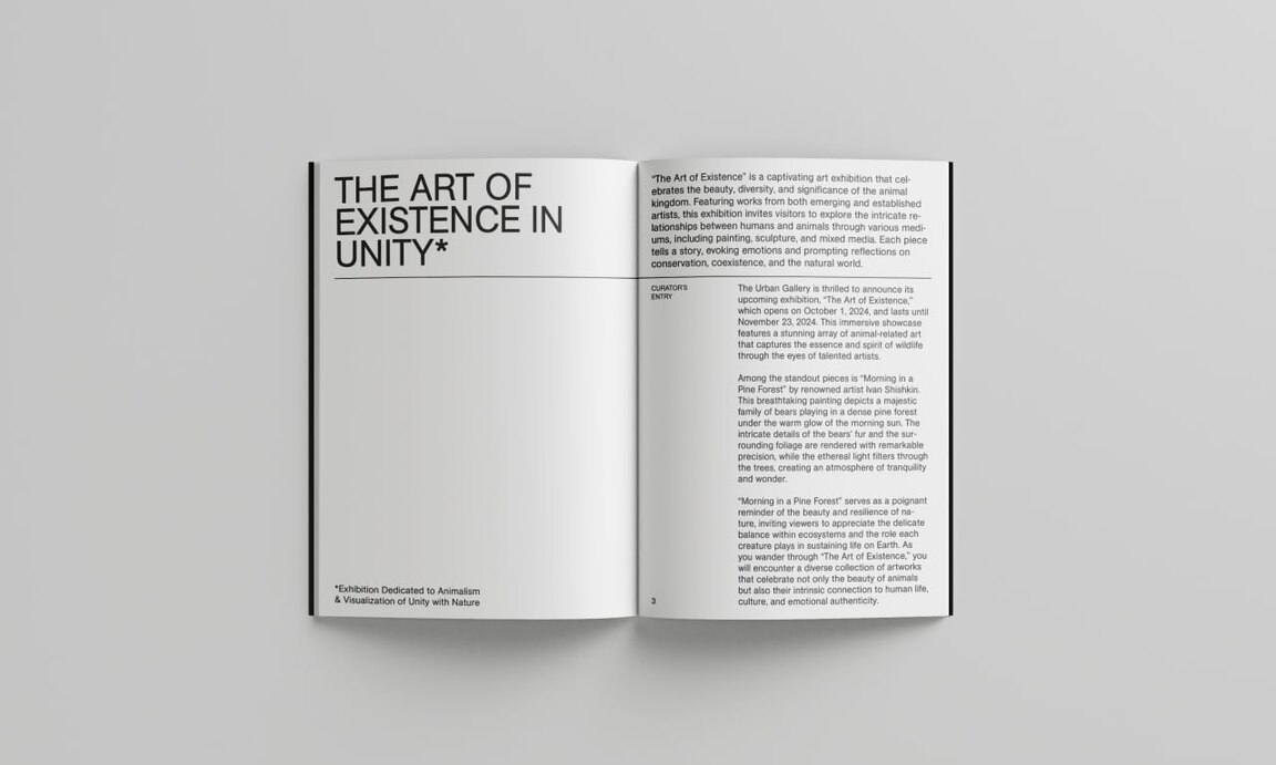
Left-hand pages: Showcase the artwork with subtle node overlays on top, balanced by structured technical credits (medium, dimensions, authorship) and historical footnotes divided by crisp horizontal rules at the bottom.Right-hand pages: Feature generous white space, oversized section numerals, and a balanced two-column layout for curatorial essays — such as the analysis of Ivan Shishkin and Konstantin Savitsky’s 1889 masterpiece «Morning in a Pine Forest».
The Impact The identity successfully reframes classical art through a contemporary Swiss-grid sensibility. It guides the visitor from initial street-level curiosity to deep, focused reading inside the gallery space, turning a standard museum guide into a collectible print artifact.
MICRO-TYPOGRAPHY & LAYOUT STANDARDS
Precision Behind the Grid
Across all projects, visual expression is supported by rigorous editorial standards and micro-typographic discipline:
Grid & Margins: Proportional multi-column systems where negative space is treated as an active structural element, guiding the viewer’s eye without visual clutter.Typographic Hierarchy: Four clearly differentiated text styles (Display Title / Lead & Pull Quote / Body Copy / Technical Captions & Folios) maintain instant navigation across spreads.Rhythm & Ragging: Careful control over line length (45–60 characters per column), leading, hyphenation, and optical margin alignment ensures clean text blocks free of widows and orphans.
SERVICES & COLLABORATION
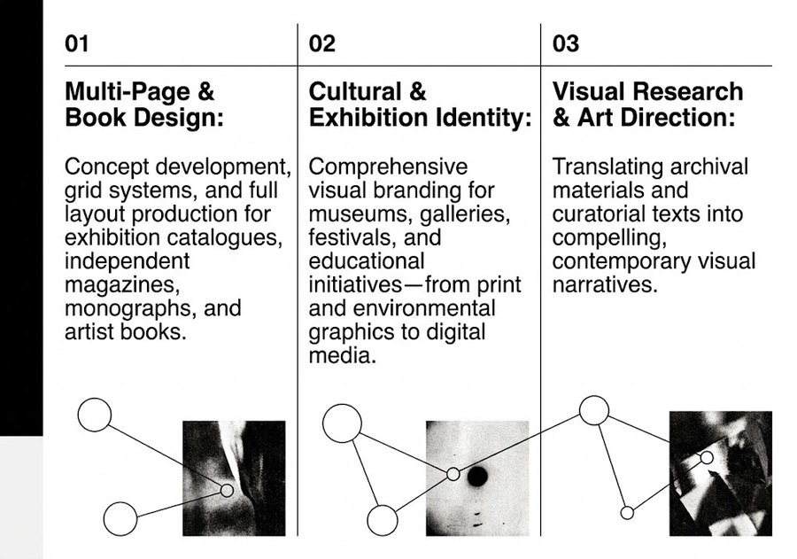
What I Can Do for Your Project
Have a Cultural Story to Tell? Let’s Give It a Form That Lasts.
I am currently available for freelance commissions, editorial projects, and collaborations with curators, design studios, and cultural institutions worldwide.
Email: pupupu@mail.ruTelegram: @pupupu