SURIKOVA S.
GRAPHIC DESIGNER
Branding, Visual Identity, Typography, 3D Design, Product Photography
I approach design through ideas, visual metaphors and attention to detail. I create visual concepts that give brands a distinctive character and connect meaning with form.
Visual Identity for a Charity Fashion Sale
Student Project
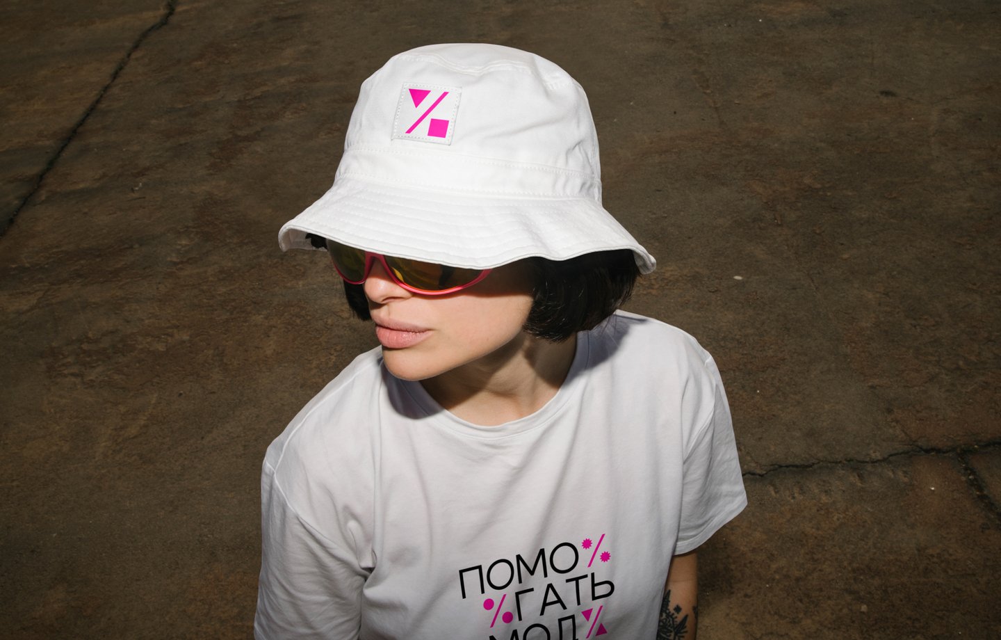
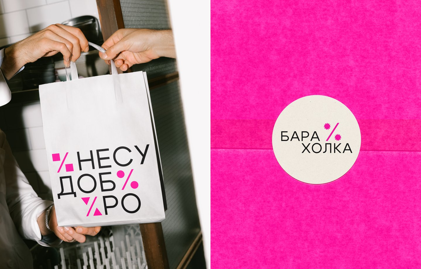
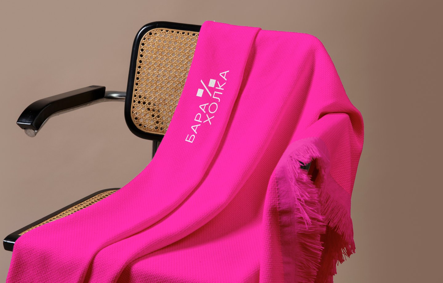
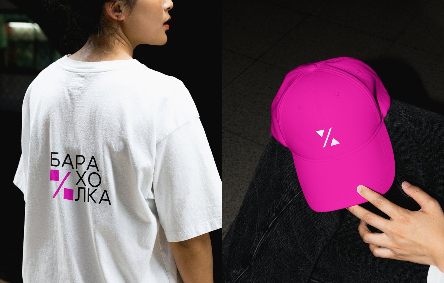
PROJECT OVERVIEW A charity fashion sale held twice a year, featuring donated items from stores, local brands and fashion-conscious women. All proceeds support social projects for children with autism spectrum disorder.The goal is to make quality fashion more accessible while supporting a charitable cause.CORE IDEA The percentage sign represents both an affordable price and a charitable contribution. The price goes down, but the value of the item grows through the good it does.
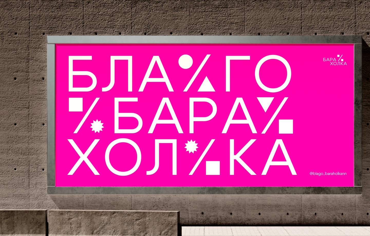
VISUAL LANGUAGE Fuchsia brings energy and recognition to the identity. The geometric percentage sign shifts between square, circular, rectangular and star-shaped forms, reflecting the variety of the assortment and the scale of discounts.Integrated into the typography, it becomes part of the visual system.
Photographic Product Project
Student Project
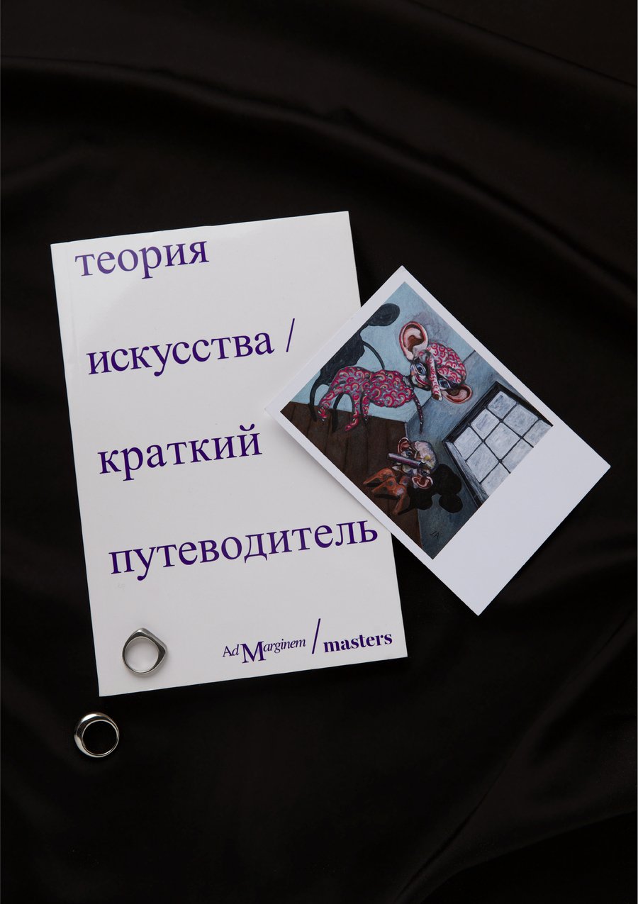
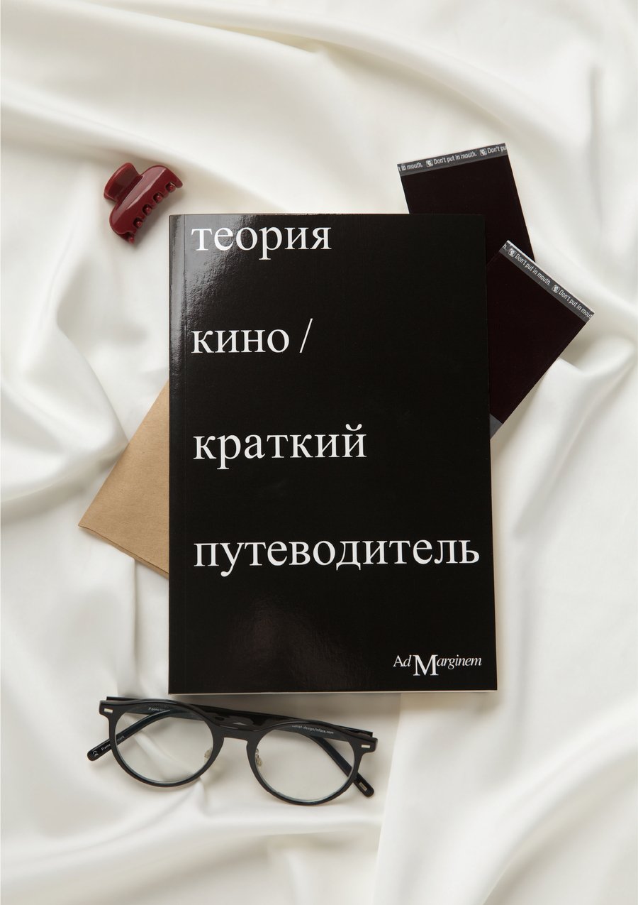
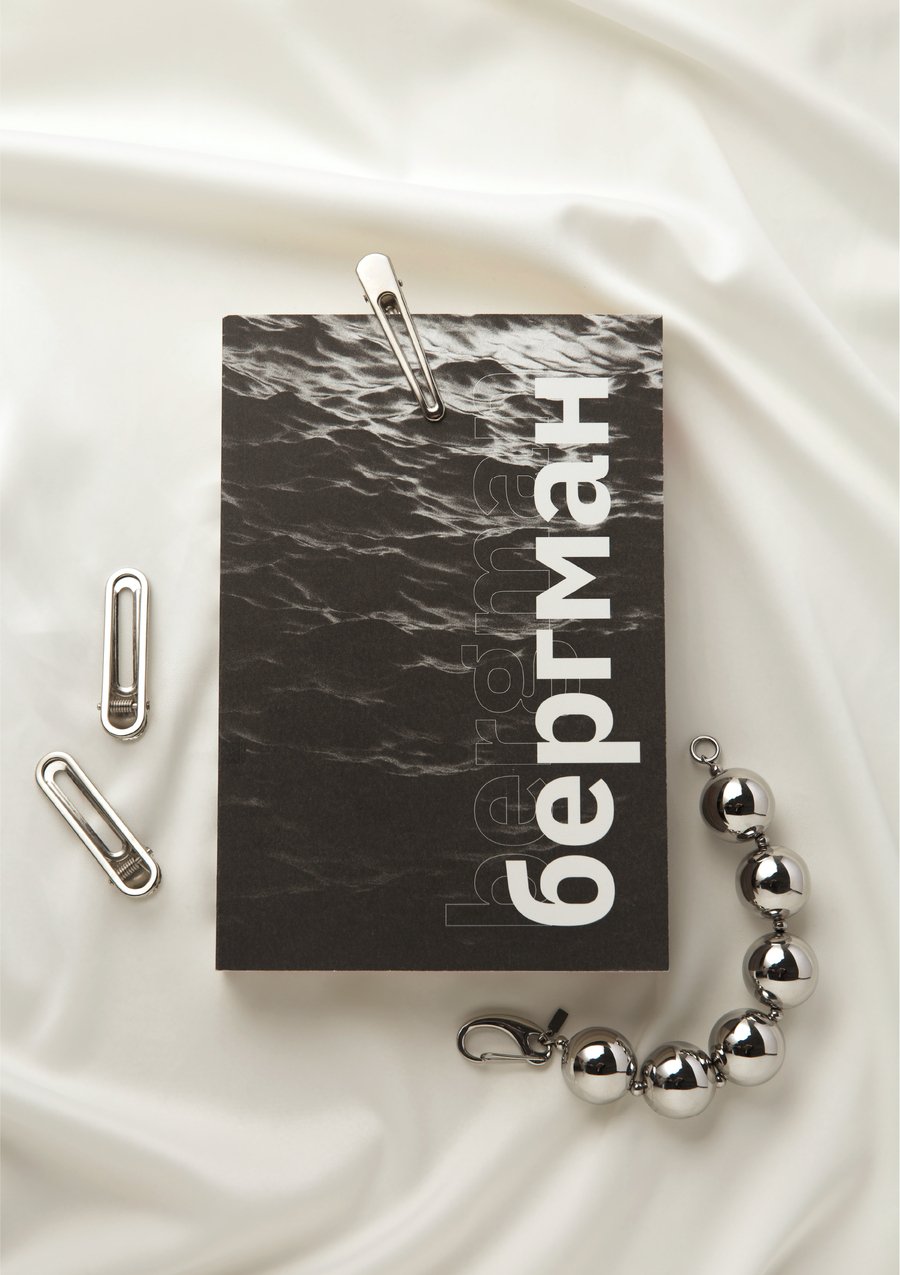
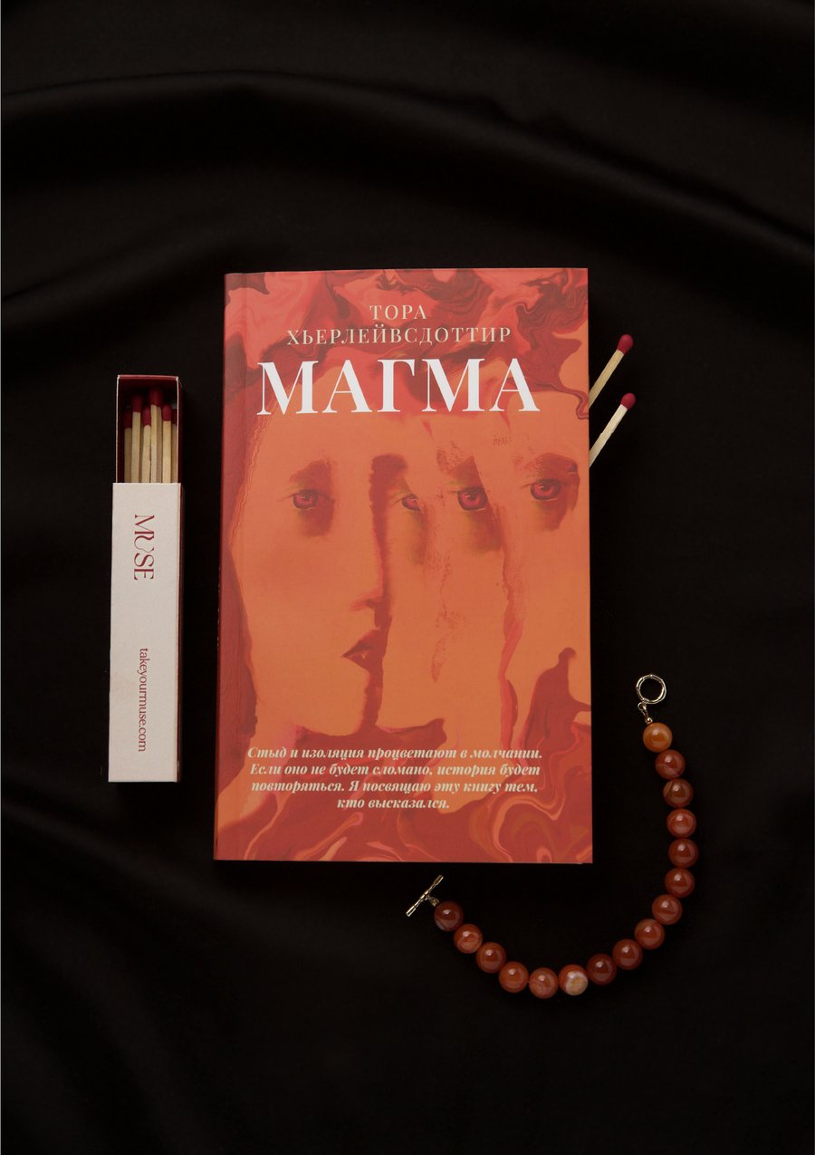
PROJECT OVERVIEW An exploration of my personal library through the objects that surround it: postcards, glasses, cosmetics, photographs and the books I read. The project captures the connection between the stories found in books and the traces of everyday life. CORE IDEA Books exist alongside the small objects that become part of our own stories. Together, they form a portrait of a life shaped by reading, collecting and remembering.

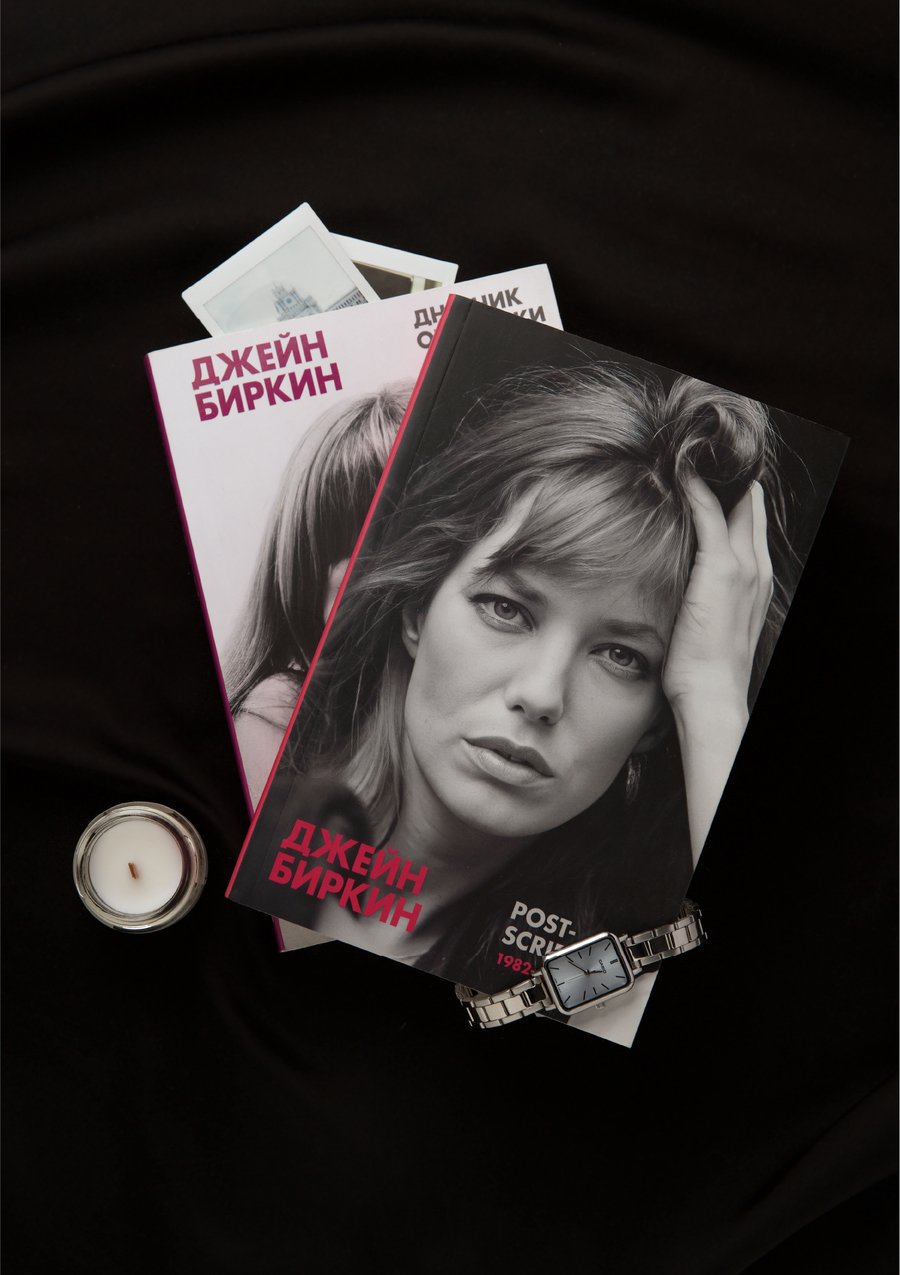
VISUAL LANGUAGE Top-down compositions place books and everyday objects against black or white satin. Soft, slightly warm light highlights the textures of fabric, paper and personal belongings, creating an intimate still-life atmosphere.
Visual Identity for Lyaminskaya Library
Student Project
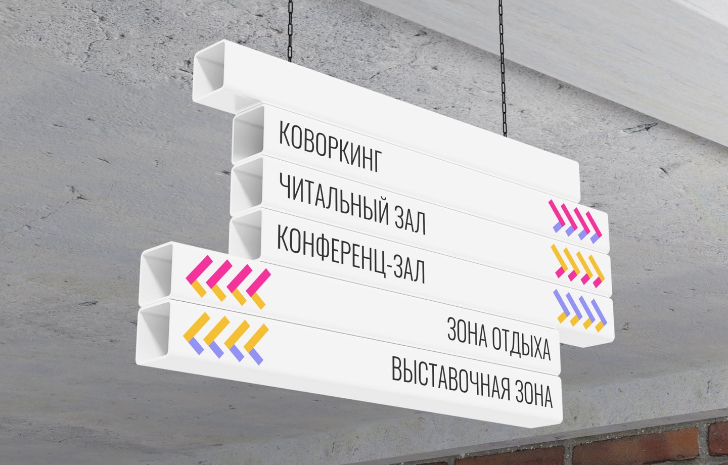
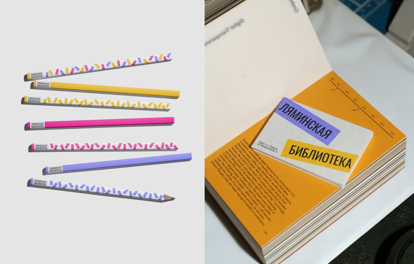
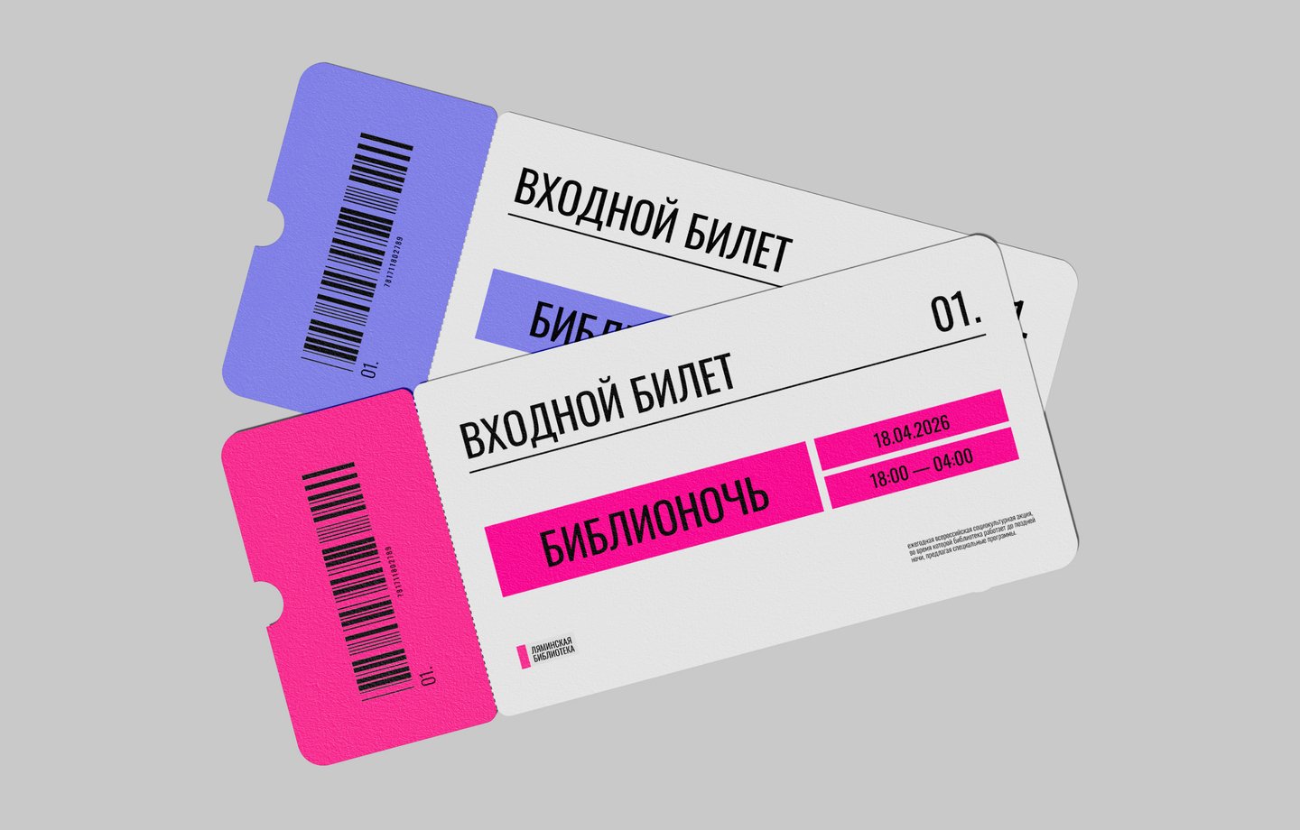
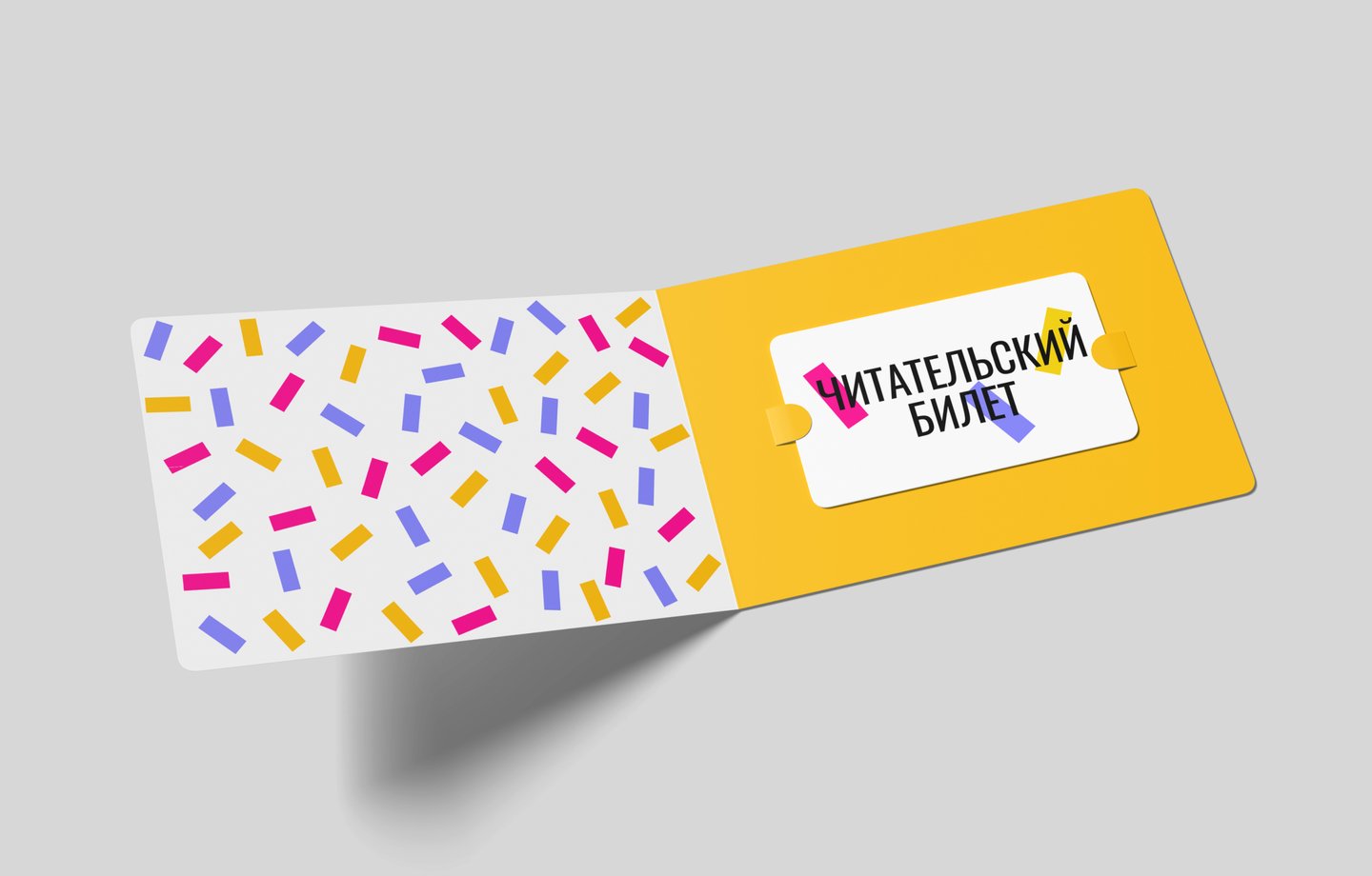
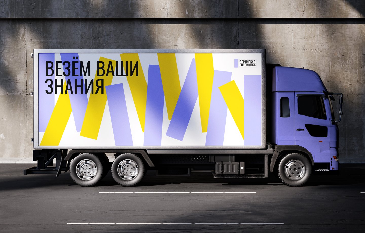
PROJECT OVERVIEW Located in the rural settlement of Lyamino, the library serves as a cultural and social hub for the local community. Beyond access to knowledge, it brings people together through conversations, events and shared experiences. CORE IDEA Stickers become confetti a metaphor for memory, everyday life and celebration. The concept reflects the library’s role as a place where knowledge, people and shared moments come together.
VISUAL LANGUAGE Dynamic sticker elements form the basis of the visual identity. Easily scaled and rearranged, they create a flexible graphic system in three vibrant accent colours: pink, yellow and lilac. Typography is sometimes integrated directly into the stickers, making them part of the composition.