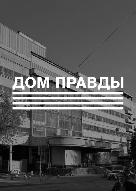
«Дом Правды» — новое культурное пространство в Москве, основанное на месте комбината газеты «Правды», реставрация которого запланирована в будущем

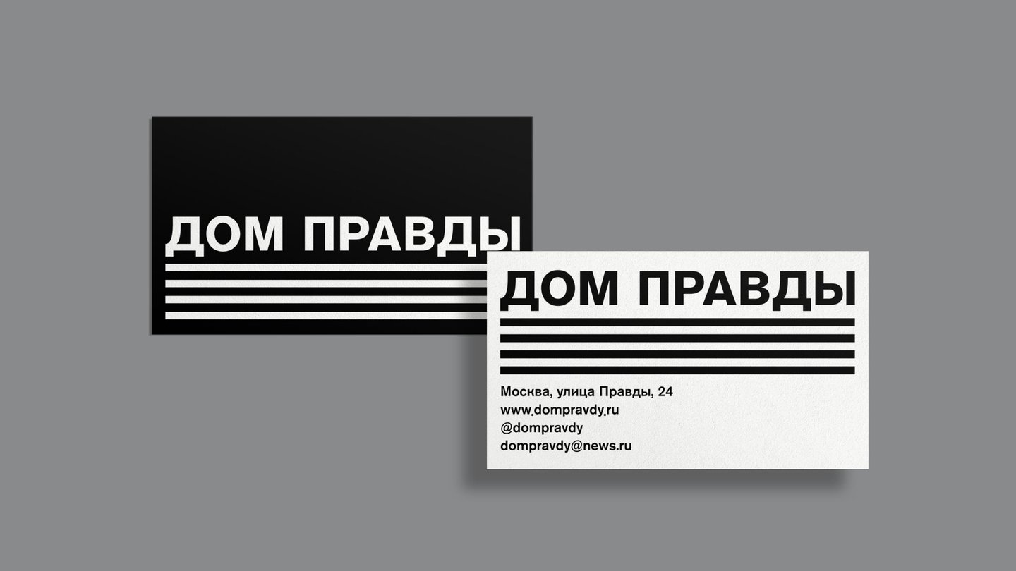
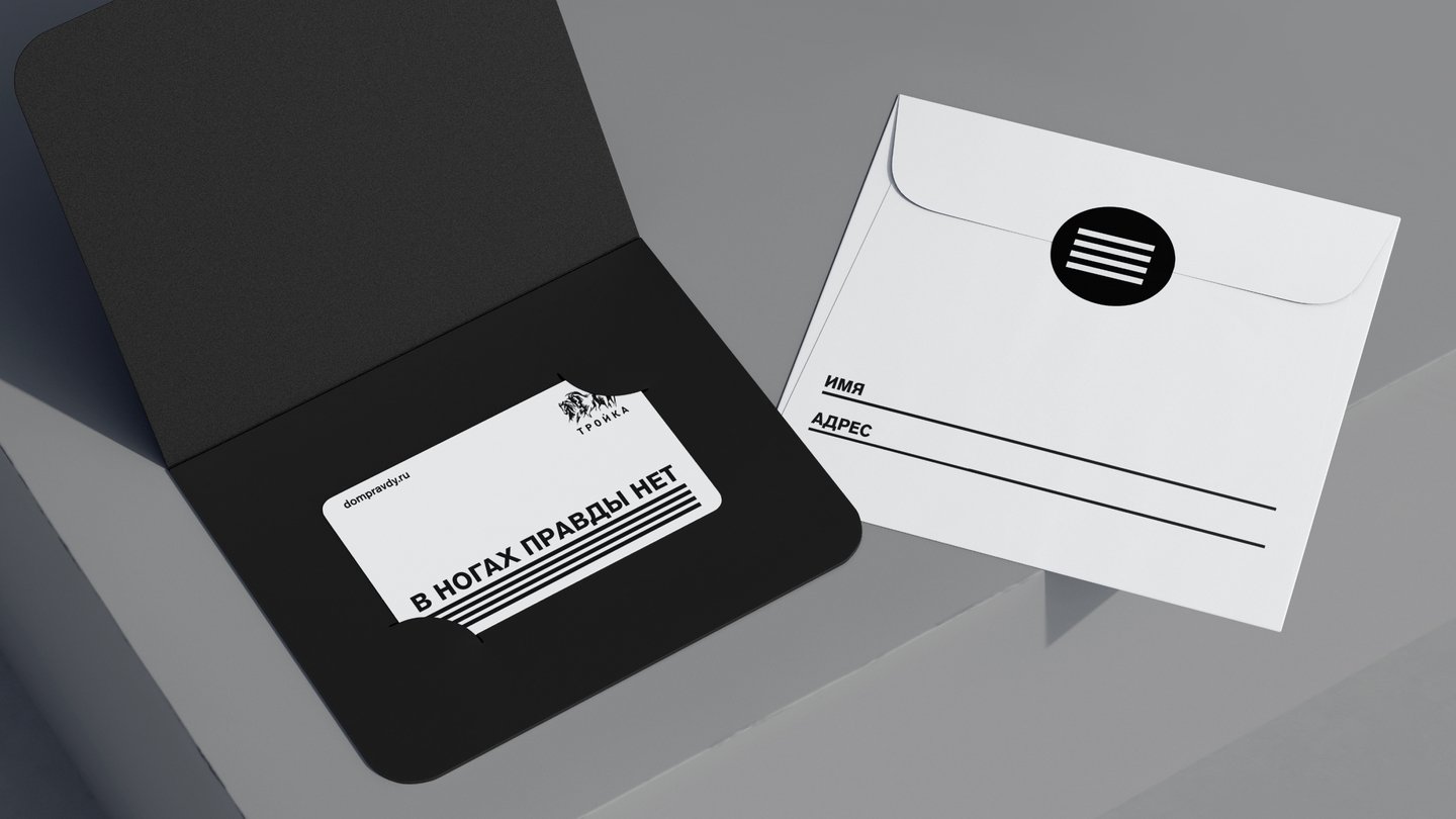
Фирменный стиль бренда основан на архитектурных особенностях здания комбината газеты «Правда» и течении конструктивизма, в котором построено пространство. Так, логотип отражает не только визуальные особенности дома, составленного из линий и имеющего вытянутую форму, но и функциональные: знак напоминает стопку бумаг, а также массив заголовка и основного текста в газете, что отсылает к истории и первоначальному назначению «Дома Правды»
Мы не могли не учесть историю здания и ту смелость, с которой оно было названо: культурное пространство показывает и формирует истинное понятие об искусстве точно так же, как издательство когда-то транслировало людям исключительно правдивые вести
Наш фирменный стиль — это правда и ничего кроме правды, и это подчеркивается ироничным копирайтингом, привлекательным для молодежи, а также сдержанностью и строгостью, отражающими более взрослый сегмент аудитории
Каждый носитель — это такое же самостоятельное послание, как и тематическая колонка в газете. Мы словно говорим зрителю: посещая культурное пространство и используя нашу продукцию, вы становитесь ближе к правде, что, например, отражено в карандашах, стачивая которые вы становитесь ближе к истине


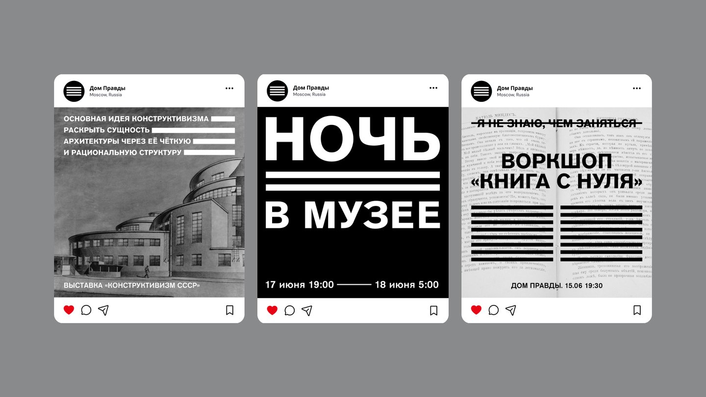
Целью нашего брендинга было построение связи между современностью и наследием конструктивизма, который не только стал главным течением той эпохи, но и нашёл своё отражение в новой и современной форме дизайна, архитектуры и искусства.
Читайте, смотрите и главное — верьте «Дому Правды»
