The Paris Metro is traditionally associated with Art Nouveau architecture and the iconic entrance pavilions designed by Hector Guimard in the early 20th century. However, beneath the familiar image of the historic entrances lies a less obvious story—the evolution of typography within the transit space itself. For nearly a century, station names, exit signs, directional placards, and informational text established a distinct visual language for the Paris Metro. This language changed alongside advancements in production technology, station architecture, and the evolving concept of effective urban navigation.
The selection of this topic stems from an interest in how typeface operates within a specific environment and how dependent it is on the conditions of its application. The Metro represents a unique space where a letter must not only possess a particular visual character but also fulfill a concrete function: to be noticeable, instantly recognizable, readable from a distance, and functional amidst constant pedestrian movement. Moreover, throughout the 20th century, signage was created using fundamentally different methods—hand-painting, ceramic tiling, stenciling, and, later, custom-designed typefaces. This allows one to trace not only shifts in aesthetic preference but also the evolution of the very approach to letter creation.
Key research question: How did the typographic form of letters in the Paris Metro navigation system change from 1900 to 1996 under the influence of production technologies, materials, and legibility requirements?
The research hypothesis is that the evolution of the Paris Métro typography was determined not only by shifts in artistic movements and aesthetic preferences, but primarily by changes in inscription production methods and functional requirements. While in the early 20th century, the letterforms were dependent on individual design, architectural context, and material characteristics, standardization, universality, and legibility gradually came to the fore. Thus, the history of the Métro’s typography reflects a transition from local, material-driven letter solutions to a unified public transportation typeface system.
CHAPTER 1. 1900. THE FIRST LETTERS OF THE PARISIAN METRO
When the metro first appeared, a unified typographic system did not yet exist. The initial signage inherited the traditions of urban hand-lettering. Letters were created considering the specific location, material, and content. Particularly telling are two parallel solutions: the functional typography of CMP inside the stations and the individual decorative lettering by Ektor Gimar at the entrances.
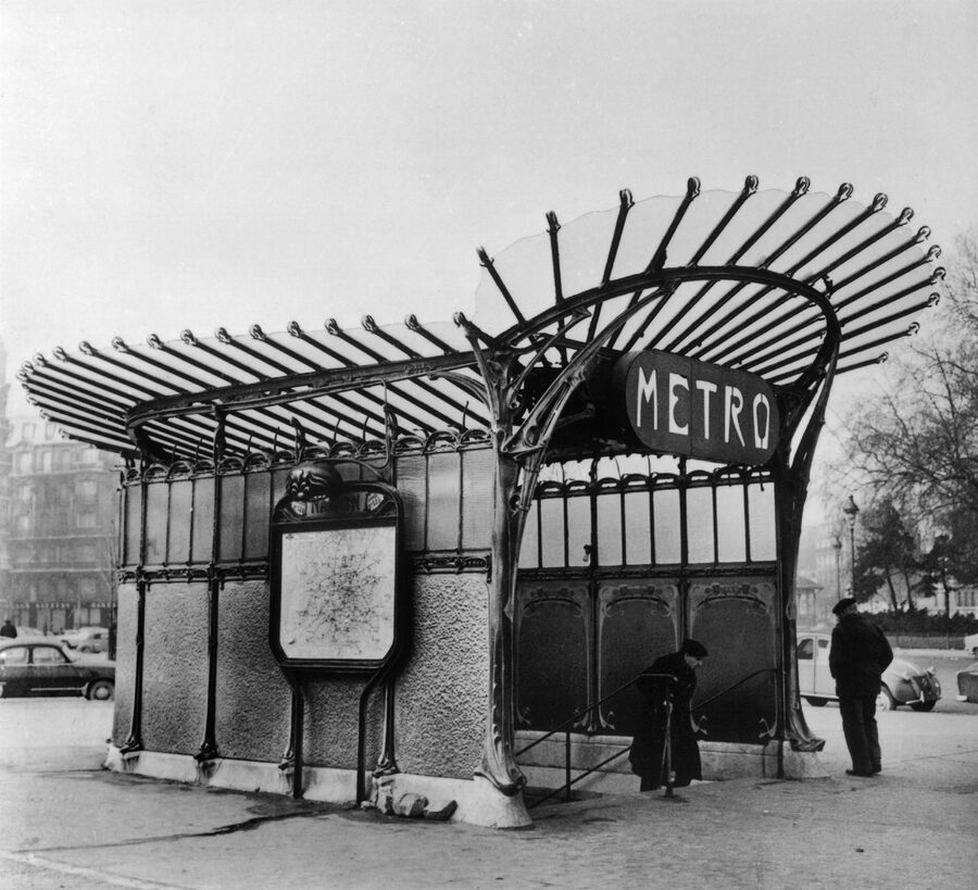
Nation Metro Station, designed by architect Hector Guimard. This structure was dismantled shortly after this photograph was taken and was moved to a foreign museum (Paris, France) on January 17, 1961. Photo: Keystone-France/Gamma-Rapho via Getty Images.
The Paris Métro opened on July 19, 1900, during the World’s Fair. The first line connected Porte de Vincennes and Porte Maillot. With the advent of this new mode of urban transportation, there arose a need to organize passenger flow within an unfamiliar underground environment.Stations, transfers, platforms, and exits required a system of informational signage. Typography became an integral part of the transport environment—it allowed passengers to understand their location, determine their direction of travel, and find an exit. Unlike conventional city signage, the Métro was a closed space with numerous repetitive elements and a constant flow of people. However, in its early years, there was no unified standard for lettering. Signage was shaped by existing practices in urban design.
Hôtel de Ville Station, 1900. A historical photograph from the RATP collection.
The photograph shows the initial organization of the station space. The walls are clad in white, angled ceramic tile that reflects the artificial light. The styling of the early CMP stations was quite restrained: station names and advertisements were placed directly on the walls, without elaborate decorative frames. It is worth noting the small station name plaque on the left wall. This choice can be interestingly contrasted with later decorative ceramic panels: gradually, the station name transforms from a simple informational label into a major typological element of the environment.
Exit Signage in Historical Photographs of the Parisian Metro. RATP Collection, published by Île-de-France Mobilités.
The word SORTIE («Exit») represents a different kind of navigational task: unlike station names, it must be quickly recognizable and unambiguously direct the passenger. Here, it is particularly important to consider the contrast between the large capital letters and the surrounding space. The word is placed on a separate sign, which sets it off well from the architectural background. The letters function as a standalone informational sign.
Hector Gimar: Letters as Part of Architecture
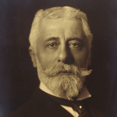
It is important here to differentiate between two parallel lines of development. Within the early CMP stations, standard urban signage was used, adapted for various informational purposes. The entrance pavilions and individual elements of the exterior navigation received Hector Guimard’s unique graphic language.
Guimard did not create a universal font for the subway system. Throughout his career, he designed individual signs, headings, and letter compositions, rather than consolidating them into one or several complete typefaces. Each sign was effectively designed as a standalone graphic object.
Entrance pavilion of the Bastille station, with glass frames bearing the inscriptions «SORTIE» and «ENTRÉE.» Photograph by Charles Maindron, April 30, 1902. Bibliothèque historique de la Ville de Paris.
The inscriptions are integrated directly into the pavilion’s architectural structure. They are placed above the doors and within the glass transoms, perceived as part of the decorative scheme. Furthermore, the inscriptions serve different functions. «ENTRÉE» denotes the entrance, and «SORTIE» denotes the exit. They are positioned on opposite doors and designed to be viewed from different perspectives: the entrance inscription is visible from the street, while the exit inscription is visible from inside the station.It is particularly interesting to examine the letterforms. In an early version, Ghimars used unusual, almost tentacle-like contours and numerous hooked serifs. These intertwine closely with the ornamentation, creating a striking composition, yet they impede rapid word recognition.Decorative expressiveness and functional legibility do not always align. In early subway design, a letterform could be part of the artistic decor, even if its informational function became less obvious because of it.
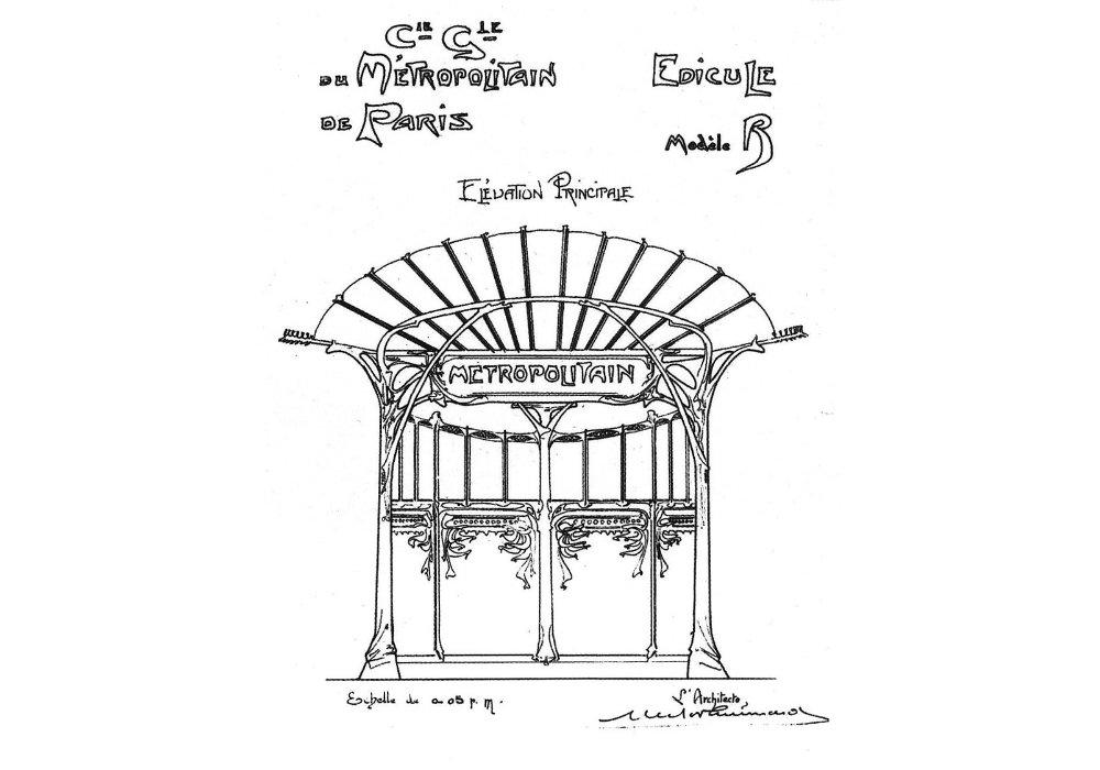
Sketch of an entrance structure from the Paris Metro. Hector Guimard, circa 1900. Musée d’Orsay. Musée d’Orsay Archive — Paris, Le Métropolitain, GP 1976
This sketch is helpful in understanding how Gimmar conceptualized the lettering within the context of the entire structure. The word «Métropolitain» does not exist in isolation from the architecture; it is inscribed within a specific form above the entrance and is subordinate to its plasticity. Here, the typography and the architecture are designed as a unified whole. The curved surface, the smooth lines of the metal elements, and the ornamental composition define the character of the lettering itself.
«Paris, The Métropolitain.» Hector Guimard, circa 1901. Full-scale study of the inscription «METROPOLITAIN Hector Guimard Archt, ” watercolor and graphite on tracing paper. GP 1882, Musée d’Orsay.
This sketch is not merely a sign above an entrance; it is an original, scaled design closely resembling the final structure. The letters possess individualized outlines—their proportions and contours diverge from conventional typefaces. Adjacent characters interact closely with one another, forming a cohesive composition. Visually, the word is perceived almost as a single symbol: the overall form first captures attention, and only then is the inscription read sequentially. This technique links the early lettering of Ghiomar to the principles of logo design, although here it is applied to a navigational marker. A particular feature of the material is the ability to view not just the finished object, but the entire design process of the letters themselves.
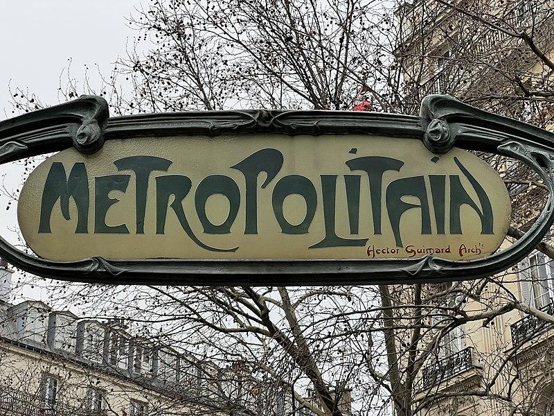
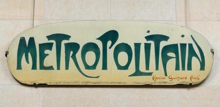
«Paris, Le Métropolitain.» Hector Guimard, 1900. Typographic design variations of the word «Métropolitain, ” graphite, charcoal, and colored pencils on tracing paper. 70,5 × 300.5 cm. „Paris, Le Métropolitain.“ /Full-scale typographic study of the inscription „METROPOLITAIN Hector Guimard Archt, ” watercolor over pencil sketch on tracing paper. 54,5 × 266 cm. GP 1882, Musée d’Orsay
Here, the explorations of letterform are presented directly. Ghimar treats the word as an independent composition: varying the contours of the letters, their width, their relative placement, and their decorative terminations. One might also note the scale—the sheet is over three meters long. Working with such an expansive composition allowed Ghimar to design the inscription as a single object rather than as a standard line of text. If the first sheet shows the exploratory work, the second presents a more refined version of the inscription. The letters form a dense composition characterized by Ghimar’s organic forms.
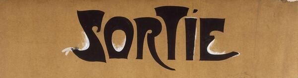
Sketch of the inscription «ENTRÉE,» Giraud typeface, published designation GP 1884. Musée d’Orsay / Sketch of the inscription «SORTIE,» GP 1885. Giraud typeface, Musée d’Orsay
It is particularly evident here that the words were designed as unified graphic forms. The letters do not simply sit next to each other; they literally «intertwine, ” and individual elements extend beyond the conventional boundaries of the line. Meanwhile, the design of later markings noticeably differs from the early inscriptions on the Bastille’s glass doors. The contours become more refined, and the composition more cohesive and expressive. Frederick Descourtel notes in his study that with these inscriptions, the overall visual perception of the composition could occur before the sequential reading of the word. This brings them closer to the principle of a logo. A specific technical detail: the blueprints were executed at full scale and were likely intended for the enamel worker. The metal plaques were cut by locksmith Félix Balet, and the enameling was performed by the Adonaï workshop. Thus, Gimard’s original drawing was transformed into a finished object through the work of several specialists.
After Ghirardelli: The Beginning of the Separation of Style from Author
In 1903, Ghimmar ended his collaboration with CMP. The company acquired the rights to use his models and continued installing entrance structures, adapting them for different stations. However, along with the architectural forms, the method of working with lettering gradually changed.
Doors of the central pavilion of the Bastille station with altered signage «SORTIE» and «ENTRÉE, ” photograph from the 1930s. RATP Collection. Reproduction and description in the study Le Cercle Guimard.
A prime example is the Bastille Pavilion. After parting with Ghimart, before 1906, CMP commissioned another letter artist to create new inscriptions for the central doors. He did not devise an entirely new style; instead, he reproduced the forms created by Ghimart to maintain the pavilion’s visual coherence, making it more noticeable to passengers.
However, the artistic character of the early lettering does not completely vanish: CMP preserves the recognizable contours of the letters while simplifying their reproduction. This results in an intermediate solution—it is neither Ghimart’s individual design nor a standardized typeface. The letterform begins to exist independently of its creator, transforming into a reproducible element of the transportation environment.
At the beginning of the 20th century, the Paris Metro lacked a unified typographic system. CMP’s informational signage inherited practices from urban hand graphics and adapted them to specific media. Hector Guimard, in turn, transformed letterforms into an independent element of architectural design, creating unique compositions for signs and directional markers.
Even within his own work, an evolution occurred: from the decorative, difficult-to-read lettering of the early Bastille pavilion to the more cohesive and unified letter compositions used for signs and entrance/exit indicators. After ending his collaboration with CMP, individual elements of his graphic language continued to be used by other fabricators.
Thus, the first phase of the Metro’s typographic history is characterized by the coexistence of various approaches: functional urban signage, authorial lettering, and its subsequent reproduction. The letterform remains tethered to a specific structure and material rather than existing as a universal typeface.
Chapter 2. 1910. Ceramic Typography of the Nord-Sud Company
If Hector Guimard’s letter was an individual drawing subservient to architectural plasticity, Nord-Sud proposed a completely different principle: the letter became the result of interaction with the material and a given modular grid. Its form was determined not only by the artistic solution but also by the physical dimensions of the ceramic elements.