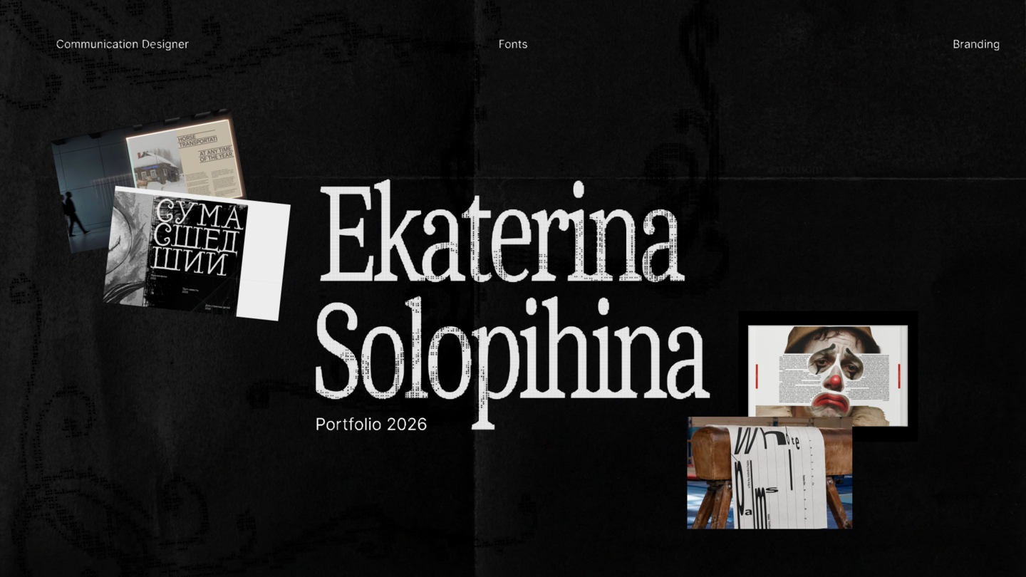
Design that makes sense
Hello! My name is Ekaterina. I am a communication designer, working with identity, digital design and typography.I lead projects from the idea to the final design, form a concept, create a visual system and adapt it to different formats and points of contact. My portfolio includes branding, digital communications, printed materials, and font design. I strive to make decisions clear, expressive, and complete.Tools: Figma, Adobe Creative Cloud, Tilda, Framer, BlenderScroll through below to get acquainted with my projects!
Branding
Project 1
The identity of the exhibition «Boundaries of age»
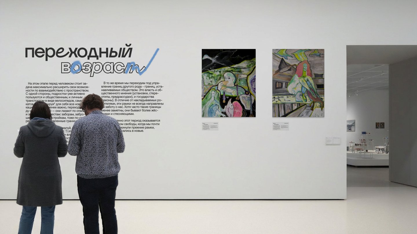
The Boundaries of Age is an exhibition about how human interaction with space, social norms and power changes at different stages of life.The project explores two systems of boundaries — spatial and domineering — and shows how a person first obeys them, then tries to revise and set their own rules, and eventually faces new limitations related to the body, memory and time.
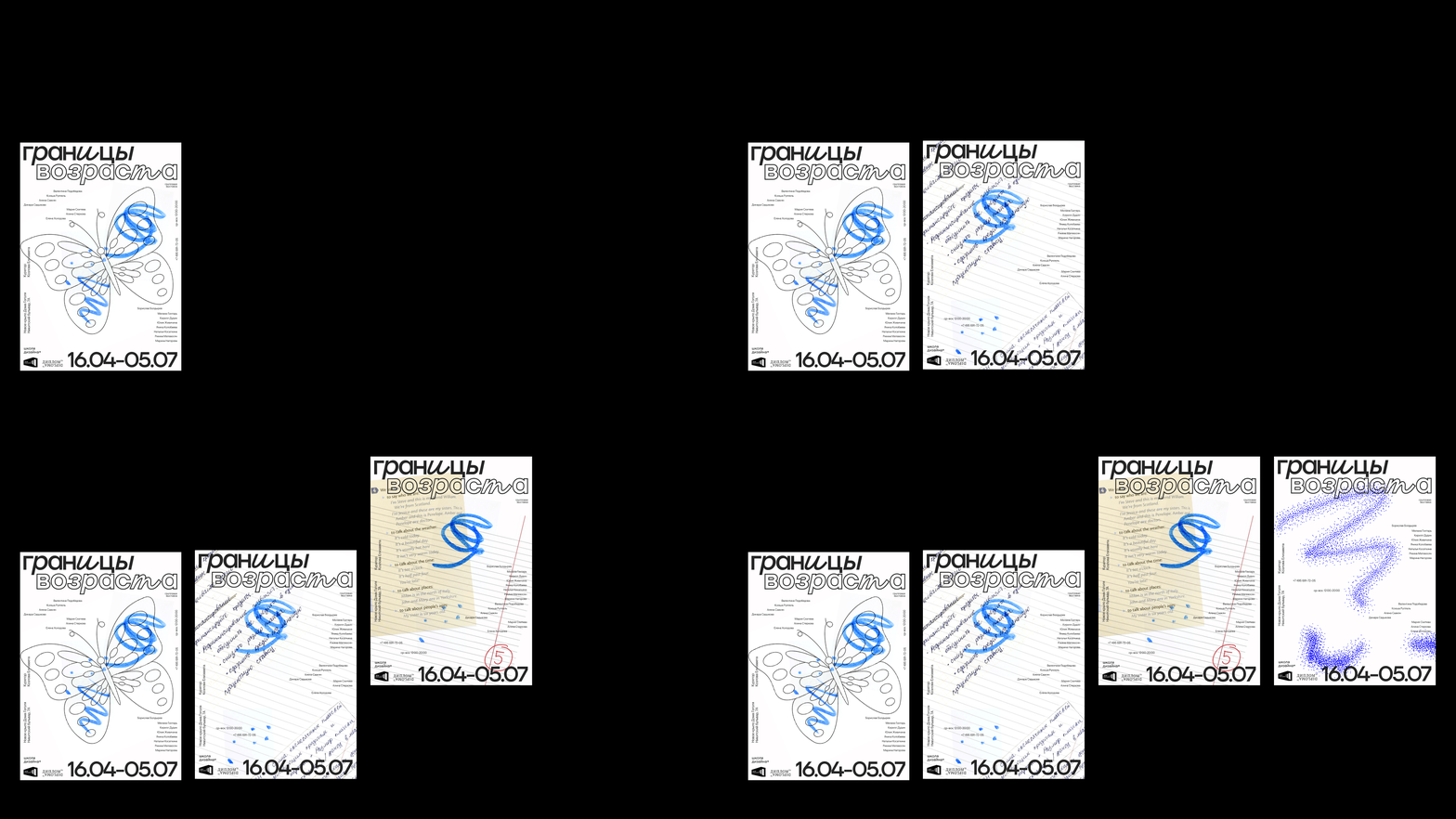
I didn’t want to use the usual images of age—clocks, lifelines, or literal depictions of growing up and aging.Instead, I started looking for a more personal and universal image that changes with the person. This is how the idea of handwriting appeared — a visual trace that goes with us through different stages of life.The metaphor Handwriting changes with a person With age, the way a person writes changes (from the first free lines to more confident and well-formed writing)Through handwriting changes, I showed different stages of life and made them the basis of the visual system.
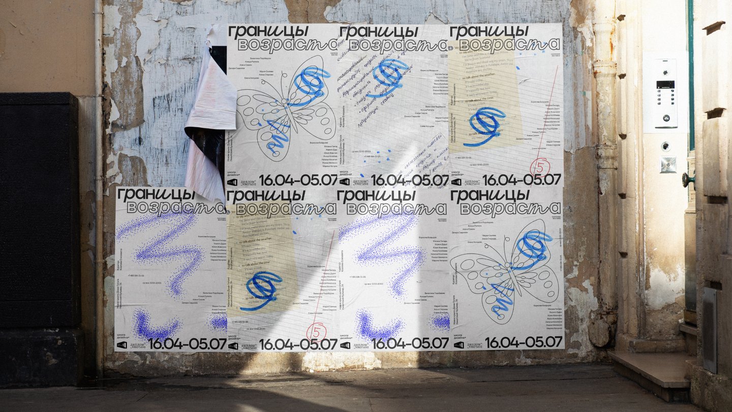
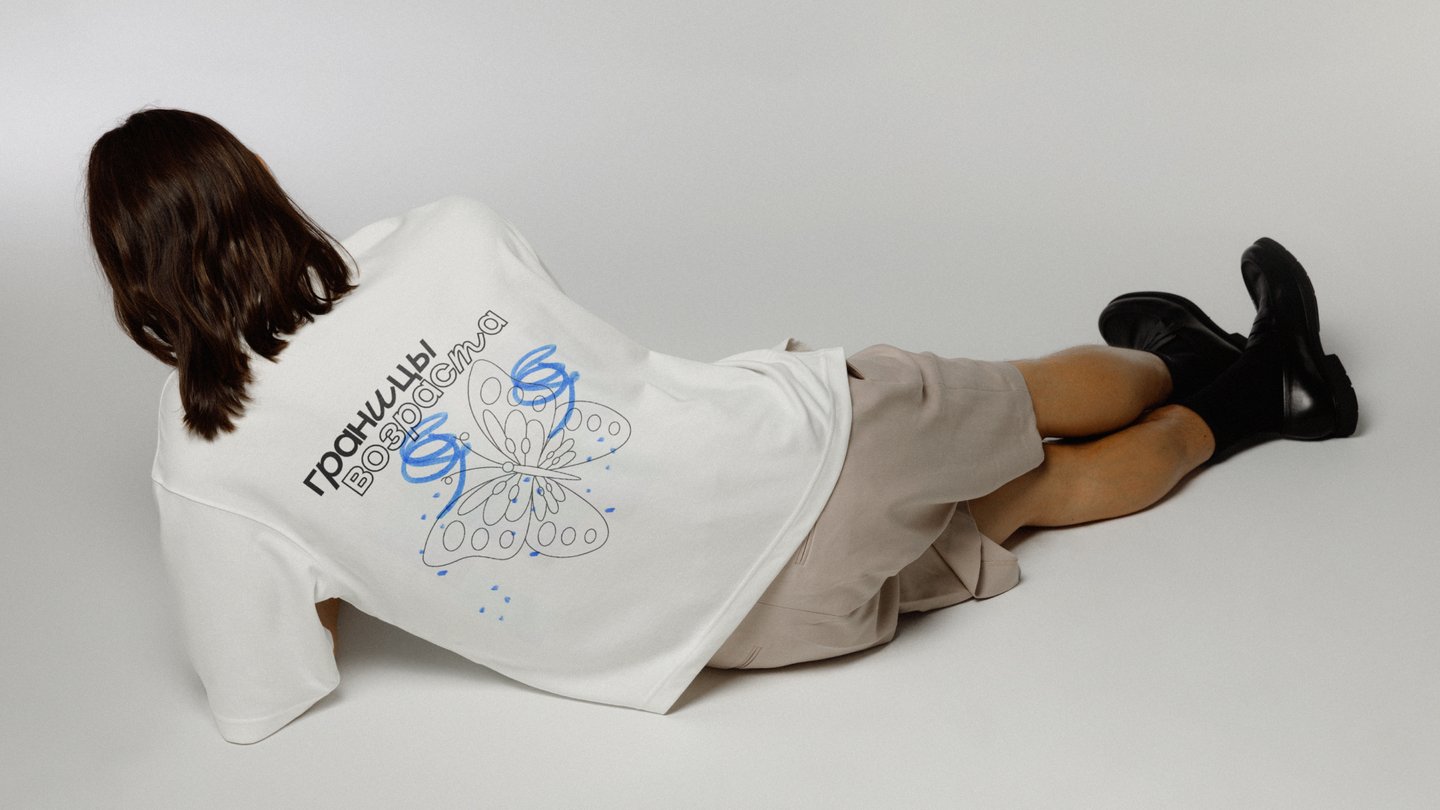
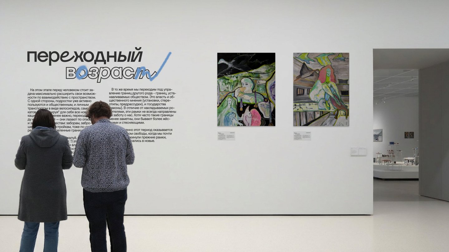
The main result of the project was a system that allows you to talk about age without linear images of aging and time. The handwriting metaphor linked five different stages of life into one story, preserving the character of each of them.We managed to translate a complex social theme into a simple visual principle and scale it into a full-fledged identity. The developed visual direction received positive feedback from the author of the project.
Project 2
Summer Wine Festival «Vineyard»
The project unites producers, experts and guests, creating a space where wine becomes not an object of expertise, but part of a common experience — communication, discovery and enjoyment of the moment.The wine between expertise and pleasure Modern wine culture exists between two poles.On the one hand, expertise (complex terminology, history of origin, tasting rules, high degree of involvement) On the other hand, it’s an emotional experience (meeting friends, traveling, aesthetics, and enjoying the moment).The goal of the festival is to connect these two worlds.
The metaphor Whirlwind — the movement of tastes and impressions As a stream of air gathers different elements around itself, the festival unites: aromas of different varieties, people, emotions, conversations, new discoveriesEvery visitor becomes a part of this movement.
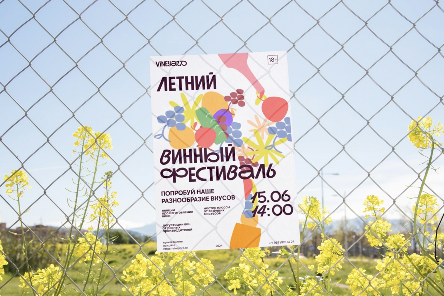
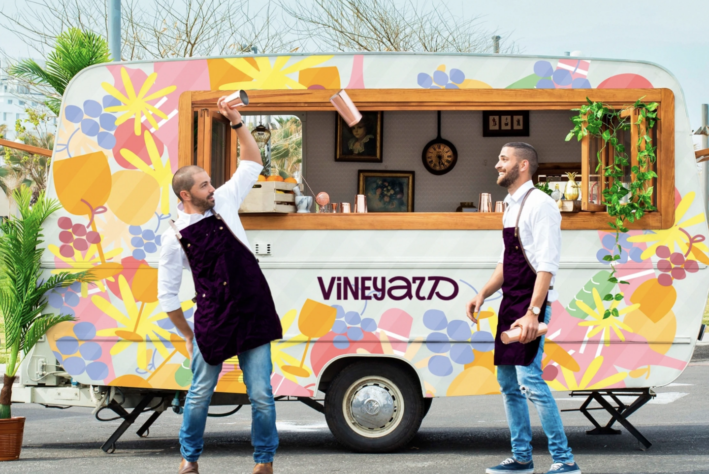
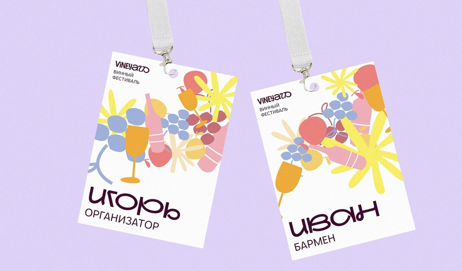
Result Wine culture without barriersThe festival’s identity has been created, which reinterprets the familiar image of wine. Instead of a closed expert environment, VINEYARD becomes an open space for acquaintance, communication and new experiences.A complex cultural theme has been translated into a simple visual principle and a system has been created that works both on an emotional and communication level.
Project 3
The exhibition «Between the Lines»
There are stories of people behind the history of mail Mail can be viewed through the development of technology, routes, and delivery methods. But there was always a person behind this system — the one who wrote, waited for a response, saved letters and returned to them years later.Therefore, the focus of the exhibition is not so much the history of the mail itself, but rather personal correspondence as a way to maintain a connection between people and time.The project considers letters as tangible evidence of human relationships and the memory of the era — documents that preserve not only words, but also personal stories, feelings and the context of time.
A visual metaphorPersonal writing as the basis of identityVisual language is built around the feeling of real personal writing — a physical object that a person held in their hands, folded, sent and saved. Lines, paper fragments, archival photographs, and typography refer to different layers of correspondence.
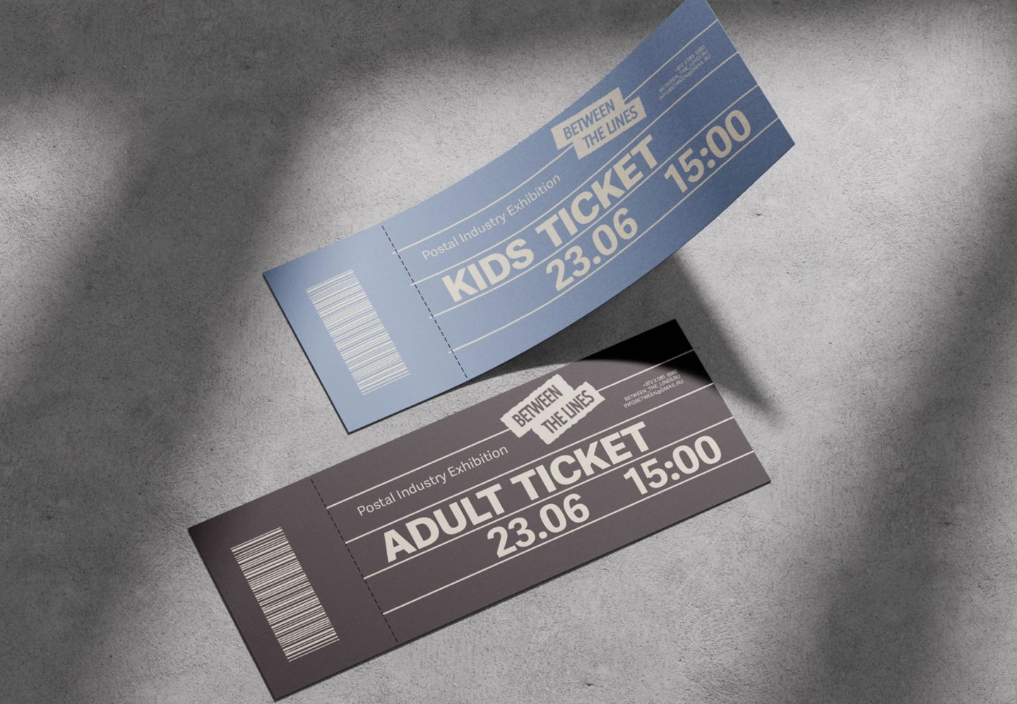
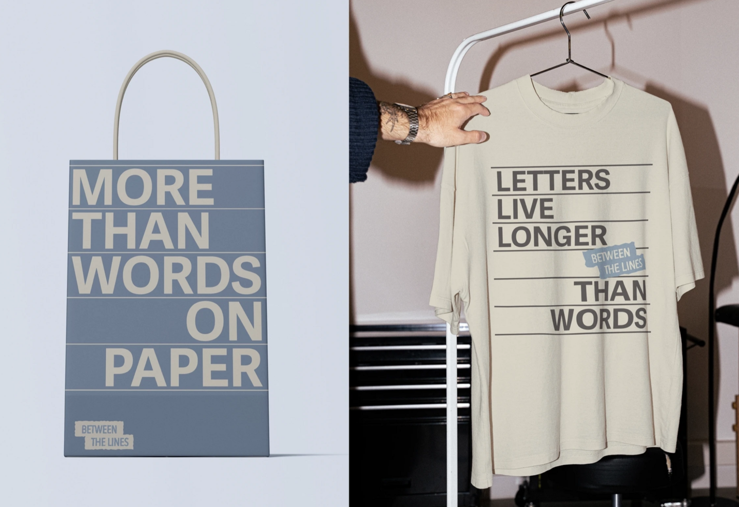
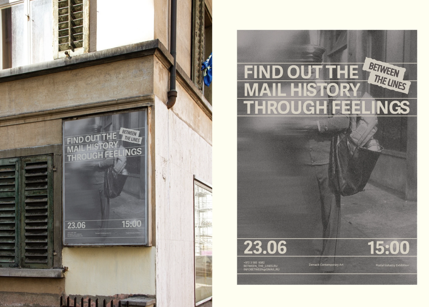
ResultHistorical theme in the language of modern culture As a result, we managed to make the history of mail more modern and emotionally close to the audience, while preserving the feeling of personal correspondence and memory.Between the Lines has received its own visual language, in which naming, composition and graphic elements work as parts of the same idea.The meaning of «between the lines» was translated from a verbal metaphor into a systematic visual principle and scaled to cover the entire communication of the exhibition.
Fonts
Fault Font is a font that is inspired by the texture of faults born in rock cracks and cooled lava flows.