DUO — бренд уходовой косметики, основанный на философии идеальных сочетаний.
Мы создаём пары продуктов, которые усиливают друг друга и превращают ежедневный уход в гармоничный ритуал.
Вдохновляясь природными дуальностями, мы помогаем коже обрести баланс, потому что всё лучше раскрывается в правильном союзе.
Я начала создание редизайна с генерации логотип
Minimalist logo design for a skincare brand. The wordmark «ДУО» in clean geometric Cyrillic sans-serif typography. The logo concept is based on duality and perfect pairing: two identical or mirrored abstract elements (two dots, two arcs, or two mirrored letters) forming a balanced composition. The letter «Д» and «О» subtly interact or mirror each other to symbolize union and harmony. Monochrome or dual-tone palette (soft beige + deep charcoal, or warm sand + sage green). Flat vector style, ultra-minimal, elegant, premium cosmetics aesthetic. White background, centered composition, logo presentation mockup. No extra text, no slogans, no English letters.
Важно понимать, что в контексте бренда некоторые визуальный решения (как цветовая палитра) меняются от коллекции к коллекции. В данном редизайне я решила сосредоточиться на одной из них.
Далее я решила сгенерировать новую упаковку основных продуктов.
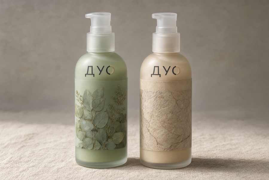
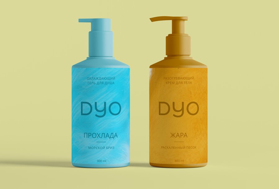
Redesign of the uploaded product image. Keep the exact same composition and arrangement of the two bottles — identical positions, proportions, perspective, and camera angle. New packaging design for skincare brand «DUO» with a partial transparency concept: the bottles are made of clear/frosted glass or translucent material, so the product inside is visible, while one section of each bottle is wrapped with a natural image — real botanical print (pressed leaves, herbs), stone texture, water ripple, or moss pattern. The transparent part reveals the texture of the formula inside (cream, serum, gel). Dual-tone nature palette: sage green + warm sand, or stone grey + soft charcoal. The uploaded logo appears on the transparent section as a clean embossed or printed mark. Natural surface background (stone, linen, sand), soft diffused daylight, premium organic aesthetic, photorealistic. Do not change the number of bottles or their placement. No extra text.
Use uploaded logo
Новый дизайн коробки.
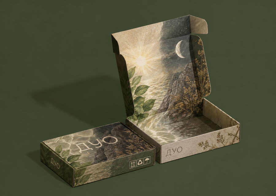
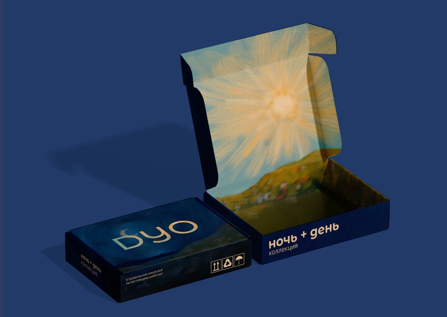
Packaging box redesign. Keep the exact same composition as the uploaded reference box image — identical position, angle, perspective, proportions, and framing. Replace only the surface design with a new identity inspired by the uploaded reference of the «DUO» bottles. he nature elements should be the same night and day Do not change the box shape, position, or camera angle — only the design must be new.
Full collection key visual for skincare brand «DUO», based on the uploaded reference of the two bottles. Create a lineup of 5–7 different products standing in a row — varied shapes and sizes: a tall serum dropper, a short cream jar, a pump bottle, a mist spray, a tube, a small balm tin, a travel-size bottle. All share the same design language as the reference: partial transparency + natural imagery + dual-tone palette (sage + sand, or stone + charcoal), embossed «DUO» logo. The products stand on a natural surface — river stones, moss, sand, or weathered wood — with nature-inspired background: soft botanical shadows, leaves, water ripples, diffused daylight. Composition: products in a clean row, harmonious rhythm, generous negative space. Premium organic aesthetic, photorealistic, high detail, cinematic soft lighting. The two reference bottles anchor the lineup (e.g., at the ends or center). No extra text.
Мерч
Merchandise cosmetic bag for skincare brand «DUO», placed on a natural surface (linen, stone, or moss) in soft daylight. The bag is a minimalist zippered pouch made of natural materials — cotton canvas, linen, or recycled fabric — in the brand’s dual-tone palette (sage green + warm sand, or stone grey + charcoal). Design: partial transparency element (a clear PVC window or translucent panel) combined with a natural print (pressed leaves, stone texture, water ripple, or moss pattern). The uploaded «DUO» logo is prominently printed / embossed / embroidered on the front — exact form and typography preserved. Premium organic aesthetic, calm ritualistic mood, photorealistic product photography, high detail. The bag looks like a natural extension of the DUO collection. No extra text.
Ritual merch set for «DUO» skincare: a sleep mask and a matching hair wrap / headband, made of natural silk or linen in the brand’s dual-tone palette (sage + sand, or stone + charcoal). The sleep mask has a natural print (botanical, stone, or water) on one side and a soft solid tone on the other, with the uploaded «DUO» logo embroidered on the front, exact form preserved. The hair wrap repeats the same print and logo. Arranged on a natural surface (linen, stone) with soft daylight, a few products from the collection nearby. Premium organic aesthetic, calm ritualistic mood, photorealistic flat lay, high detail. No extra text.
Reusable water bottle merch for skincare brand «DUO», placed on a natural surface (linen, stone, moss) in soft daylight. The bottle is a minimalist cylindrical shape made of clear or frosted glass / recycled stainless steel in the brand’s dual-tone palette (sage green + warm sand, or stone grey + charcoal). Design: partial transparency — a clear section reveals the liquid inside, while another section is covered with a natural print (pressed leaves, stone texture, water ripple, or moss pattern) or a matte soft-touch finish. The uploaded «DUO» logo is printed / embossed / engraved on the front, exact form and Cyrillic typography preserved. Minimalist cap, clean silhouette, premium organic aesthetic, calm ritualistic mood, photorealistic product photography, high detail. The bottle looks like a natural extension of the DUO collection. No extra text.
Кейвизы
DUO — KEY VISUAL CAMPAIGNBRAND CONCEPTDUO is a cosmetics brand built around the idea of perfect pairs: two products that complement each other and work together to achieve the ideal result. The brand’s core philosophy is expressed through the concept: «Two make the perfect duo.»Use the uploaded DUO brand identity references as the primary source for the visual style, color palette, typography, logo, packaging, and graphic elements.OBJECTIVEDevelop a cohesive advertising campaign consisting of five independent key visual designs, unified by one distinctive visual concept and a consistent system of graphic elements.The goal is to create a recognizable visual signature that can be adapted to different advertising formats while maintaining a strong and consistent brand identity.Use the attached VkusVill advertising campaign as a reference for the principle of visual consistency. In the reference, a mango-shaped sun serves as the central visual element across multiple advertisements, while the composition, messaging, scale, and advertising medium change.Create an original visual metaphor for DUO based on the concept of two complementary products. Possible directions include two cosmetic products interacting to form a single visual symbol, two shapes merging into one, or a distinctive visual composition representing the perfect pair.Do not copy the mango visual or any other specific elements from the VkusVill campaign. Develop an original visual signature for DUO.FIVE INDEPENDENT ADVERTISING DESIGNSOutdoor BillboardCreate
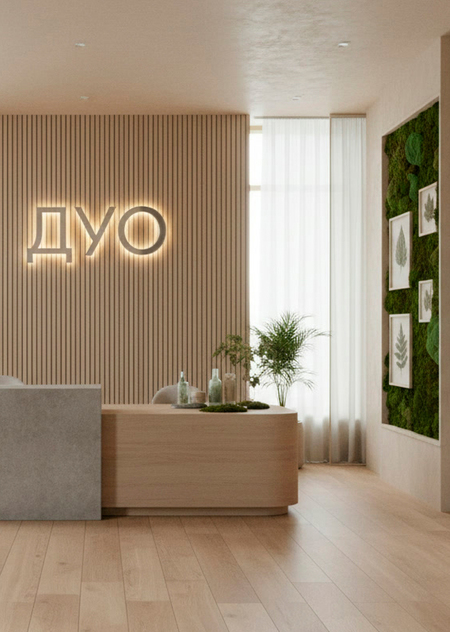
Офис бренда
Interior of a modern minimalist office for skincare brand «DUO», visually consistent with the uploaded brand collection reference. The main focal point is a large «DUO» logo mounted on the wall — clean geometric Cyrillic typography, embossed or in brushed metal/wood, softly lit. The office design continues the brand identity: natural materials (oak wood, stone, linen, clay), dual-tone palette (sage + sand, or stone + charcoal), partial transparency elements (glass partitions, frosted panels, clear shelves), natural imagery accents (pressed leaves framed, moss wall, stone textures, water ripple art). Products from the collection are displayed on open shelves and a reception desk. Soft diffused daylight, large windows, calm ritualistic atmosphere, premium organic aesthetic. Photorealistic, architectural photography, wide angle, high detail. No extra text.
Реклама