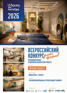
Design Project for School No. 45 for Children with Disabilities
The design project for School No. 45, tailored for children with disabilities, was developed with a focus on the comfort, safety, and development of every child. Five key spaces—the assembly hall, the dining area, the gym, the junior classrooms' recreation area, and the «Pages of Tomsk» thematic zone—were equipped with mobile, transformable furniture and thoughtful sensory solutions. The assembly hall was cleared of fixed seating; the dining area was filled with warm light, wood, and terrazzo color; and the gym was divided into three functional zones featuring an interactive projector. The recreation areas now feature soft poufs, safe window ledges, and sensory panels that introduce children to the history and nature of Tomsk. This is not just a renovation—it is an environment where every child with a disability feels calm, engaged, and secure.
Security Post The first step into the school—without fear, with a smile. This isn’t just a place where passes are checked—it’s where students are welcomed. Wooden panels provide warmth, the carpet dampens sharp noises, and the soft, even lighting is neither blinding nor frightening. The security desk doesn’t resemble a barrier—it is a place dedicated to ensuring safety, where every child is seen and anticipated. Even the most anxious children cross the threshold with curiosity, not tension.


Locker Room Like Home: Cozy, intuitive, and kind. Lockers shaped like small houses with built-in benches feel like your own private corner. Here, you can undress unhurriedly, sit down, or check yourself out in the mirror. Soft ottomans invite you to rest and relax, while the cork-textured walls seem to embrace you—they are warm and quiet. The terrazzo floor sparkles beautifully; it’s pleasant to walk on and offers good grip. This isn’t a locker room—it’s a welcoming foyer where every child feels: «I am loved and expected here.»


Corridor and Navigation
The corridor is designed as a visually expansive, airy space: light-colored walls, uniform lighting, and soft LED strip lighting eliminate shadows and apprehension. Along the walls, we feature infographics that guide without overwhelming. But the most important element is the color line above each door—mathematics has its color, and literature has another. The student remembers not the room number, but the color of the route. A circular, high-contrast number, a pictogram (flask, globe, book), and text—three keys. Color, symbol, word. The corridor ceases to be a labyrinth; it becomes a calm, predictable pathway where every turn is intuitive to the heart.


Recreation Table tennis—a favorite for kids—is at the center. Along the walls are interactive tactile panels and a «Health Trail» for sensory training. There is a resting area: soft seating, a motivational quote, and living vertical greenery. The space features uniform, flicker-free lighting and safe materials. Here, breaks are productive: motor skills develop, teamwork is fostered, and tension is relieved.


Assembly Hall Fixed seating rows have been eliminated. Mobile poufs and soft window benches allow the space to transform in minutes—from a concert to a music lesson. A subtle musical staff suspended from the ceiling guides the kids from entrance to exit, reducing anxiety. This is a space where every child is not an audience member, but a participant.


Gymnasium Three zones in one space: active games, a hall of fame featuring awards, and a comfortable locker room. An interactive projector transforms warm-up into an engaging game. The polyurethane floor absorbs impact and protects joints. The warm wall colors (latex paint) are not irritating—they are soothing. Sports become accessible and desirable.


«Through the Pages of Tomsk» is a thematic recreation designed for students with disabilities, focusing on wooden architecture and the nature of the native region. The space is divided into three zones: an interactive panel detailing local landmarks, an audio map featuring the sounds of Tomsk nature, and a segment of the Blue Cliff for tactile exploration. A display shelf with cork surfacing is dedicated to student artwork. Authentic wooden ornamentation from the school surrounds the perimeter.


Dining Hall The muted orange chosen by the kids warms and stimulates the appetite without overexciting. The milky-white background, wooden slats on the ceiling, and round pendant lights create the feeling of a homey dining room. The terrazzo floor is durable, non-slip, and beautiful. Here, the kids eat in a calm atmosphere, and they take care of their own hygiene.


Recreation: «State Symbols» A space where the color blue, pride in Russia, and the values of the «Movement of the First» converge.
We selected various shades of blue—a color that is calming, fosters an atmosphere of trust, and is a key element of the brand book for the «Movement of the First.» On the interactive display, students can witness the grandeur of our country: mountains, cities, and seas—things not everyone can visit in person. The School opens the world to those with limited mobility.
Nearby is a small hallway leading to the staircase. This area features motivational quotes from the «Movement of the First» (such as, «Be in Motion—Be First!»), awards, diplomas, and vibrant vertical greenery. Every step serves as a reminder: success is possible, and nature is always near.
This is a place where state symbolism, tranquility, pride, and self-belief unite to inspire students toward their own achievements.


Recreation Area for Elementary Students
A bright, rectangular space where kids can relax and socialize. In the center are soft poufs that can easily be stored on a shelf, clearing room for play. By the windows are sills furnished with cushions and railings—a perfect spot to read a book, look outside, or simply enjoy quiet time. An interactive wall panel invites exploration, and the light color palette and clean commercial linoleum flooring create a feeling of comfort and order. Everything is designed so that young children, regardless of their specific needs, feel safe and happy at school.