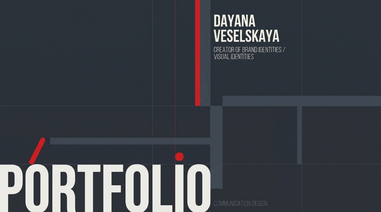
BRAND IDENTITY & GRAPHIC DESIGN
Hi, I’m Dayana Veselskaya. I turn cultural codes and bold narratives into tactile brand systems.
I am a 21-year-old graphic and communication designer from the HSE Art and Design School. I don’t believe in design that simply fills space. I build visual identities, packaging, and digital products that have a voice, a character, and a clear business purpose.
MEET YOUR GUIDE: THE RED DOT
«Think of me as the pulse of a brand. Every project in this portfolio started as a contradiction: how to mix street food with nomad traditions? How to sell beauty to someone with no reflection in the mirror? Scroll down—I’ll show you how Dayana solves the impossible.»
01 / THE PROBLEM & MY APPROACHVisual noise is everywhere. Monotonous brands get scrolled past in 0.5 seconds.Many brands suffer from two extremes: either they use safe, repetitive templates that blend into the shelf, or they chase loud visuals disconnected from how the product actually works in real life.● My solution: I unite deep research, storytelling, and functional form. Whether it is a cardboard box you hold on the go or a mobile interface, every detail works as one cohesive system.
02 / WHAT I DO & FOR WHOMI partner with founders, creative studios, and startups who are ready to stand out: 1. Food, Retail & FMCG Brands: Structural packaging, dielines, and bold shelf identity that make taking products on the go effortless.2. Concept & Lifestyle Businesses: Full-scale branding, tone of voice, 3D visuals, posters, and merchandise with unforgettable storytelling.3. Digital Startups: Research-driven UI/UX, product hypotheses, and interactive mobile ecosystems.
ㅤ
CASE 01 / PACKAGING & IDENTITY
ASTAU — Kazakh Street Food Brand
ROLE: Market research, positioning, structural packaging (dielines), visual identity, 3D visualization.
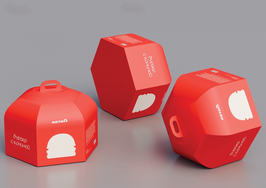
CONCEPT: astau is a modern Kazakh street food brand that merges classic fast-food formats with authentic national Kazakh cuisine—from horsemeat burgers to kurt and French fries.
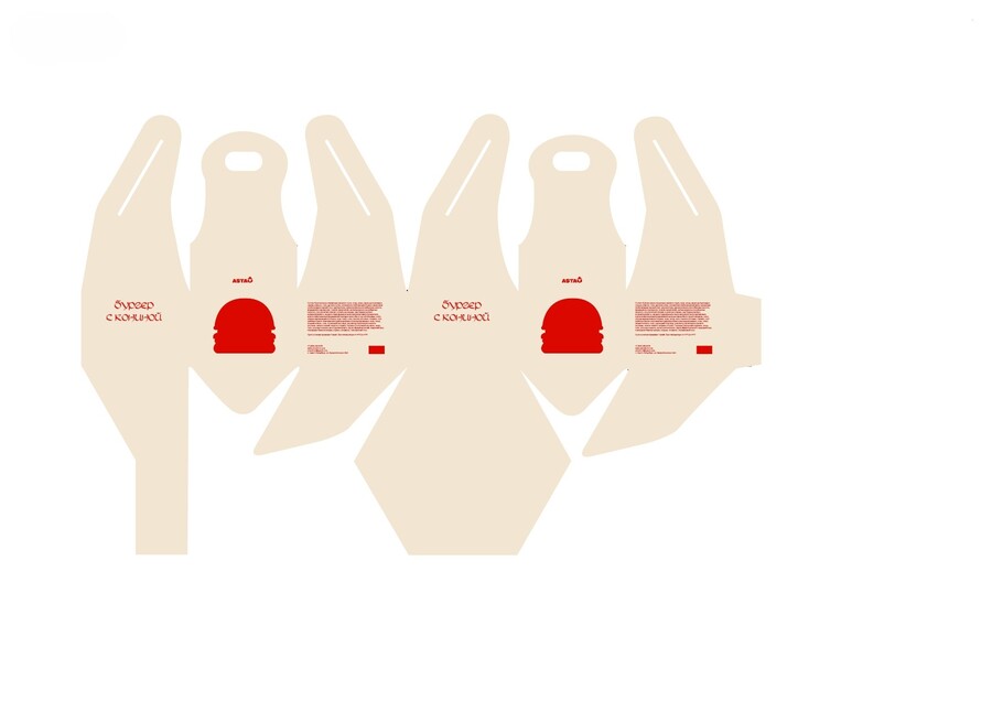
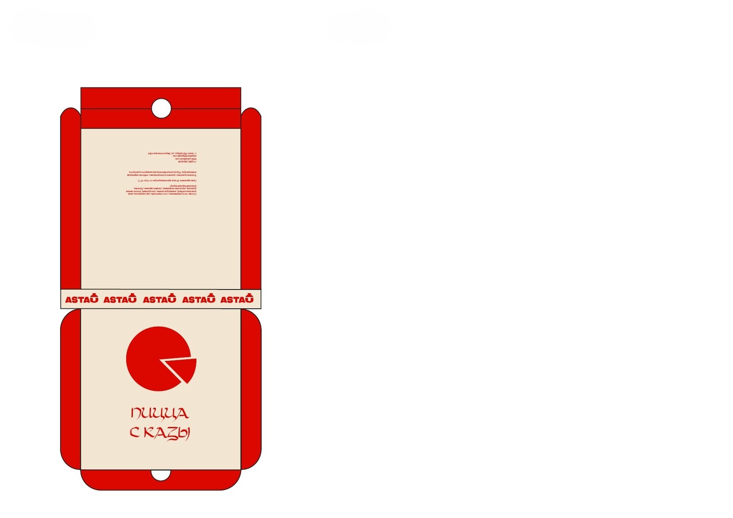
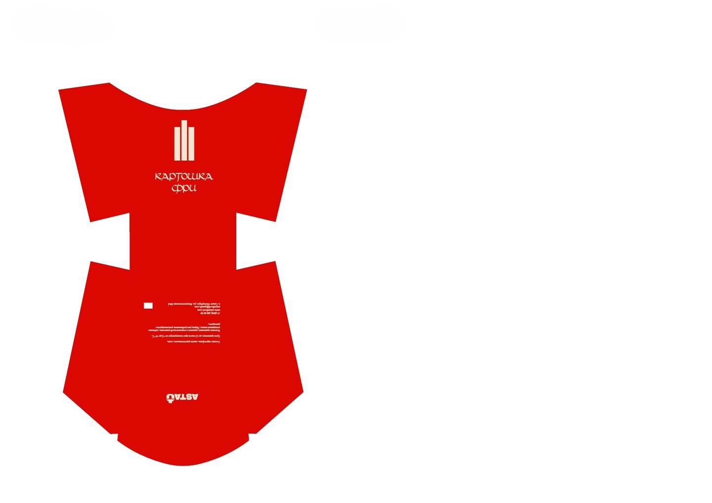
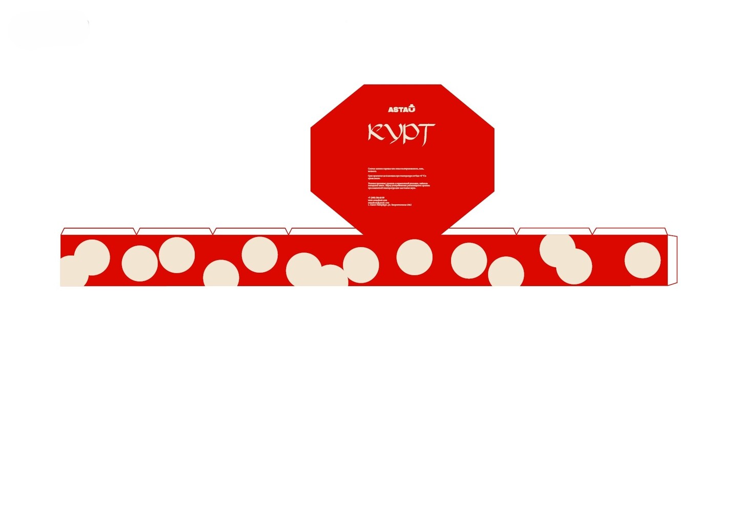
ASTAU / PROBLEM & RESEARCHWhy standard fast-food packaging failed this brand: During the research phase, I analyzed existing street-food packaging and market positioning (comparing players from 55₽ to 250₽ per burger) and identified three critical pain points:01. Monotonous, repetitive visual design where packaging only features a generic logo.02. Non-hermetic, moisture-weak materials that fail when holding hot, juicy national dishes.03. Ready-made meals are awkward and inconvenient to carry on the go.Moreover, astau operates in an above-average price segment (around 250₽) because authentic ingredients like horsemeat are rarer and more expensive to produce than standard beef. The packaging had to justify this value bridging tradition and modernity.
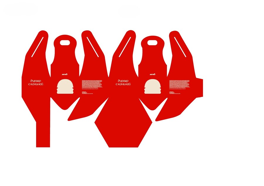
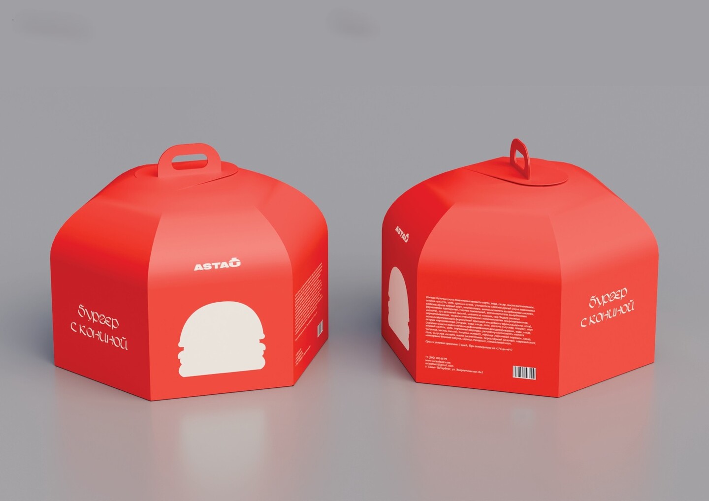
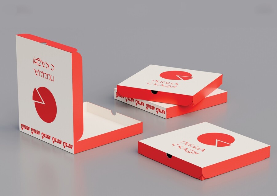
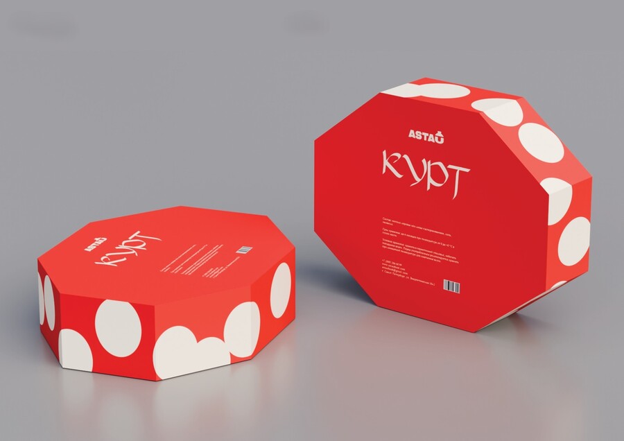
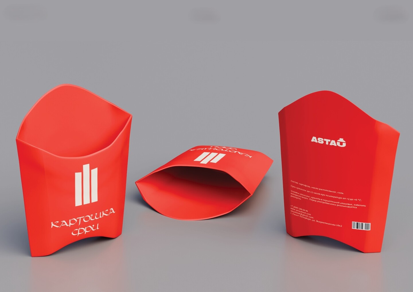
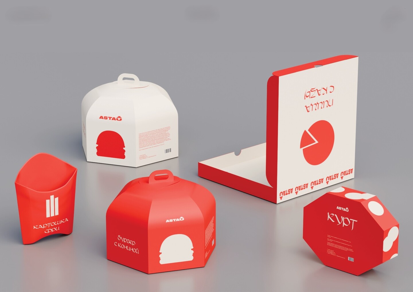
ASTAU / IDEA & DIELINESYurt-inspired geometry meets ergonomic cardboard engineering. I selected dense cardboard as the core material for five reasons: universality, cost-efficiency, functionality, ease of use, and eco-friendliness.Instead of standard square boxes, I engineered custom multi-faceted dielines with built-in top handles for the horsemeat burgers, angled pockets for French fries, and octagonal boxes for kurt and pizza slices. The silhouette echoes traditional nomadic forms while locking securely in one motion.
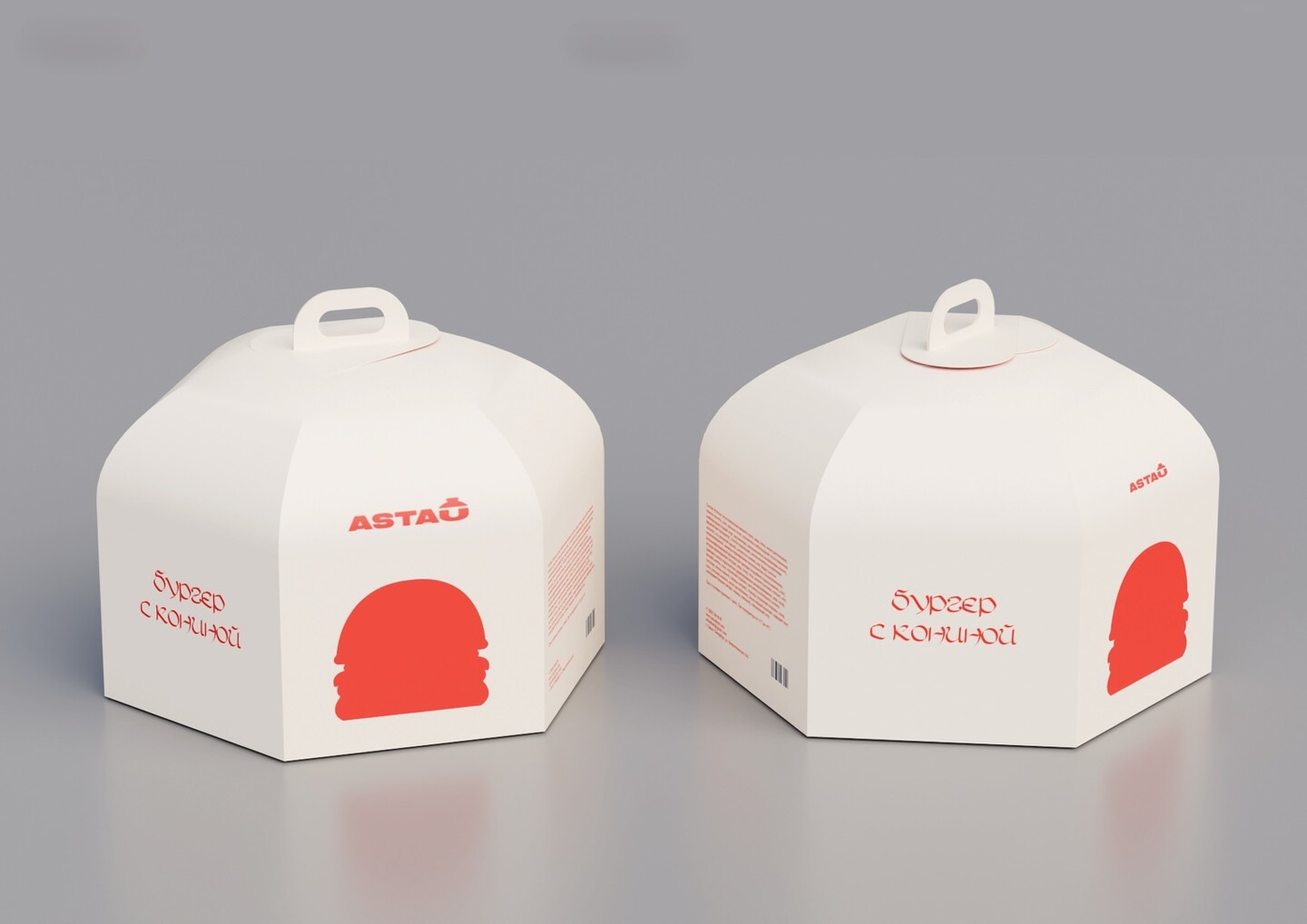
ASTAU / RESULT
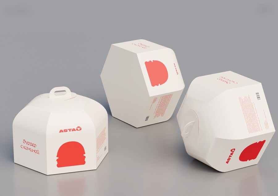
A bold red-and-white color system paired with minimalist product silhouettes and expressive handwritten-style typography. The packaging stands out instantly on the street, protects hot food on the move, and turns a quick meal into a memorable cultural experience.
ㅤ
CASE 02 / BRANDING, 3D & VISUAL IDENTITY
VAMPALE — Beauty Salon for Vampires
ROLE: Concept, storytelling, logo & identity system, packaging line, poster design, 3D character.
«Staying eternally young is harder than it looks. Even vampires need self-care to keep their pale skin matte and porcelain after several centuries—especially when you can’t see your own reflection in the mirror.»
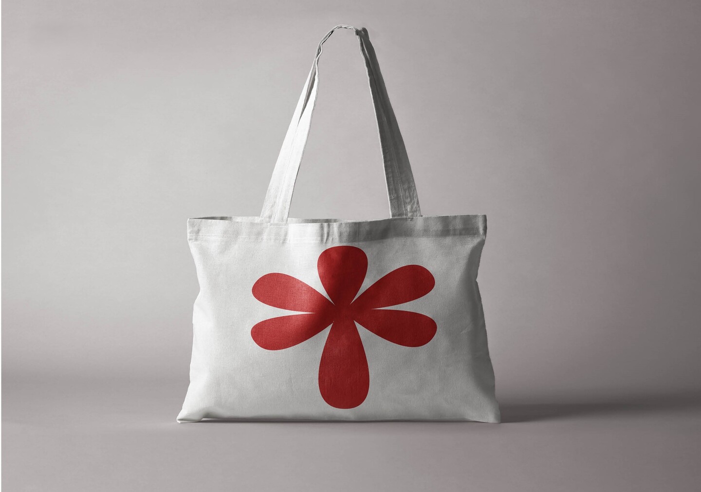
VAMPALE / THE CHALLENGE & IDEADesigning a high-end beauty brand for clients with no reflection. The Challenge: Build a complete visual identity for «Vampale”—a salon offering everything from porcelain skincare treatments to fang whitening—without slipping into cheap Halloween clichés.The Solution: A sharp, editorial palette of deep black, porcelain white, and blood red. I developed custom character illustrations, a flower-drop emblem, geometric vampire patterns, and an experimental glossy 3D typography series that translates across both cosmetic packaging and conceptual posters.
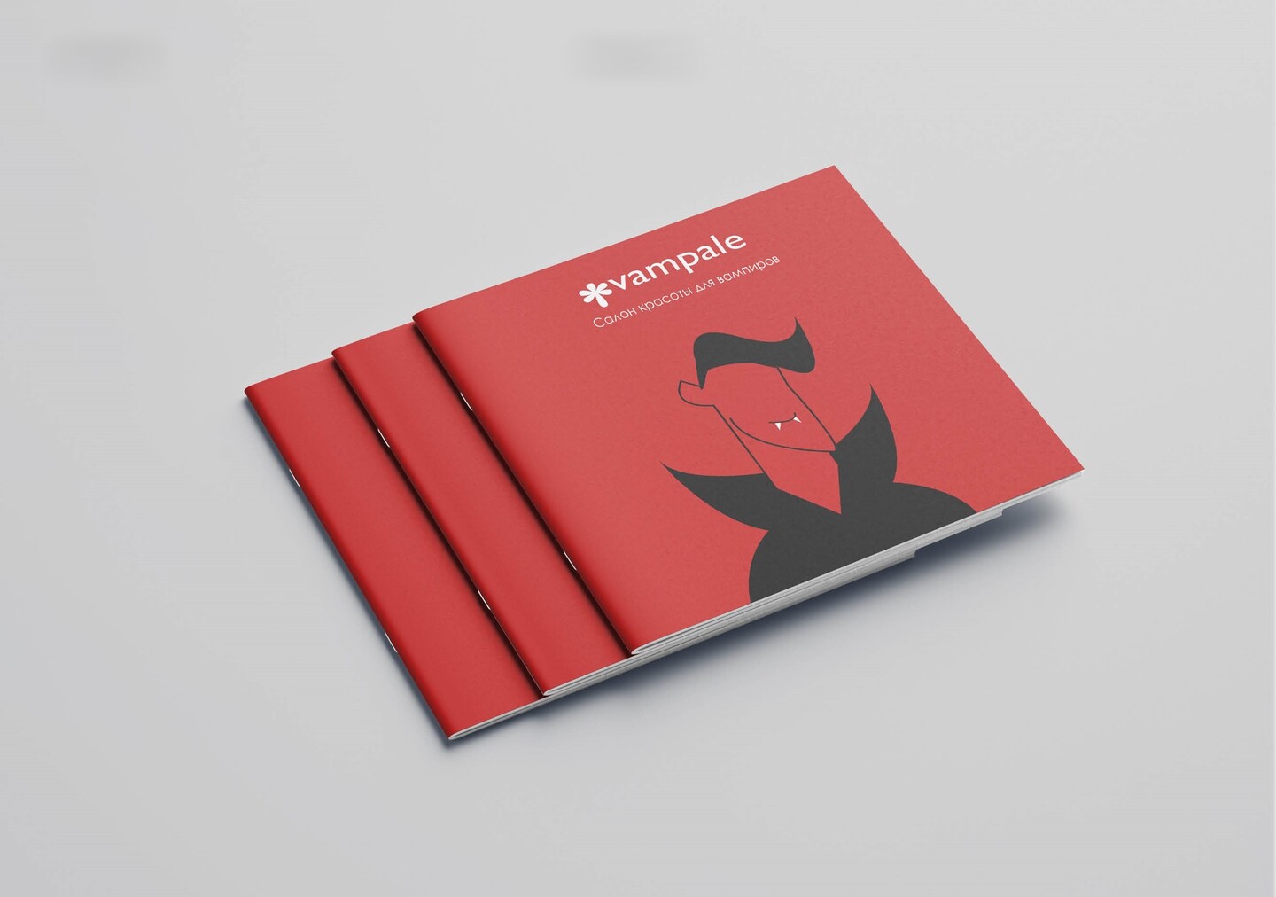
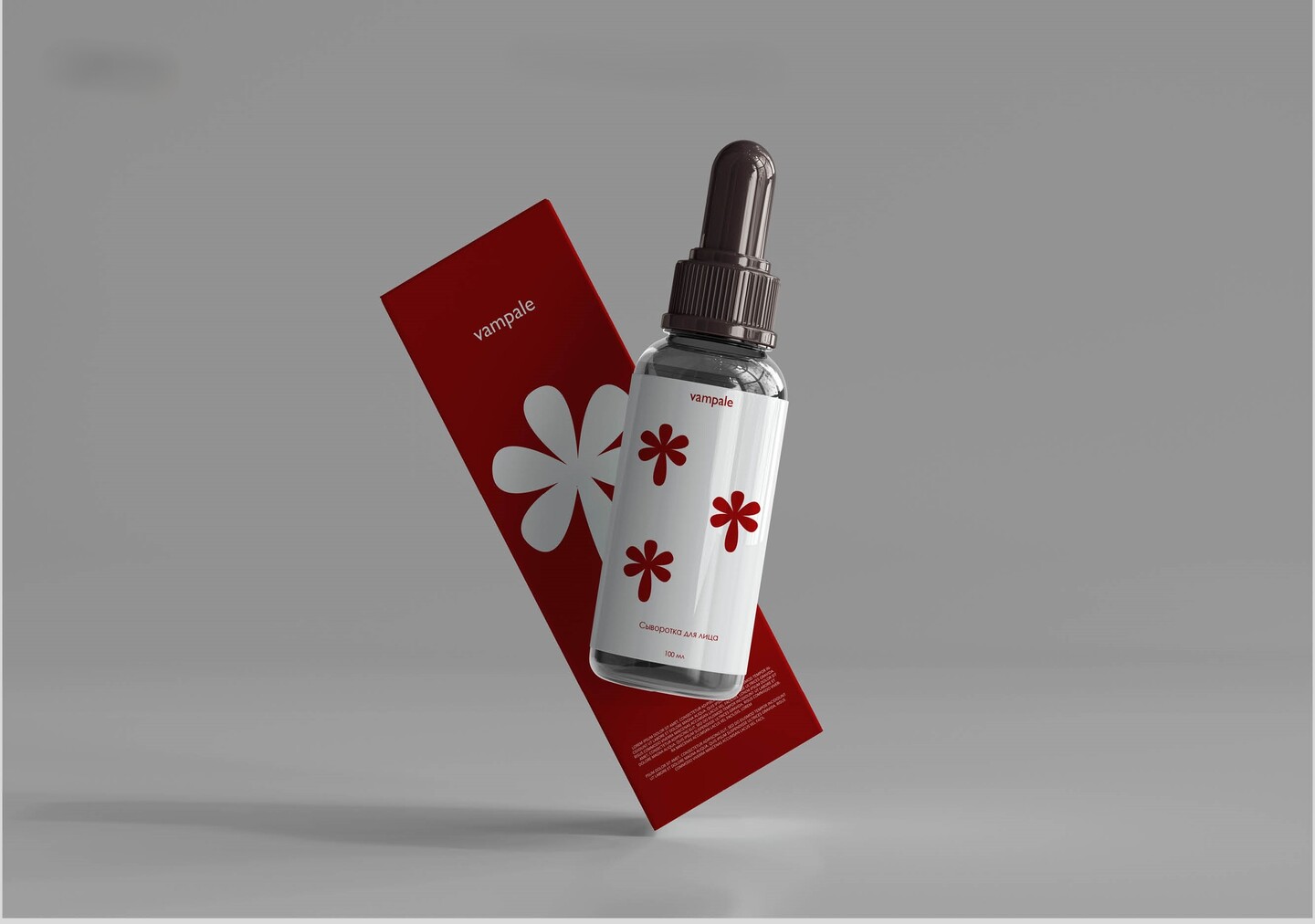
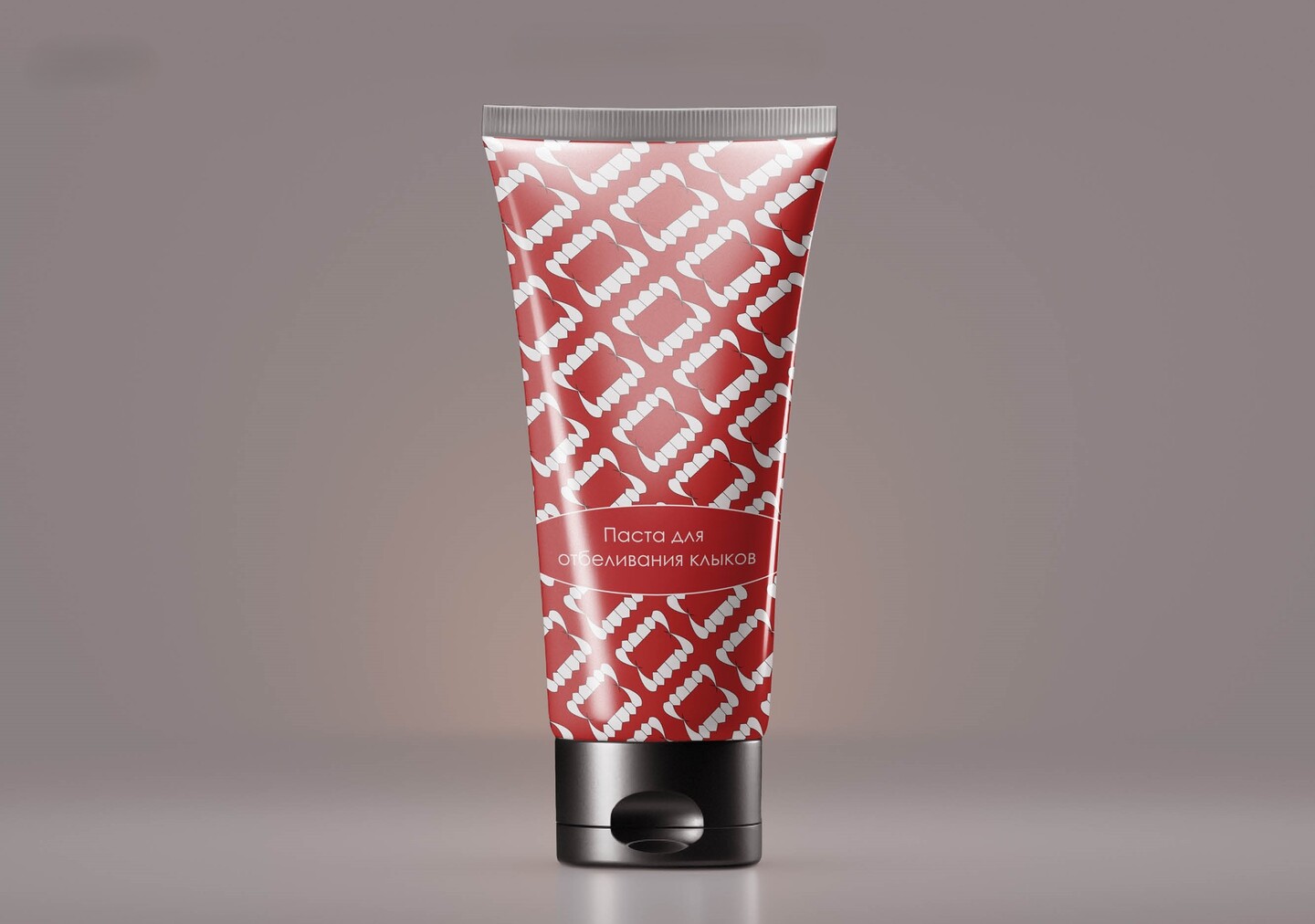
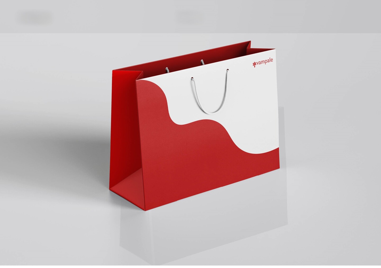
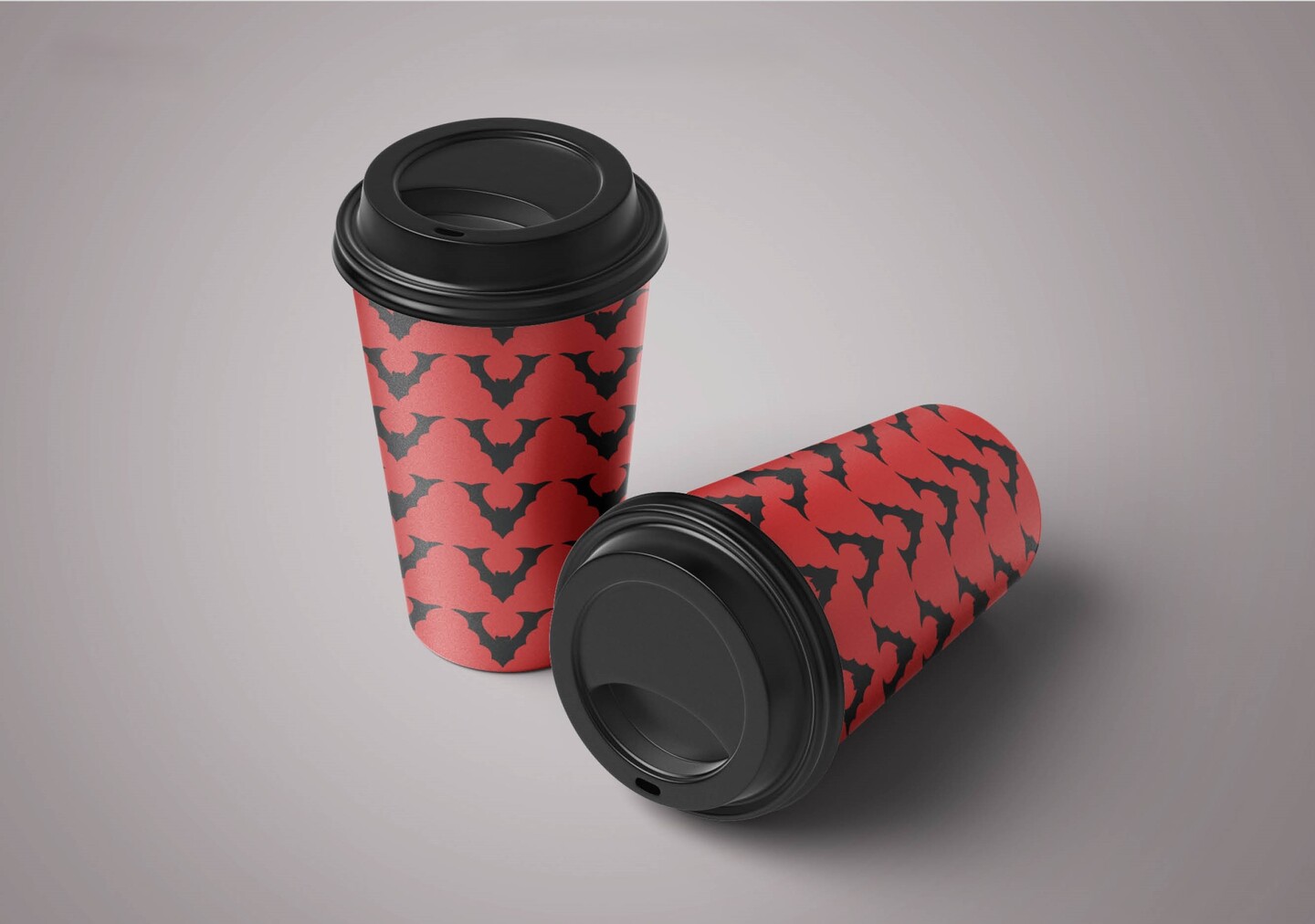
VAMPALE / SYSTEM IN ACTION
From serum dropper bottles, blood-drop soap dispensers, and matte lipsticks to tote bags, coffee cups, loyalty cards, and 3D posters—every touchpoint speaks the same ironic, aristocratic language. It proves that strong brand architecture can make even the most fantastical concept feel tangible and commercial.
ㅤ
CASE 03 / PRODUCT DESIGN & MOBILE APPWAG — Interactive Dog Training AppCONCEPT: An interactive mobile application that helps dog owners teach commands, correct pet behavior, and track daily training progress.User Pain Points Discovered:«My dog doesn’t listen to me and ignores commands.»«I want to get a dog, but I’m afraid I won’t be able to train it properly.»«I want to train my dog, but I have no idea where to start.»
WAG / JOB STORIES & HYPOTHESESTurning user anxiety into a structured digital journey: Job Stories:1. When I get a dog, I want clear professional lessons so that I can teach it essential commands.2. When my dog misbehaves, I need expert guidance so that I can gently correct its behavior.3. When I train my dog daily, I want to track my progress so that I can clearly see the results.Key Hypotheses Tested: ● An interactive onboarding lesson boosts engagement and helps users master the app faster.● A direct chat with a canine specialist speeds up problem-solving, building user trust and loyalty.● A built-in community and challenge system keeps motivation high over long training cycles.