Renetica — лаборатория, базирующаяся на мощностях Центра Живых Систем МФТИ и занимающаяся исследованиями и разработкой препаратов в области генной инженерии. Основная задача по созданию нового бренда — стать большой фармкомпанией и крупным производителем лекарств, обрести уникальное лицо и наименование.
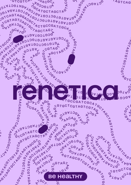
За основу метафоры для создания айдентики была взята ДНК. Двойная спираль, привычная каждому зрителю, была преобразована в последовательность азотистых оснований: аденина, тимина, цитозина и гуанина. Основным медиумом стал генеративный инструмент, который позволяет тонко настраивать графику.
Такой инструмет позволяет генерировать богатый и разнообразный слой графики.
Нейминг «Renetica» соединяет в себе английскую приставку „re-“ и русское слово „генетика“, что символизирует переосмысление классического подхода к науке. В написании юникейсом данный нейминг имеет явные отсылки к русскому исходному слову.
Сейчас бренд состоит из двух подразделений: «consult» , который отвечает за разработку и исследования в области геномной инженерии, и „school» , который отвечает за образовательные проекты для взрослых и детей, а также за стажировку студентов на базе МФТИ. Названия так же написаны юникейсом, чтоб придать дополнительную однородность и близость к логоблоку.
Иконки обладают нейтральной пластикой для лучшего распознавания и считывания. Тем не менее, они все равно имеют отсылку к основной графике в виде скругленных углов и плавных переходящих друг в друга линий.
Мерч вторит идее генных последовательностей. Основная и отличительная его черта — расположение буквенных кодов на длинных элементах. Чистота макетирования, цветовое кодирование и материалы также подчеркивают медицинскость бренда.
Подразделение «school» имеет свою собственную графику, консистентную главному подразделению „consult». Она имеет твист в виде генных цепочек, перетекающих по трубкам биореакторов, что символизирует студенческую работу в лаб практикуме по созданию и поиску новых лекарственных препаратов.
Как и в случае с другим подразделением, фотостиль для образовательных проектов был создан с использованием нейросети Midjourney. Это хороший способ быстро генерировать контент, особенно в условиях молодого бренда.
Отличия также выражаются и в типографическом наборе. Сдвижки в заголовочных блоках и medium начертание шрифта освежают стиль, придают ему более молодой и активный вайб.
Мерч так же перенимает идею основной графики, но может работать не только нюансно — в виде элементов на одежде или украшениях — но и более активно.
Благодарности:
Огромное спасибо всем сопричастным к созданию данного проекта за неоценимый вклад как в стратегическую, так и в креативную части.
Отдельные благодарности Евгению Каширину и Лебедевой Тане)


