SafeSkin
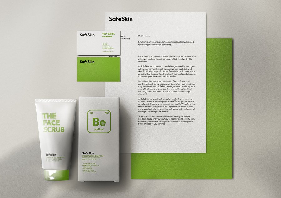
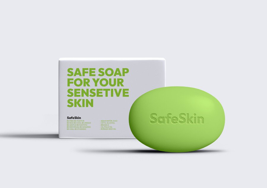
SafeSkin is a Swedish brand that produces safe cosmetics for people with atopic dermatitis. Each cream is formulated with microelements from a thermal spring, which provide healing and protective properties for sensitive skin.
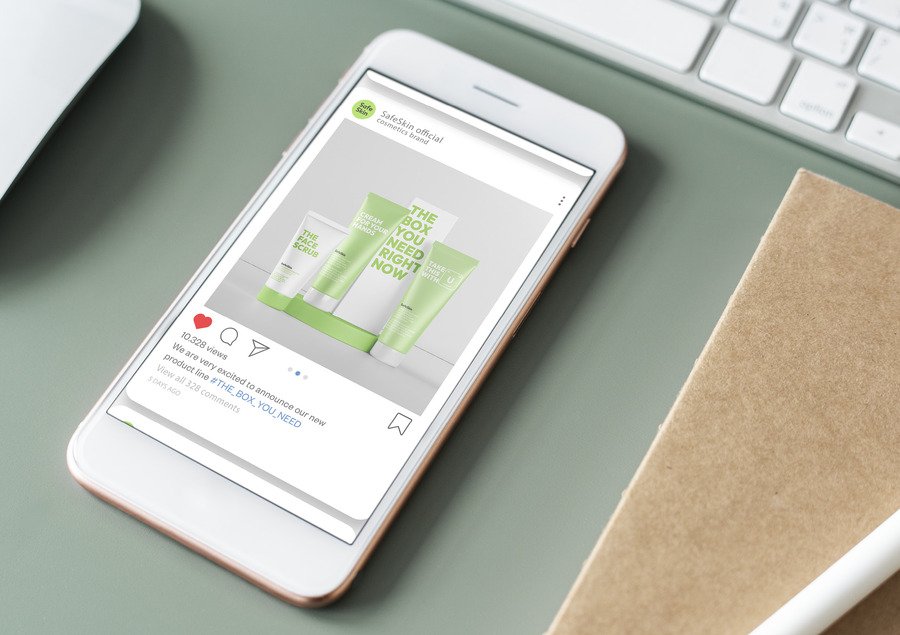
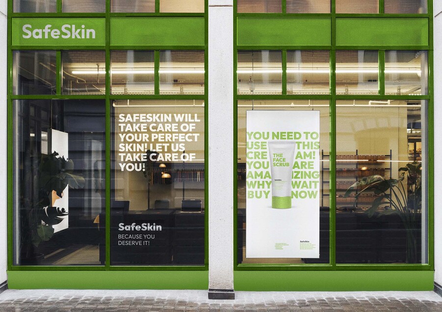
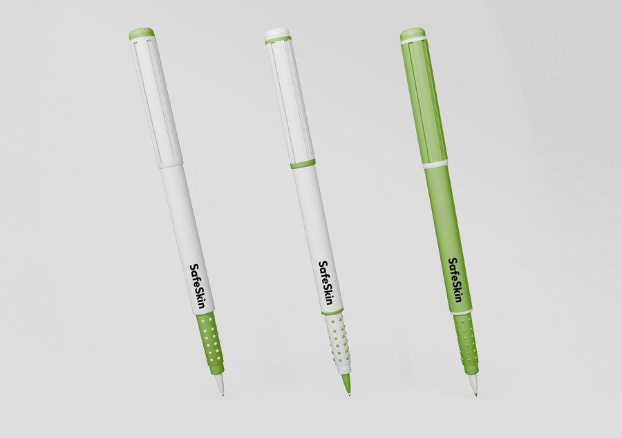
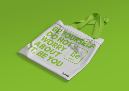
The SafeSkin identity is built around a supportive, calming, and emotionally warm communication system designed for teenagers with atopic dermatitis. Since flare-ups are often triggered or intensified by stress, the brand’s core metaphor focuses on gentle, encouraging messages embedded directly into the packaging and visual language. These short phrases act as small moments of care in a stressful daily routine, helping teenagers feel seen, understood, and emotionally supported in school and beyond.
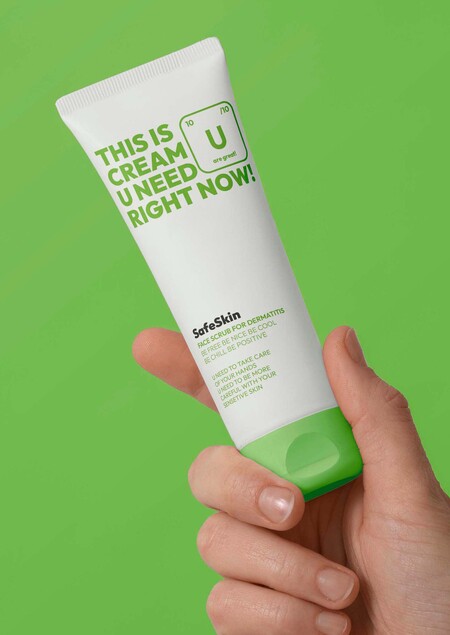
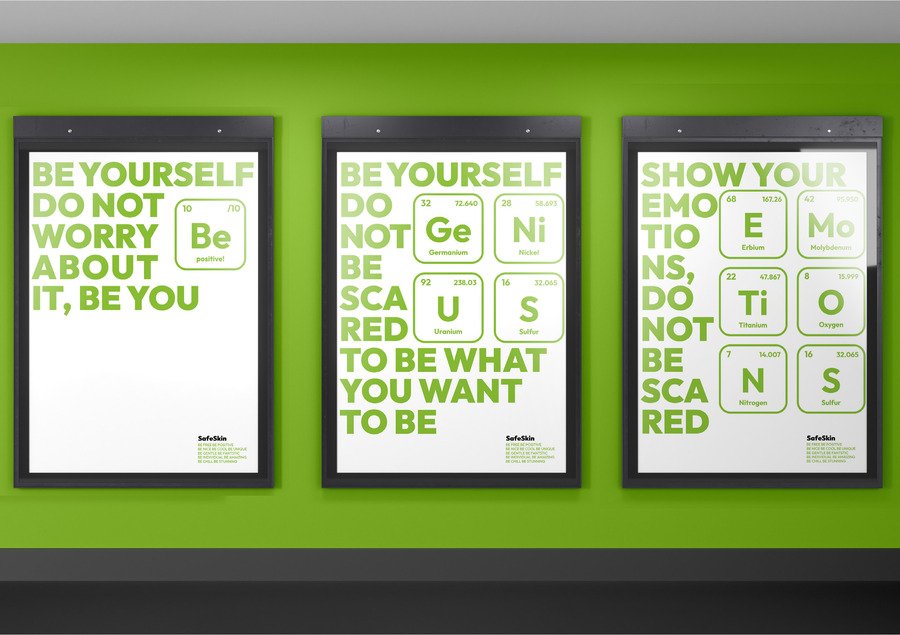
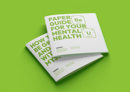
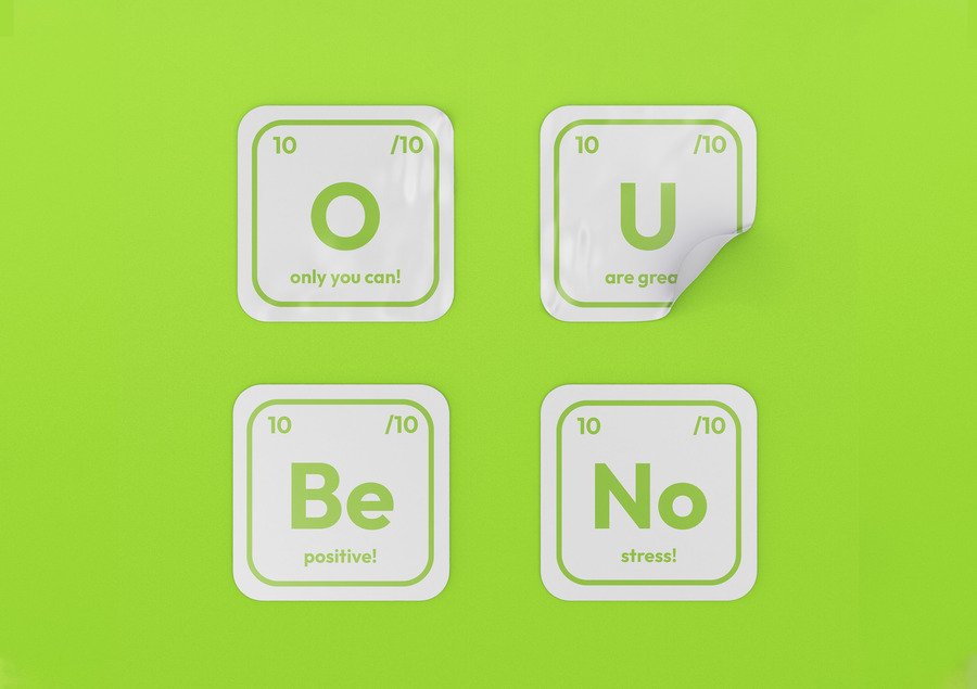
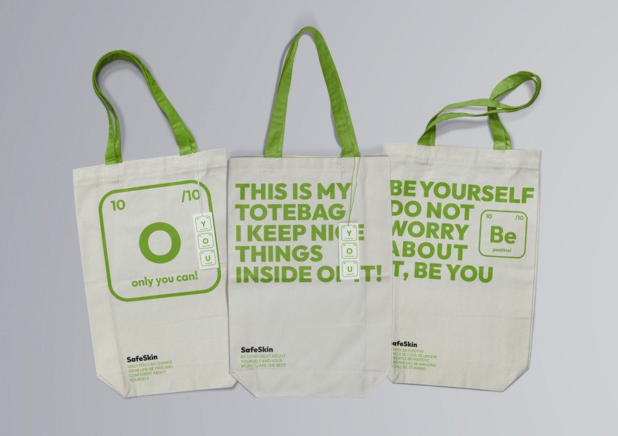
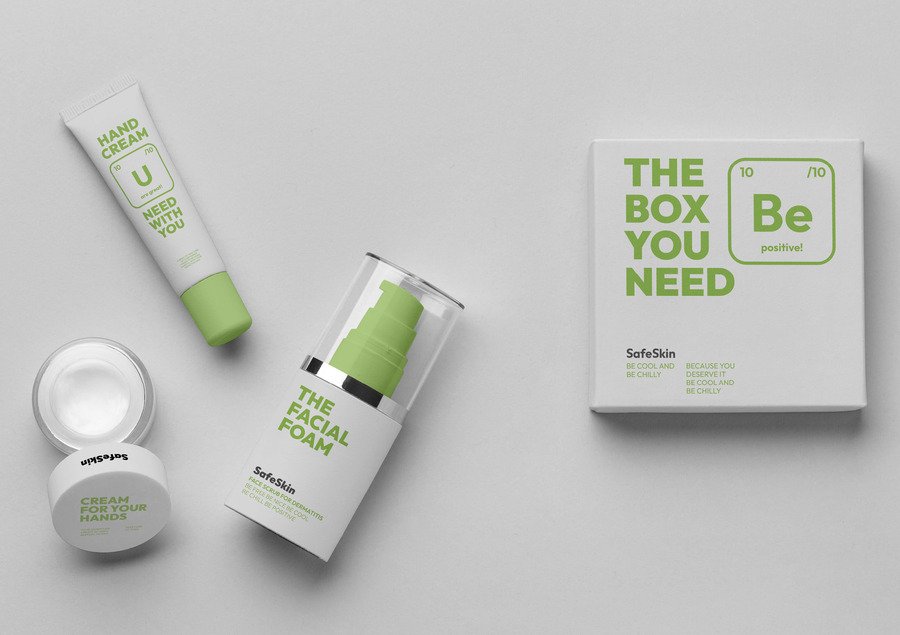
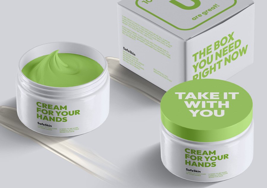
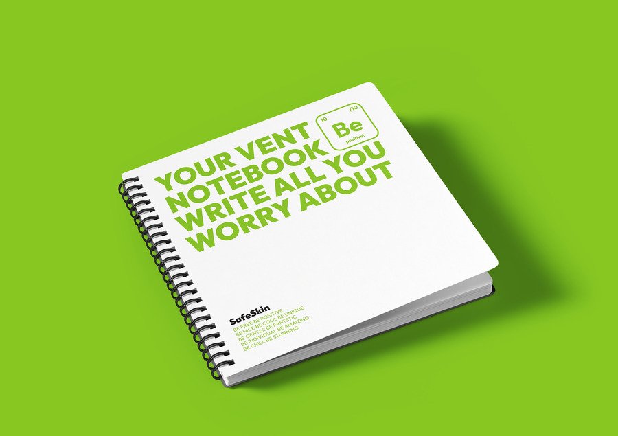
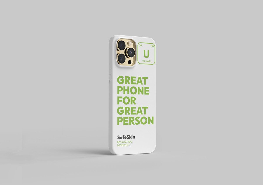
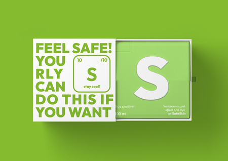
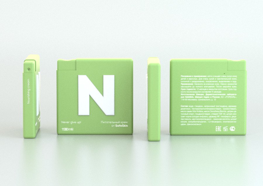
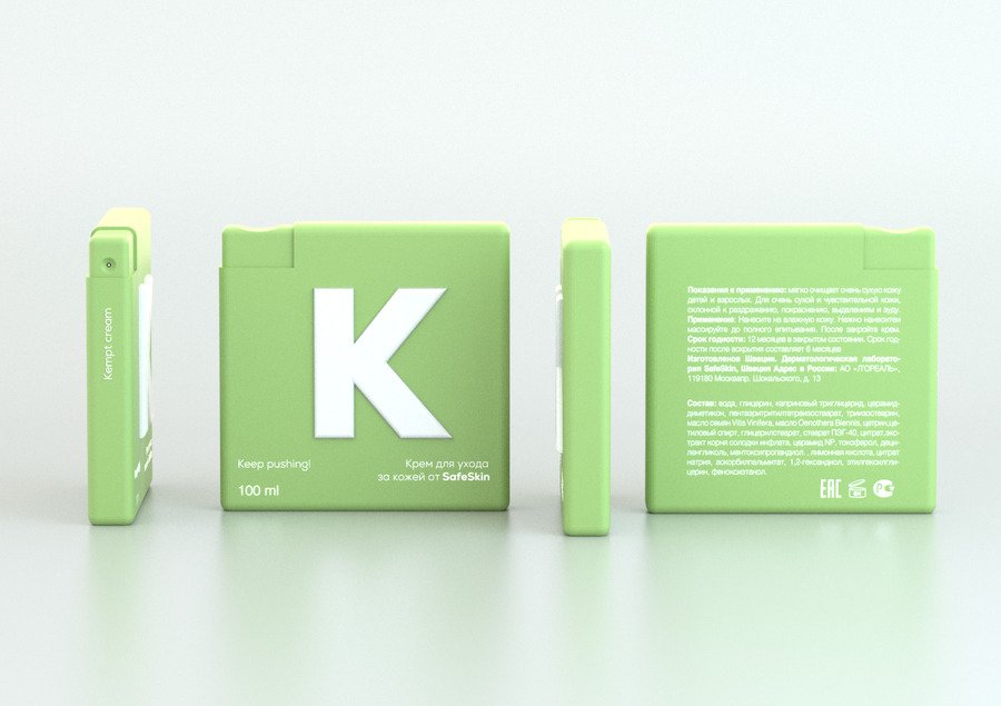
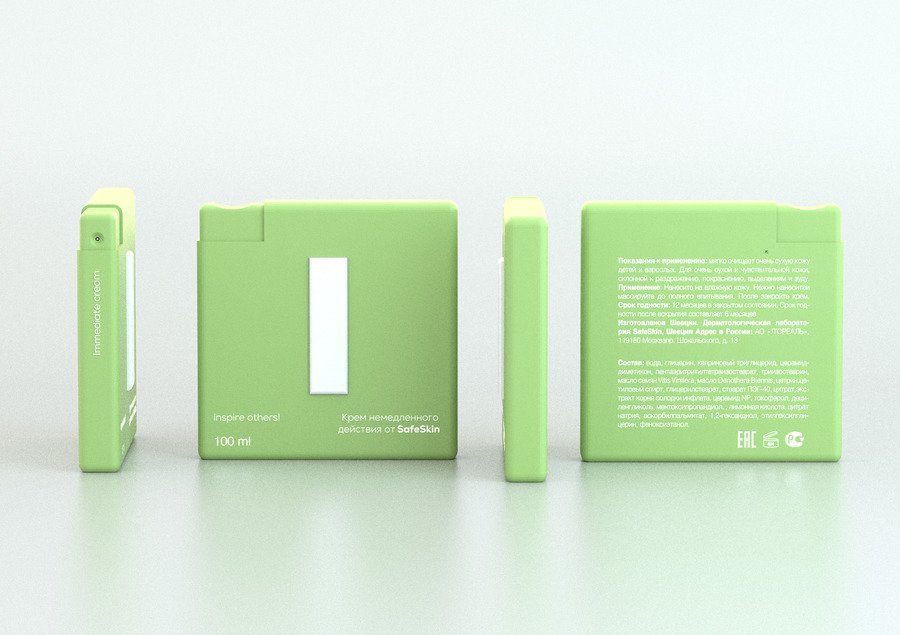
A central part of the brand’s metaphor is the use of periodic table–inspired elements. The ingredients are stylized as «chemical symbols» that turn into supportive messages, creating a sense of friendly dialogue between the product and the user. This approach transforms the packaging into a motivational space where each element feels like it’s speaking directly to the teenager, offering calmness, reassurance, or a simple reminder to breathe.
The overall design remains minimalistic and structured, emphasizing clarity and lightness, while the communication layer adds emotional depth. Together, these elements create a cohesive identity where care is expressed not only through the skincare formula itself but through the way the brand connects with its young audience on a human level.
Communication theory in the field of design

In designing the SafeSkin identity, we approached visual communication not merely as aesthetic packaging, but as a functional component of the therapeutic process. Drawing on semiotic theory, we recontextualized the authoritative visual language of the periodic table—typically a signifier of cold, clinical efficacy—into a system of emotional support. By subverting these established scientific symbols to deliver messages of calm and care, the design performs a rhetorical shift from simple information delivery to active stress reduction, which is medically vital for our specific audience. This approach demonstrates that design can act as a mediator; it transforms a routine medical necessity into an empathetic dialogue, ensuring the visual interface treats the user’s anxiety just as the product treats their skin.
Presentation for a general audience
Stop treating your skin like a problem to be solved. SafeSkin is the ally that helps you feel seen, understood, and totally ready to face the day.
Packed with microelements from a special thermal spring. It’s the highest quality science, made gentle for the most sensitive skin. This is the quality you expect from Scandinavian skincare.
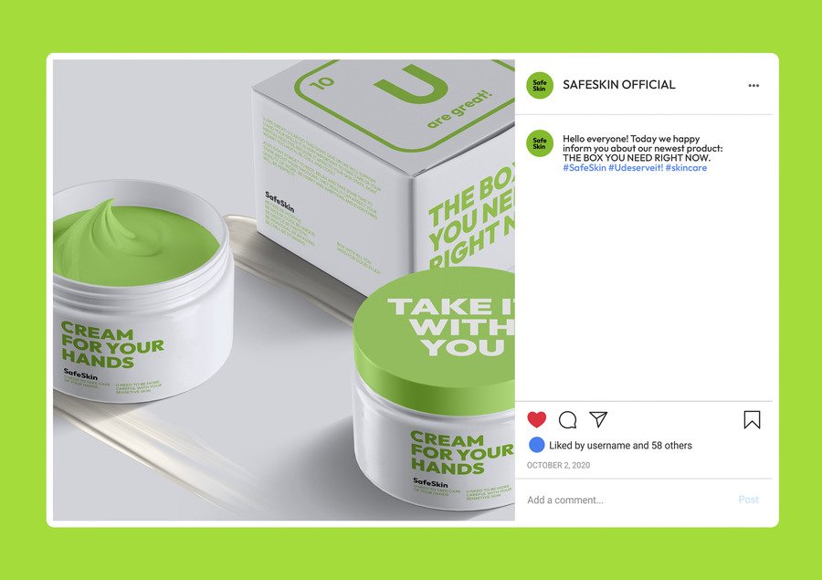
The Only Cream That Talks Back.
We took the boring chemical symbols and swapped them for supportive messages. Every application is a private moment.
SafeSkin gives you the comfort, confidence, and care you need. Your skin deserves an ally.
Presentation for a professional audience
We created SafeSkin, a Swedish brand that delivers advanced, spring-water based formulas for sensitive skin. But our real innovation is our mission: To turn a medical necessity into an emotional ally. We believe true care means supporting the mind and the skin.
Our creams are highly effective, formulated with microelements from a European thermal spring, proven to heal and protect. This provides the medical efficacy our audience needs.
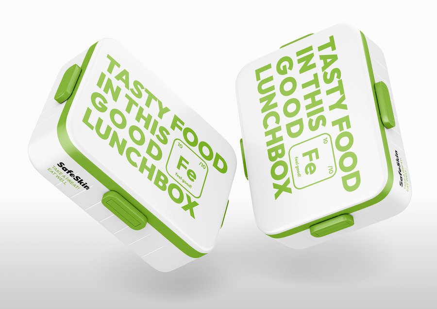
We use a minimalist, structured design inspired by the periodic table of elements. Why? Because it communicates efficacy and trust. But we subvert it.
The packaging itself becomes an anti-stress tool.
Every time you reach for SafeSkin, it’s a quick moment of kindness. It feels like the product is genuinely looking out for you. We take the focus off the condition and put it onto your well-being. It’s care that speaks to you, right when you need it most.
SafeSkin is where Scandinavian efficacy meets human empathy. We are ready to revolutionize how teenagers manage their sensitive skin, giving them confidence and comfort every single day.

Communication theory as basis for the presentations
In SafeSkin presentations, communication theories form the basis for building a narrative, visual system, and user experience that position the brand not only as a cosmetic solution, but as an emotionally supportive companion for teenagers with atopic dermatitis. It is key for the brand to create a trusting and safe space for an audience such as teenagers with problematic skin, because they are a vulnerable group. The presentations emphasize that SafeSkin works at the intersection of healing and emotional well-being, recognizing that skin conditions are deeply connected to stress, self-perception, and everyday social pressure. The theory of symbolic convergence manifests itself in creating a supportive safe space, where SafeSkin transforms scientific language into an emotionally supportive dialogue. The familiar visual references to the periodic table—chemical symbols, elements, and scientific schematics—form a symbolic system in which authority is tempered by caring and empathy. Repetitive motifs such as delicate colors, rounded shapes, and short phrases of encouragement embedded in the «elements» create an overall emotional sense of trust, security, and understanding. This creates trust in the brand in terms of a good care cosmetics composition and willingness to help the audience. As a result, teenagers with atopic dermatitis feel recognized and supported, which strengthens trust in the brand and connects the reliability of medicine and science with emotional accessibility.
The narrative paradigm is main to how SafeSkin communicates its values and products. The presentations introduce the audience to the brand’s products through a minimalist and structured design combined with a layer of emotional and accessible story based on the everyday experiences of teenagers. Instead of relying on dramatic transformation, SafeSkin focuses on micro-stories from everyday life, such as reading an encouraging message on a package during a stressful moment. These stories bring SafeSkin closer to the human experience, making the audience feel understood and heard.
The rhetoric and persuasion manifest themselves in the fact that SafeSkin is positioned as a supportive and value-oriented ally, and not just cold strict medicine. The main problem is that teenagers with atopic dermatitis experience not only physical discomfort, but also emotional stress, anxiety, and a constant sense of vulnerability. SafeSkin offers not just a cosmetic product, but a routine-integrated daily care system that combines clinically effective formulas, soothing visual language, and supportive messages on the packaging design. In the presentations, the audience will see how SafeSkin should improve their daily well-being, reduce stress, and help with problematic skin.
SafeSkin addresses the needs of its audience: it speaks to teenagers in an accessible, soothing language and at the same time shows its professional approach in medicine related to the care of facial skin.
The final professional presentation highlights that SafeSkin’s entire visual style — from product packaging to advertising posters — combines a minimalistic, structured design, and a reinterpretation of the periodic table. Each element is designed to create an anti-stress tool that is accessible and emotionally engaging, turning routine skin care into a personal, uplifting experience for each user. All of this makes medicine a fascinating and supportive experience. Communication theories in SafeSkin serve as practical foundations rather than abstract ideas. They inform the brand’s narrative, visual design, and user experience, transforming scientific motifs into emotionally supportive cues and micro-stories from everyday teenage life. Together, these elements create a cohesive system that reinforces the brand’s core meaning: trust, care, and emotional safety for teenagers with atopic dermatitis, as well as confidence in the medical elements of the product.
In conclusion, SafeSkin successfully transforms routine medical care into a compassionate and emotionally engaging experience by using communication theory in its design. In addition, a minimalistic visual style, soothing colors, motifs inspired by the Periodic Table, and encouraging messages work together to build trust, reduce stress, and support teens' mental health. So, the brand functions not only as a skin care product, but also as a daily ally that combines clinical effectiveness with empathy.
Image & Literature sources
The project is based on materials from the Communication Theory: Bridging Academia and Practice Course
Images are from Tsoy Daniil project SafeSkin: https://hsedesign.ru/project/2ff0f59badf04ec4903c1d2af9279061