Communication theory: Cardly
Communication theory in the design field
Communication theory is the systematic study of the processes of creating, transmitting, interpreting, and exchanging meaning between people through verbal and nonverbal symbols. As the course materials demonstrate, communication is understood as a relational process in which messages are created, interpreted, and evoked a response. In design and art, communication theory provides the foundation for the meaningful creation of visual, spatial, and interactive messages aimed at specific audiences.
In design, communication theory is used to structure a visual message to accurately convey an idea, emotion, or value. The designer acts as the sender, encoding the message through composition, color, typography, and form, while the viewer or user becomes the receiver, decoding that message. Importantly, communication in design is always a process that takes into account context, culture, and individual perceptual experience.
The interaction between the designer and the consumer is built on the principles of feedback and the co-creation of meaning. A designer doesn’t simply impose a message but considers the audience’s perception, which aligns with the interpretive approach in communication theory. For example, through user experience (UX) research, a designer can tailor a message, minimizing distractions and enhancing clarity.
Communication varies significantly depending on the channel. As Marshall McLuhan notes, «the medium is the message»: the form of delivery directly influences content and perception. Visual design for social media requires brevity and emotional impact (the peripheral processing pathway in the ELM model), while museum exhibition design may be designed for deep, thoughtful perception (the central pathway). Each channel — be it a poster, a website, or an installation — dictates its own rules for encoding a message.
Communication theory helps convey a brand’s values and beliefs through various mechanisms. A brand can highlight certain attributes and create desired associations in the audience. Rhetorical strategies, such as the use of metaphors, storytelling, or appeals to authority, enhance the persuasiveness of the message and make the brand’s values recognizable and meaningful.
Gatekeeping theory helps separate the essential from the unimportant when creating a brand design. The designer or art director acts as a gatekeeper, filtering information and setting emphasis. The designer directs the viewer’s attention to key messages through the hierarchy of visual elements, contrast, and composition, thereby eliminating unnecessary distractions. This process also relies on an understanding of the audience’s normative beliefs, i.e., what they find meaningful.
In design teams, communication theory is applied through the lens of group dynamics and structuration theory. Effective team communication requires clear roles, a common language (signification), and a decision-making process. Using tools such as symbolic convergence strengthens group identity and cohesion and improves collaborative project work.
Furthermore, Brown and Levinson’s politeness theory helps regulate team interactions. It ensures that each team member’s «face» is taken into account, helping to minimize threats to self-esteem. This is especially important in creative processes, where criticism must be constructive and not disrupt the positive atmosphere of collaboration.
Messaging on merchandise
Thus, communication theory provides designers and artists with both tools for creating effective messages and a framework for understanding interactions with audiences, within teams, and within cultural contexts. It transforms design into a conscious act of communication, where every element contributes to clarity, impact, and meaning.
Presentation of The Brand for a General Audience
For a general audience, Cardly is presented as a service that simplifies and improves the digital experience of businesses by creating landing pages that are clear, persuasive, and visually coherent. The brand communicates its core promise through accessible language, focusing on the outcome rather than the technical process.
General Audience Description
The general audience includes individuals with varying levels of digital literacy—small business owners, early-stage entrepreneurs, students, consumers interested in marketing, and individuals encountering the brand through non specialized media channels.
When addressing this audience, Cardly positions itself as:
- A solution to a common frustration: Many people know the experience of opening a website that is confusing, slow, or unclear. Cardly explains its value by showing how a well-structured landing page can make a business easier to understand and engage with.
- A brand that improves everyday digital interactions: Instead of emphasizing performance metrics, the brand highlights intuitive benefits such as clarity, simplicity, trust, and ease of use.
- A service that «makes websites work the way they should»: This message is direct, approachable, and immediately relatable to a non-technical viewer.
- A partner that enhances business visibility and customer attraction: For a general audience, the brand emphasizes the idea of «attracting people through quality online presence, ” which resonates even without specialized marketing knowledge.
General Audience Framing
The communication strategy focuses on:
- Simple metaphors (attraction, clarity, guiding the visitor)
- Emotional reassurance (confidence, trust, ease, reduced frustration)
- Everyday problems and solutions
- Visual storytelling rather than data-driven arguments
Overall, Cardly is framed as a friendly, helpful, problem-solving brand that makes digital experiences smoother for everyone.
Messaging example
Presentation of The Brand for a Professional Audience
For a professional audience, Cardly is presented as a highly specialized, performance-oriented service designed to optimize conversion, strengthen marketing outcomes, and function as an integral part of the digital sales funnel.
Professional Audience Description
The professional audience includes marketing agencies, performance specialists, growth managers, UX/UI designers, product teams, and business decision-makers responsible for measurable digital outcomes.This audience has advanced knowledge in:
- Digital marketing
- Conversion rate optimization (CRO)
- Performance advertising
- Customer journeys
- Funnel architecture
- Analytical evaluation of digital assets
Messaging examples
Professional Audience Portrait
Professional Audience Portrait
How Cardly Is Communicated to a Professional Audience
In this context, Cardly positions itself as:
- A performance partner rather than a design vendor: The focus shifts from aesthetics to strategic function — Cardly builds landing pages engineered to increase conversionand strengthen KPI performance.
- A technical expert in structuring digital touchpoints: Messaging centers around data-driven decisions, behavioral insights, A/B testing, and the architecture of persuasive interfaces.
- A system that enhances efficiency of paid traffic: Professionals understand that ineffective landing pages can undermine even highly optimized ad campaigns. Cardly communicates its value by demonstrating how structural clarity, UX logic, and controlled «attention flow» can dramatically improve ROI.
- A provider of predictable, measurable improvements: For this audience, the brand emphasizes metrics such as conversion rate, cost per lead, time on page, bounce rate, and customer acquisition cost. The brand presents itself as a tool for performance stabilization and scale.
Creative goal of the key messaging
Professional Audience Framing
Communication for this segment relies on:
- Precise terminology (conversion architecture, behavioral friction, attention pathways, value hierarchy, etc.)
- Demonstration of analytical methodology
- Case studies with before/after metrics
- Technical explanations of design decisions
- Frameworks and models commonly used in UX and performance marketing
Key Messaging for Professionals
- Cardly transforms landing pages into predictable conversion assets.
- The brand delivers structure-first design, where interface decisions derive from user behavior mapping.
- The experience is grounded in performance logic, not subjective aesthetics.
- Cardly positions itself as a layer of expertise that amplifies agency output and strengthens funnel reliability.
Key messaging
How communication theory formed the basis of the Cardly brand presentation
Our project is based on a course «Communication theory» and considers design as a conscious act of communication: the designer acts as the sender, the visual system as the message, and different types of clients as the recipients who interpret the meaning in their own context.
1. Communication model: Who, to Whom, and through Which channels
In lectures, communication was defined as «the relational process of creating and interpreting messages that elicit a response» — the process of exchanging meanings through verbal and nonverbal symbols, always depending on the context and channel.
We used this model as the basis for the Cardly brand structure:
- Sender — is Cardly, a service and team that «configures advertising and develops designs» as an «all-in-one» solution for small businesses.
- Message — the idea of a «digital pit stop» for marketing: Cardlee helps you quickly put your hypothesis «on track» and test whether it brings in money.
- Recipients — two distinct audiences: owner of B2C retail Irina; co-founder of B2B-service Andrey
Their «pains/fears/needs» are written down as expected interpretations of the message.
We proceeded from the McLuhan’s idea that «the medium is the message»: the same meaning is interpreted differently in a digital presentation, on a street billboard, or on a T-shirt. Therefore, the brand’s visual language is adapted to each channel, but retains the motif of a race track and a bright green track everywhere.
2. Audience message
The lectures describe the Elaboration Likelihood Model, which explains that people process messages either through a central (thoughtful) route or a peripheral (quick) route, depending on their motivation and ability to engage deeply with the message. In our project, we deliberately structured the communication so that it could be perceived by the same audience in different situations of contact, especially in conditions of limited attention.
In cases of brief, low-involvement contact (such as offline media and first visual encounters), the message is designed to function through the peripheral route of persuasion.
The communication relies on:
- short, imperative headlines that immediately signal action and result;
- a clear metaphor of speed, energy, and movement;
- high visual contrast (bright green elements against a black background) to capture attention;
- minimal verbal information focused on outcome rather than explanation
These elements act as peripheral cues, allowing the audience to quickly decode the core meaning of the message without analytical effort. The result is a fast emotional response, where the audience intuitively understands the message as being about growth, effectiveness, and tangible results, and relates it to their own business context.
3. Social identity and «we are on the same team»
In lectures on group communication, social identity is described as a part of the «self-image» associated with belonging to a group, and as a motivated process: it is important for us to simultaneously be «like our own» and «a little special» (Optimal Distinctiveness Theory).
Cardlee intentionally builds communication around the group identity of a small business:
Who are «we»?
- Small businesses that struggle with marketplaces, expensive agencies, and complex analytics;
- Founders who want a «growth team on call without expanding their staff.»
How do we emphasize this?
- The mission: «We turn small business ideas into sales growth in minimal time» — a direct «we» instead of a distant tone;
- Tone of voice: «Partner. We’re on the same team. While you are dealing with the product, we are dealing with traffic» creates a relationship rather than an agency–client hierarchy.
This is how the idea is realized that communication not only transmits information, but also constructs affiliation: a brand helps a small business feel like a member of a separate, «racing» team, and not a «small» player in the market.
4. Semiotics: Visual language as a sign system
The lectures highlight the semiotic tradition, where communication is understood as the exchange of meanings through signs and symbols.
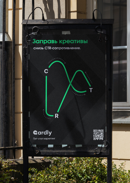
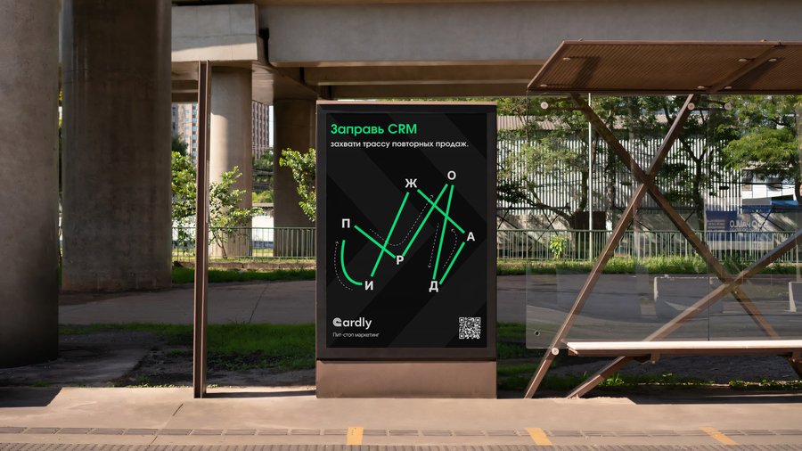
The green track (on posters, merchandise, and packaging) is a sign of the route and growth trajectory. It simultaneously looks like a metric graph and road markings connects marketing and racing.
The dark background is associated with night racing, focus, technology, and the analytical panel screen.
Short verbal slogans («Fuel up the ROI engine», «Fuel up the CRM», «Fuel up the A/B tests») are verbal signs that connect familiar marketing tools with the metaphor of fuel and track.
Accordingly, each visual element is not a «decoration», but a part of the brand’s semiotic system, through which the meaning of «fast sprints and measurable results» is conveyed.
This corresponds to the understanding of design as encoding a message, taking into account the cultural codes of the audience.
Communication Theory: Bridging Academia and Practice (Online course) // HSE Platform URL: https://edu.hse.ru/course/view.php?id=133853
Cardlee — digital агентство // HSE Design URL: https://hsedesign.ru/project/757358e62d0d430b9a6bd5d79698b615


