Communication in the field of design
Communication is the process of meaning creation via exchanging verbal and non-verbal messages. Communication play a huge role in the brand design and promotion process, because it shapes how people perceive, understand and emotionally relate to a product.
In the field of design communication is crucial, as it helps convey the designer’s idea to the general audience, get people’s attention and gain their trust. In digital product design, most of the time, people see the brand’s communications and advertisements before they test the app or the website itself, therefore, the communication materials should leave a positive impression to make the users want to interact with the brand further.
Understanding communication theory allows designers to make deliberate decisions about how visual stories and media channels influence the audience’s perception. In this project we have made an attempt to explain how the communication theory works in the digital product design on the example of Medvedium — an interactive learning app for kids.
Presentation of a brand for General Audience
Kids get bored. They want to create, play, and express themselves, but sometimes they just need a spark. And as a parent, it’s tough to see screen time turn into empty scrolling. You want that time to be positive, creative, and safe—especially when you’re busy.
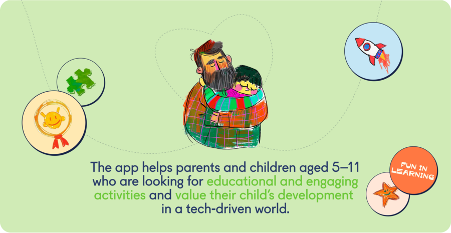
Medvedium is a daily companion for your child’s curiosity. It’s a world where screen time transforms into growth time. Our Promise: To give your child a fun, creative outlet every single day, and give you peace of mind.
This is more than a game—it’s a world where your child’s new friends are waiting to chat. By interacting with the unique personalities of our characters, your child practices empathy, builds emotional intelligence, and learns to express their own ideas.
Here’s how the magic happens…
- You Personalize It: Set up a profile based on your child’s age and interests.
- They Discover Daily: Every day brings new, playful tasks—drawing, puzzles, creative challenges—all checked by smart technology for encouragement.
- They Play & Chat: Kids can take breaks with mini-games or have real conversations with their favorite characters, powered by advanced, safe AI.
- They Feel Proud: A rewards system celebrates their efforts and achievements, building confidence.
Why parents trust Medvedium?
— It’s Productive Play: We turn passive watching into active creating.
— It’s Safe & Secure: A carefully designed environment with you in control.
— It’s a Window for You: See what sparks your child’s joy and creativity.
— It Fosters Skills: Encourages critical thinking, creativity, and a love for learning.
We’re more than an app, we’re a community of parents who believe technology can help kids grow. Follow us for parenting tips, creative ideas, and stories from other Medvedium families. Give your child the gift of daily wonder and a safe space to shine.
Medvedium: where every day is a good day to discover
Presentation for Professional Audience
The visual identity of Medvedium works as a gentle, emotionally clear system of signs — a set of colours, shapes, characters and textures that supports the child both visually and emotionally. Nothing in this world is random: every colour, every line, every rounded corner carries meaning, offering signals the child can understand instinctively, even before they learn to put those feelings into words.
The colour palette operates as an emotional grammar in its own right. Its flat, saturated tones — free from halftones or gradients — communicate with clarity and assurance, lending the interface a sense of psychological stability reminiscent of a familiar, well-loved toy.
Elements of identity
Within this chromatic universe, the characters function as symbolic archetypes — not simply illustrated figures, but embodied emotional roles that children intuitively recognise. Medvedium , the bear, represents warmth and protection; Tigrumy conveys courage and dynamic energy; Lisitsyn expresses creativity and lightness; Kitovsky introduces a sense of calm depth; and Soveliy, the owl, signifies clarity, reflection and gentle wisdom. Each figure becomes a compact cultural unit, a narrative emblem that supports the child in navigating their own emotions and understanding the relational dynamics of the world.
Even the interface components — icons, rounded forms, smooth transitions — participate in this semantic landscape. Their softness signals friendliness, lowers cognitive load and reinforces the perception of Medvedium as a safe, forgiving space where experimentation and mistakes are integral to learning. Through this soft geometry, the brand engages in a form of non-verbal pedagogy, shaping the child’s emotional expectations and sense of security before any dialogue or instruction appears on screen.
Characters
Although Medvedium exists entirely within a digital environment, it deliberately cultivates a sense of tactility. Hand-drawn textures evoke crayons, picture books and other familiar analogue materials, giving characters and colours a warm, physical presence. As a result, interaction shifts from simple interface navigation to an embodied experience: the child perceives personalities, senses emotional nuances and engages in it 0; responsive dialogue with characters it 1; AI that adapt it 2; their mood, language and hesitations. Medvedium becomes it 3; space it 4; co-presence, where imagination and reality meet it 5; it 6; gentle, continuous exchange.
it 7; it 8; social level, Medvedium operates it 9; a 0;compact cultural ecosystem that encourages co-creation, shared rituals and meaningful moments a 1; interpersonal connection. Drawings unfold into conversations, stories develop into collaborative adventures, and characters subtly model empathy, expression and communicative intuition. The a 2; s vivid, easily shareable visual language extends naturally into family interactions and peer exchanges, forming micro-communities a 3; which Medvedium becomes a 4; shared medium for creativity, connection and collective meaning-making.
Within the Medvedium universe, the brand operates as an underlying structure: a set of narrative principles, emotional signifiers, visual codes and character archetypes that together create a gentle scaffold for children’s play and communication. Rather than being passive recipients, children act as co-authors of this world, reshaping it through their choices, dialogues, imaginative leaps and interactions with both characters and AI.
Through this reciprocal process, young users simultaneously draw on familiar cultural patterns — storytelling conventions, emotional scripts, social gestures — and reinterpret them, generating new narratives, blended emotional states, unexpected meanings and personalised versions of the Medvedium experience. In this sense, the brand does not function as a fixed system; it becomes an evolving structure that is continuously redefined by the child’s own creative agency.
In developing Medvedium, we also worked through an essential design tension: the need to maintain the emotional and narrative coherence of the fictional world while supporting the child’ s natural drive toward open-ended creative exploration. Our task was to keep each character’ s identity clear and recognisable, yet allow young users to freely reinterpret stories, atmospheres and interactions.
This balance was achieved by reconsidering the affordances we 0; the digital medium itself. Elements often perceived we 1;«we 2; — simplified silhouettes, soft geometric forms, modular colour fields and AI-facilitated we 3; — were treated we 4; communicative tools rather than limitations. Together, they provide we 5; visual and narrative framework that feels safe and comprehensible, while still leaving ample space for children we 6; construct personal meanings and experiences within the Medvedium universe.
The Use of Communication Theory in the Project
While preparing the presentation of our project for the general and professional audience we have used multiple concepts which were discussed in the Communication Theory Course.
Semiotic Tradition of Communication
First of all, Medvedium’s promotion is best defined by the semiotic tradition of the communication theory, so we carefully considered the system of signs suitable for our target audience.
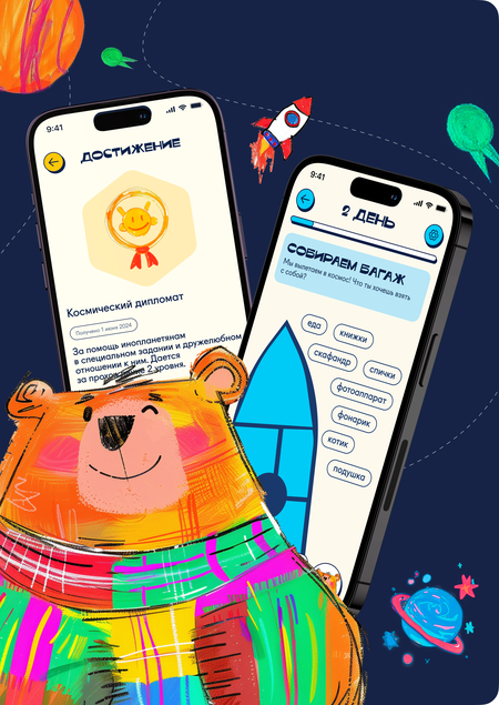
We have used colorful illustrations, fonts with fun character and friendly-looking mascots to create a virtual learning environment that would be interesting to discover for a child aged 4 to 7 years old. With the bright colors and smiling characters we try to convey the idea that learning can be fun.
All of these signs appear both in the mobile app itself, and on the promotion materials, such as posters, merch and social media posts, so the style seems consistent, and the kids recognise their favourite characters anywhere.
Narrative Paradigm
Secondly, our communication strategy has been greatly influenced by the narrative paradigm, according to which humans tend to be better persuaded by a good narrative rather than by logic. Using this information, we created an emotional story around our brand, that would be understood and gain trust by both kids and their parents.
Medvedium is not just a learning app, but a supportive mentor and a great friend, who will help the child with his exploration of this huge world. We strive to show the kids that no matter what happens in the real world, we are proud of them and their achievements, and we support them constantly.
Our brand story was built to demonstrate narrative coherence(so that the kids feel understood and supported by the characters, just as our brand promises) and narrative fidelity (we strive to demonstrate that our values align with what parents appreciate in educational tools).
The Framing Theory
The framing theory, which suggests that media influence what we think and how we think about it, is used in our project to create a positive image of the brand. While bright colors and funny charatcers catch the attention of the audience, in our social media we try to further connect with the audience. In our communication, we frame educational content as playful exploration for kids, and as safe developmental support for parents.
The project is based on materials from the Communication Theory course.
Медведиум // HSEDESIGN URL: https://hsedesign.ru/project/267ac62aae714b80ab690069f69c0a17 (Дата обращения: 08.12.2025)


