Erich Krause is a popular international group of companies and one of the most famous brands of stationery. The brand was founded in Russia in the 1990s and named after the German artist Erich Krause. The products are quite widespread in Russia and other countries of the former Soviet Union.
The company produces writing and office supplies, school and creative products, even holiday and decor items. The company regularly updates its collections, introducing innovative materials and focusing on maximum user comfort. Unlike niche brands that, for example, produce only pens or accessories for developing creative abilities in children. Erich Krause allows you to cover all your work, educational, and home hobby needs in a single order. The products are more expensive than local brands, but significantly more affordable than German giants, despite comparable appearance and quality of materials. Prices are still quite balanced for the Russian buyer, who finds it more profitable to spend money on an import-substituting product.
This visual study will examine three different target audiences by Erich Krause: office workers, children and artists. It will analyze the similarities and differences between products sold on the market.
First, the previously mentioned key production areas are discussed in a more concise format. Next, we’ll dive deeper into the topic.
Office workers are offered a clean and stylish line designed to enhance productivity. The assortment includes convenient ballpoint and gel pens with signature easy-glide systems, markers, stickers, desktop organizers and high-quality document folders. These products are characterized by their functionality and reliability.
For artists and creative professionals, Erich Krause produces specialized materials that combine not only ease of use and safety but also aesthetic appeal. The brand offers professional graphic rulers, pencils of varying hardness and erasers. This also includes an extensive series for painting, featuring watercolors, gouache, pastels, acrylic paints, and various brush shapes.
For children, these same products typically offer simpler functionality, but are also distinguished by their vibrant and intricate design. The assortment includes easily washable markers, non-toxic play dough, wax crayons, colored pencils, convenient, skin-friendly sharpeners, and sketchbooks. Products undergo stricter laboratory testing and are certified to European standards, taking into account the clumsiness and inattention typical of the younger generation.
OFFICE STATIONERY SUPPLIES
In the overall ErichKrause product line, office supplies occupy a practical segment. These are products that customers choose not for self-expression, as in the case of creative goods, and not for a bright emotional reaction, as in the children’s line, but for convenience, reliability, and everyday use. Therefore, the brand’s communication in this category is built around rational meanings: order, stability, affordability, and functionality.
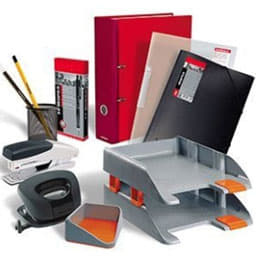
A set of stationery from the Erich Krause brand
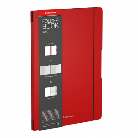
The packaging of ErichKrause office products performs an important communicative function. It helps the customer quickly understand the key information: what kind of product it is, how many items are inside, what tasks it is suitable for, and what characteristics it has. For example, for pens, the important features are ink color, line width, and body shape; for paper clips or binder clips — size, quantity, and material; for folders — format, density, and purpose.
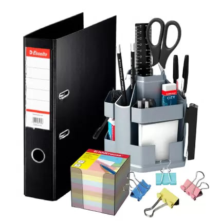
Various kinds of office supplies
This presentation reduces uncertainty during the purchase process. The customer does not need to study the product for a long time: the brand structures the information in advance and guides the choice. This is especially important for office stationery, where decisions are often made quickly and based on clear practical criteria.
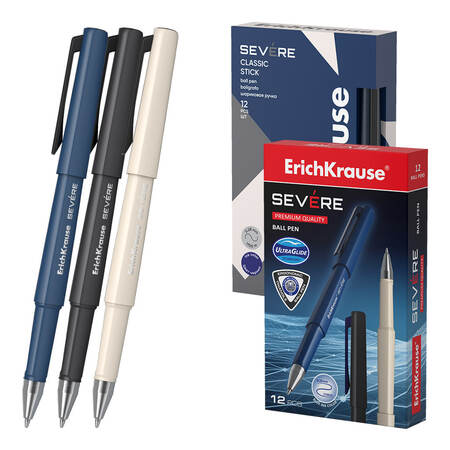
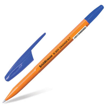
Pens from Erich Krause
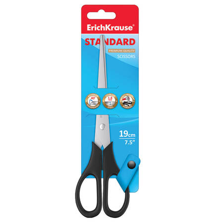
The visual strategy of ErichKrause in the office segment remains fairly restrained. The packaging often uses red, blue, white, and gray, as well as transparent elements. Red attracts attention and makes the brand noticeable on the shelf. Blue and gray create associations with the business environment, documents, the office, and rationality.

The white background adds a sense of cleanliness and order, while transparent elements allow the customer to see the product before buying it. As a result, the packaging creates the image of a product that promises predictable quality and convenience in use.
It is especially important that ErichKrause office products visually appear mass-market and universal. The brand does not aim for excessive decoration or strong individuality. Instead, it chooses a clear and accessible style that suits different audiences: senior school students, university students, office workers, and organizations. This universality can be explained by the fact that office stationery is often purchased not only for personal use, but also for group or corporate needs.
The brand’s advertising and positioning are also based on the idea of practicality. ErichKrause is presented as a brand that is well suited for everyday tasks. The customer does not need to emotionally «fall in love» with a pen, folder, or clip. It is enough for them to feel that the product is familiar, reliable, and will not disappoint in an ordinary situation. In this sense, the brand works through trust, habit, and a sense of stability.
Price also becomes part of the communication. ErichKrause office supplies are perceived as products in the affordable or mid-range segment. This supports the image of a mass-market brand: its products can be purchased regularly, bought in large quantities, and used without the feeling that they are expensive or «special» items. At the same time, the brand does not look random or too cheap, because it has a recognizable name, a consistent visual style, and a wide assortment.
Thus, the ErichKrause office line is built not on emotional expressiveness, but on a rational promise of convenience, order, and reliability. The brand speaks to the customer in a simple and understandable language: this product is needed for work, study, and everyday tasks; it is easy to choose, clear in appearance, and performs its function without unnecessary complexity. This is the main strength of ErichKrause’s communication in the office supplies segment.
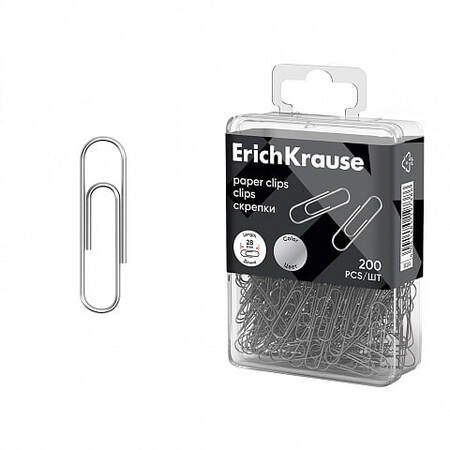
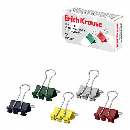
Paper clips from the Erich Krause brand
CHILDREN’S STATIONERY
Of course, just like regular Erich Krause pencils for adults, children’s pencils are associated with German quality, despite the company’s Russian roots, and their marketing is distinguished by the use of visual anchors. However, there are quite a few differences, ranging from practicality to gimmicks for potential buyers.
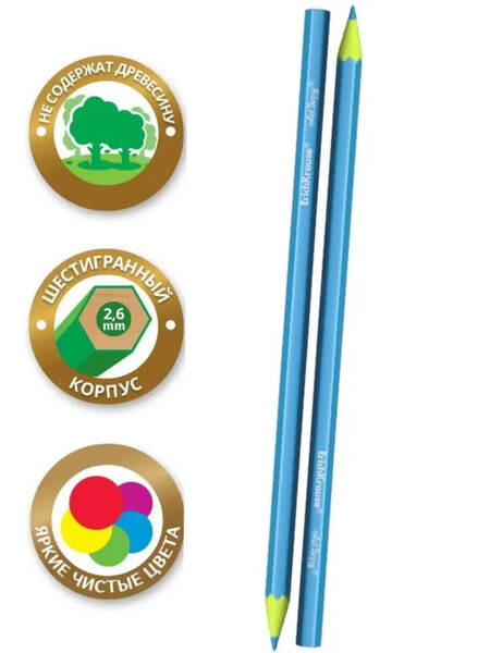
First of all, the main difference between Erich Krause children’s series and regular pencils lies primarily in the adaptation of the tool to the anatomy and safety of the child. Children’s pencils have a larger barrel and lead diameter. Children under 3-5 years old have difficulty holding standard thin pencils due to their poorly developed fine motor skills. A thicker barrel makes it easier to grasp with the palm. Child psychologists and fine motor skills specialists consider this to be a rather good sign.
Thick pencils of Jumbo format
And now the fun part! The most interesting and colorful are the marketing strategies for selling children’s stationery. The packaging often has a glossy finish with lacquered elements, just like regular pencils, creating the appearance of a premium product. However, the most eye-catching part of the box design is the pictures. It’s enough to remember yourself as a child, a time when the covers and illustrations of fairy tales seemed almost the most important feature of a book, especially if they were done in a cartoon style. So, a child might be captivated by a picture of an adorable puppy in space, enough to ask their parent to buy it.
Importantly, visual appeal and the «toy-like» nature of the product can instill in a child a desire for learning and creativity. This is a key factor that benefits both the seller and the buyer.
Erich Krause Kids Jumbo Space Animals
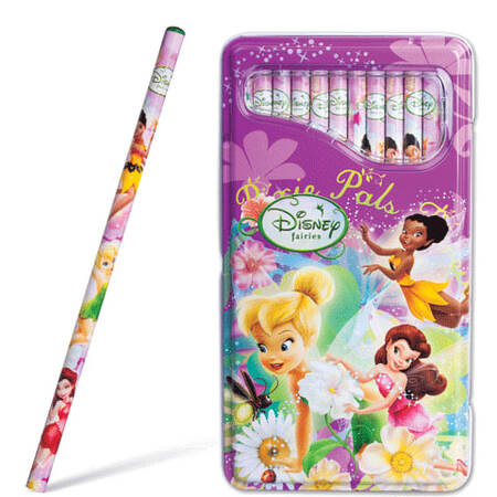
Recognition also plays a major role in packaging illustrations. Erich Krause has had numerous collaborations, the results of which you’ve likely seen on display or marketplace websites. The most popular example of this phenomenon is the joint project with the Disney Channel. Sponsored videos were broadcast as part of the «Big Animation» program. The boxes featured famous characters from popular cartoons, recognizable worldwide, which expanded the brand’s reach
Mickey Club House Drive
Another equally large-scale licensing agreement for the brand in recent years was its collaboration with the Soyuzmultfilm studio. The company has released a large line of colored pencils featuring classic Soviet classics, familiar to almost every child in the CIS countries and even beyond.