Бренд .OBJI — это проект, в котором исследуется разница виртуального и реального. Через предметы напоминается, что несовершенная реальность интереснее цифрового мира, и ошибаться — нормально
На предметах векторные чертежи самих объектов, чтобы показать разницу между «идеальным» эскизом и несовершенным результатом
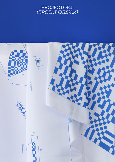
На платке изображена схема как сложить его в «идеальную» розочку
На скатерти изображены чертежи того, что понадобится для «идеального» завтрака
Брендинг построен на метафоре слоев: → вся работа в графических редакторах осуществляется по слоям → слои олицетворяют усложнение в реальности Использование элементов из принтов для предметов:
В логотипе присутствует геометрическая форма, а также смещение, будто что-то пошло не так и название стоит не на месте
Упаковка должна быть простой, но в то же время быть созвучна с концепцией проекта. Результат штампа никогда нельзя предсказать, каждый раз уникален
Наклейки составляются из форм предметов. Также на них помещается техническая информация
В дополнение в пакет кладется вкладыш с информацией о бренде
Для фотографий использовалось стекло, из-за которого происходит эффект «распада» предмета на части. Важно, что этот эффект достигается с помощью реального объекта
Зин, в котором собраны эскизы, пробы печати, первые варианты того, как должен был выглядеть проект. Важно показать процесс работы, потому что в этом и есть эстетика проб и ошибок


