REBRANDING OF THE BASALT GROUP
BASALT is a construction company founded in 2016. The company has since grown and opened new branches. The purpose of rebranding is to update the corporate identity to reflect the company values as well as the changes that have occurred in the company since its foundation.

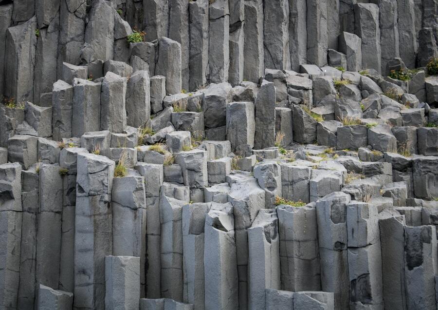
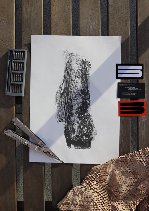
The name of the company, Basalt, was chosen as the starting point for the design of the signature style. I studied what basalt deposits look like and was inspired by them when creating illustrations, logo and corporate typography.

The logo shows the Cyrillic letter «B». The logo can adapt to any format and remain recognizable, which shows adaptability and immutability in their essence.
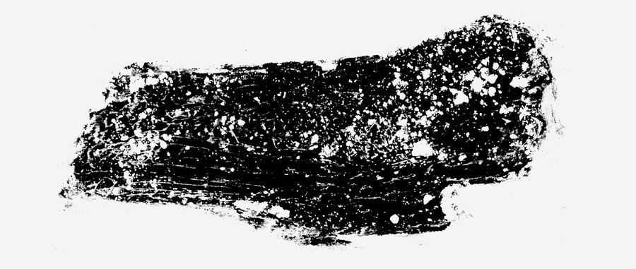
The visual identity uses original prints designed with intaglio printing. They show natural textures, i.e. stone, tree bark, granite, as the construction business is all about materials. Iron discs with diamond inclusions, concrete slabs, and metal structures.
Thank you!


