Mr.Doors is a well-known Russian company that has been manufacturing cabinet and built-in furniture since 1996.
For 24 years, the Mr.Doors logo has not changed and has been the embodiment of excellent design work, the main theses describing the past logo are modularity, originality, recognition. But time passed, priorities changed both in the company itself and trends in graphic design. Semantic detailing has been replaced by abstract, humanistic minimalism. The company’s communication with the consumer has become simpler, along with communication, the visual language in which the company speaks with its customers has also become simpler.
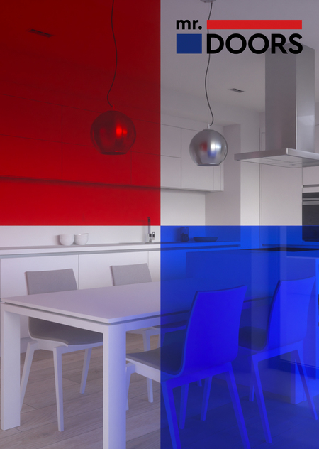
It was decided to change the visual image of the company. We have developed a new logo that retains the successive features — a modular structure and the main corporate colors. We have thought of several options for the layout of the logo, which are used depending on the medium: the main vertical version, the horizontal version for signs and entrance groups, the simplified version for very small formats. The main element of the new Mr.Doors corporate identity is colored glass, which symbolizes transparency and colorfulness. Blue and red solids are integrated into printed products and image materials, color overlays, transparency, full-size images — the new graphic language of Mr.Doors for the coming years.