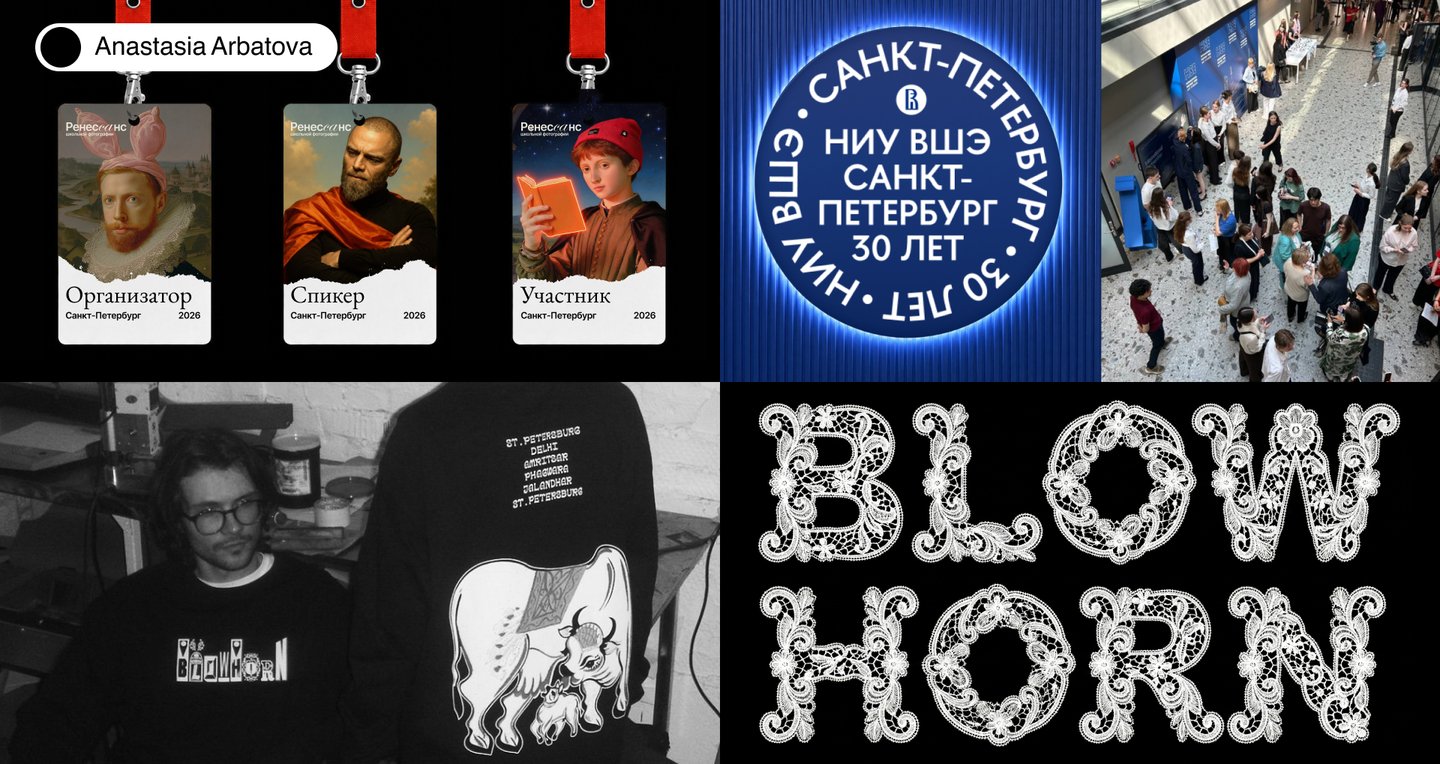
↳ Brand identity, logos, and custom typefaces
Who I am & what I do
About:
Hi, I’m Anastasia Arbatova, a Saint Petersburg–based freelance communication designer. I work across brand identity, typography, and digital design, creating thoughtful visual solutions that help brands communicate their ideas.Services:
01 / Identity & branding 02 / Logo & symbol design 03 / Pattern design 04 / Merch design 05 / Custom typeface design 06 / Website design 07 / Social media templatesSelected projects
Area: Brand identity, Art direction, Graphic design
⟶ HSE University — Saint Petersburg: 30 Years
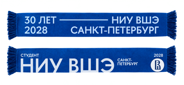
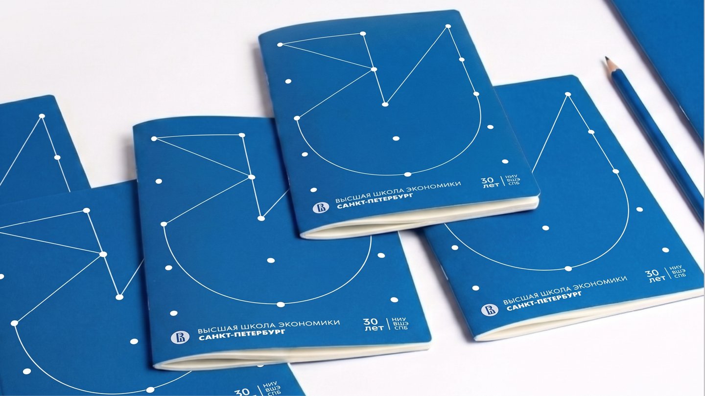
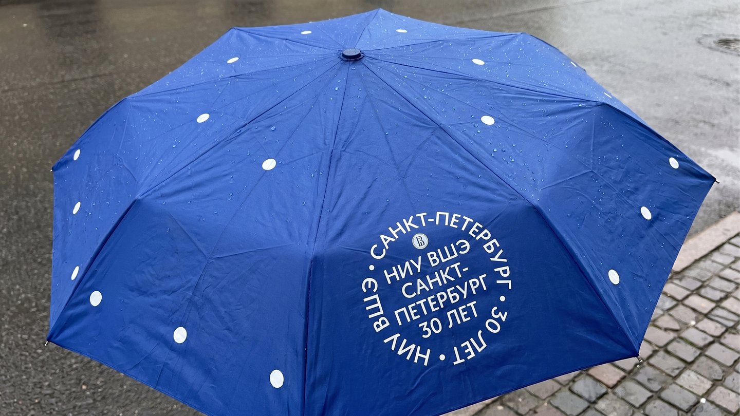
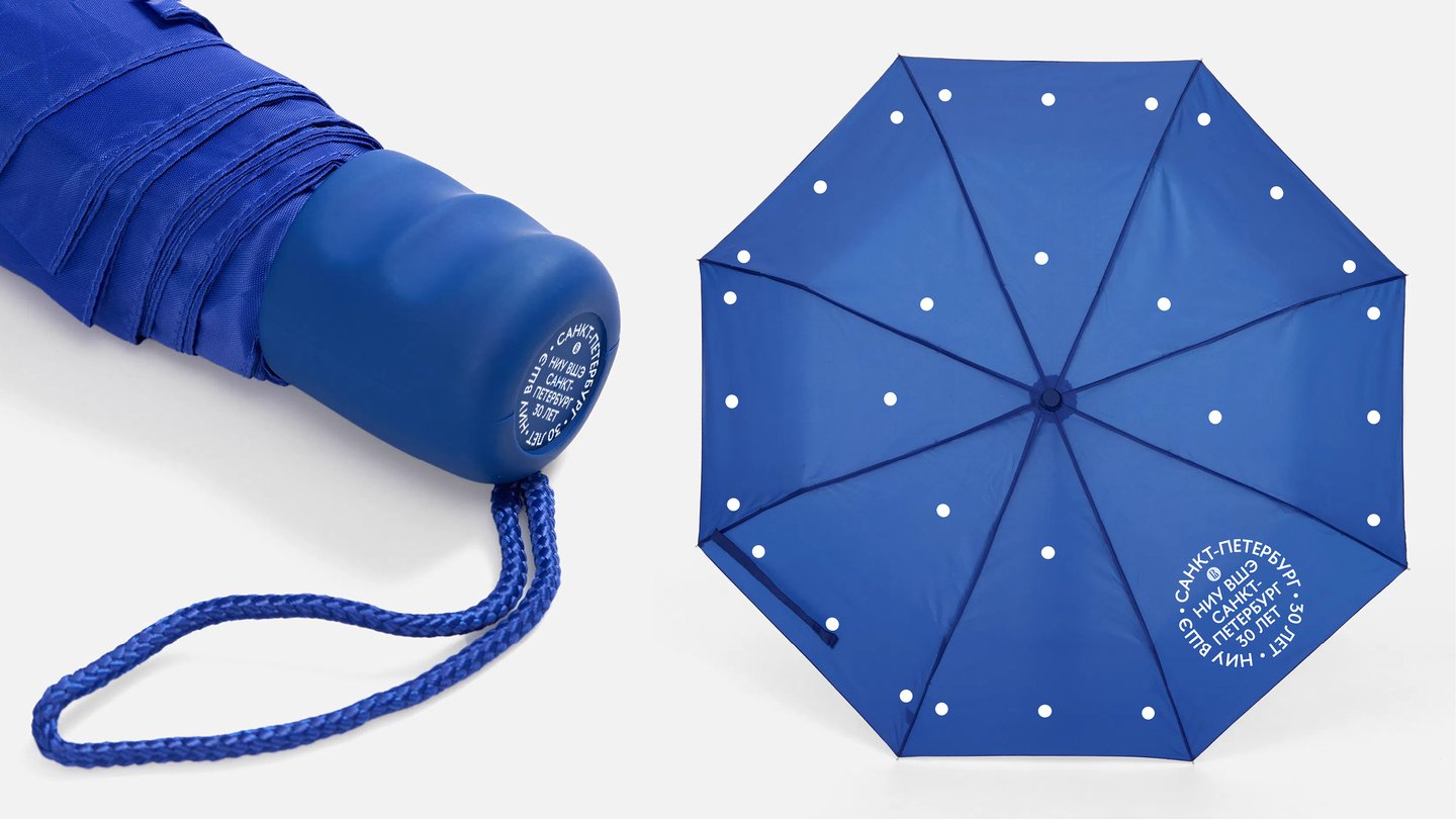
An anniversary identity that connects three decades of history with the university’s future — from campus signage to merch and social media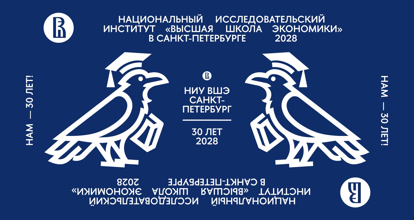
Исходный размер 1920x1023
Brief
An identity for the 30th anniversary of HSE University — Saint Petersburg, designed to unite applicants, students, faculty, alumni and partners. The style had to stay true to the university’s brand, so its palette and HSE Sans typeface were keptDesign tasks:
01 / Posters 02 / Merch 03 / Press wall 04 / Rope Workshop interiors 05 / MascotИсходный размер 1800x1013
Approach
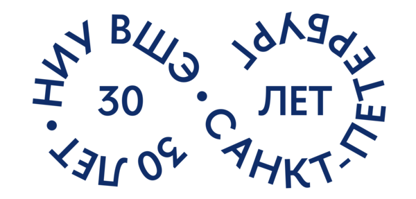
Key words: Modern, Dynamic, Academic, Human. Inspired by heraldry and typography: text with breaks, circular type and bold graphics. HSE Sans adds academic rigour with warmthИсходный размер 2667x1500
Solution
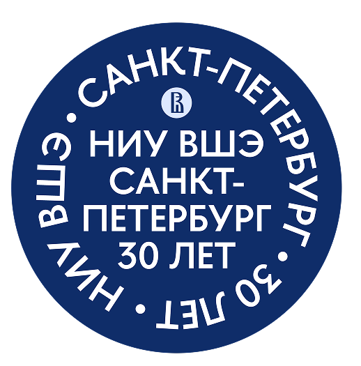
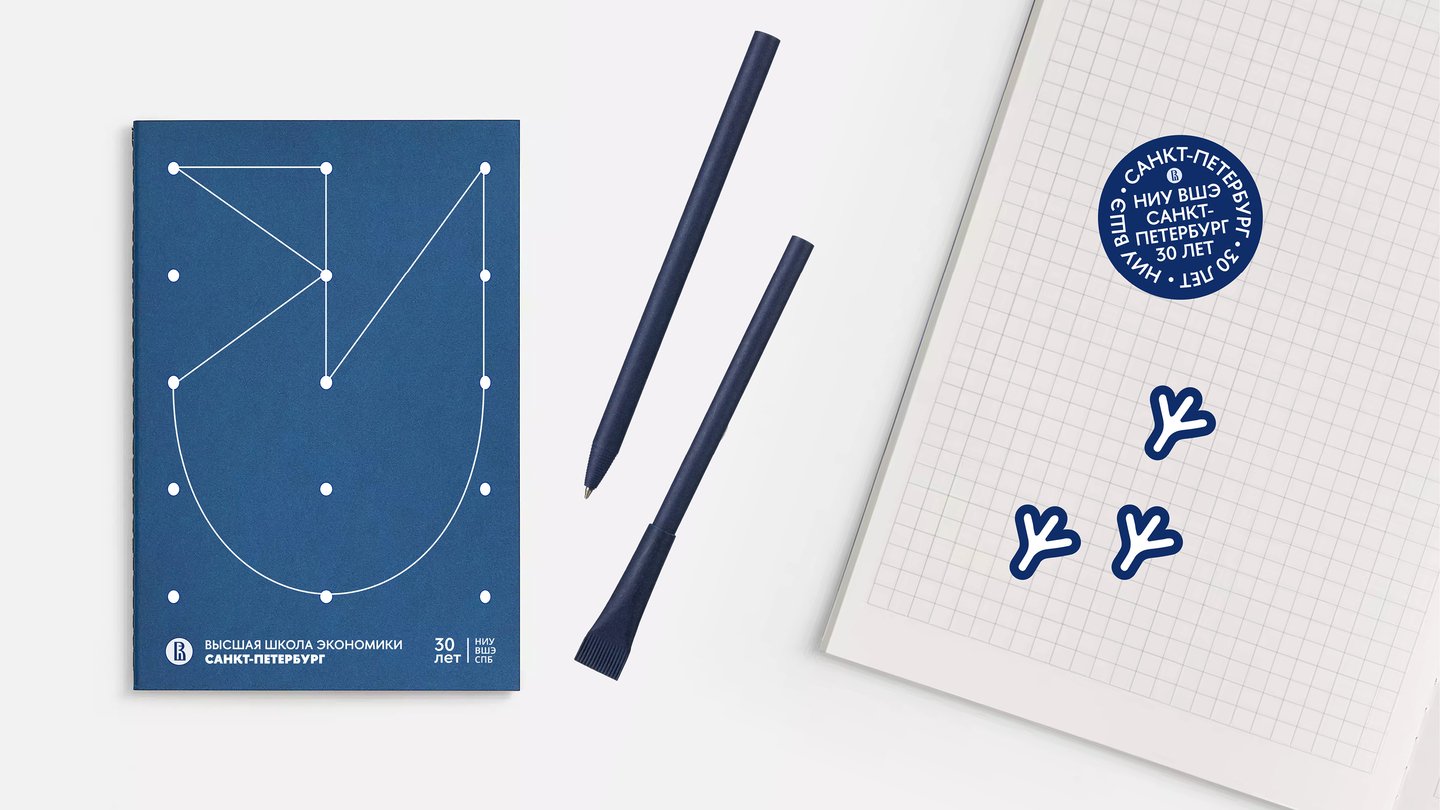
The identity reinterprets heraldry through typography. Circular text echoes academic seals, while breaks in the lettering add rhythm and a modern feel. Built on the official palette and font, the style is recognisably HSE yet has its own festive character. One flexible system works across all formats, and the mascot gives the celebration a friendly face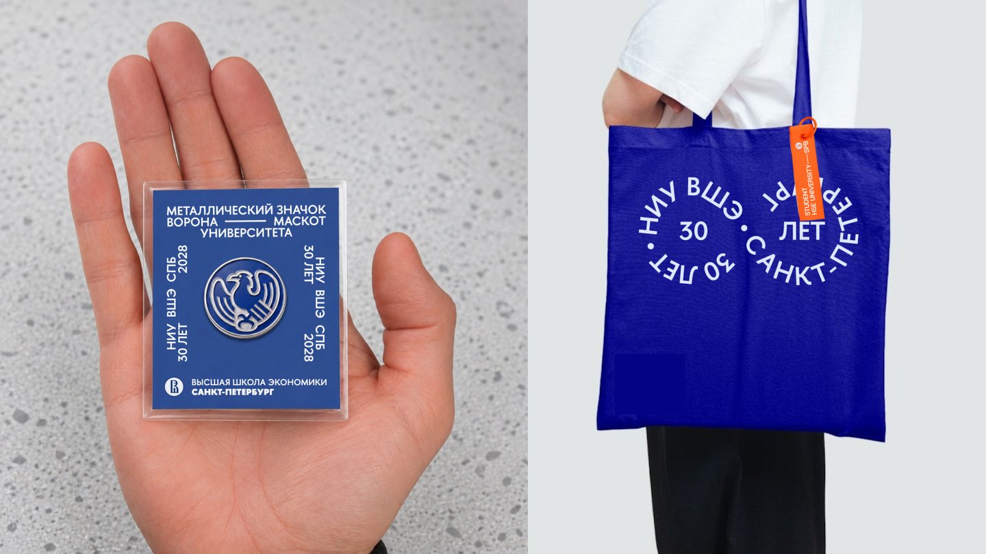
1/5
Area: Event identity, Art direction, Graphic design
⟶ The Renaissance of School Photography
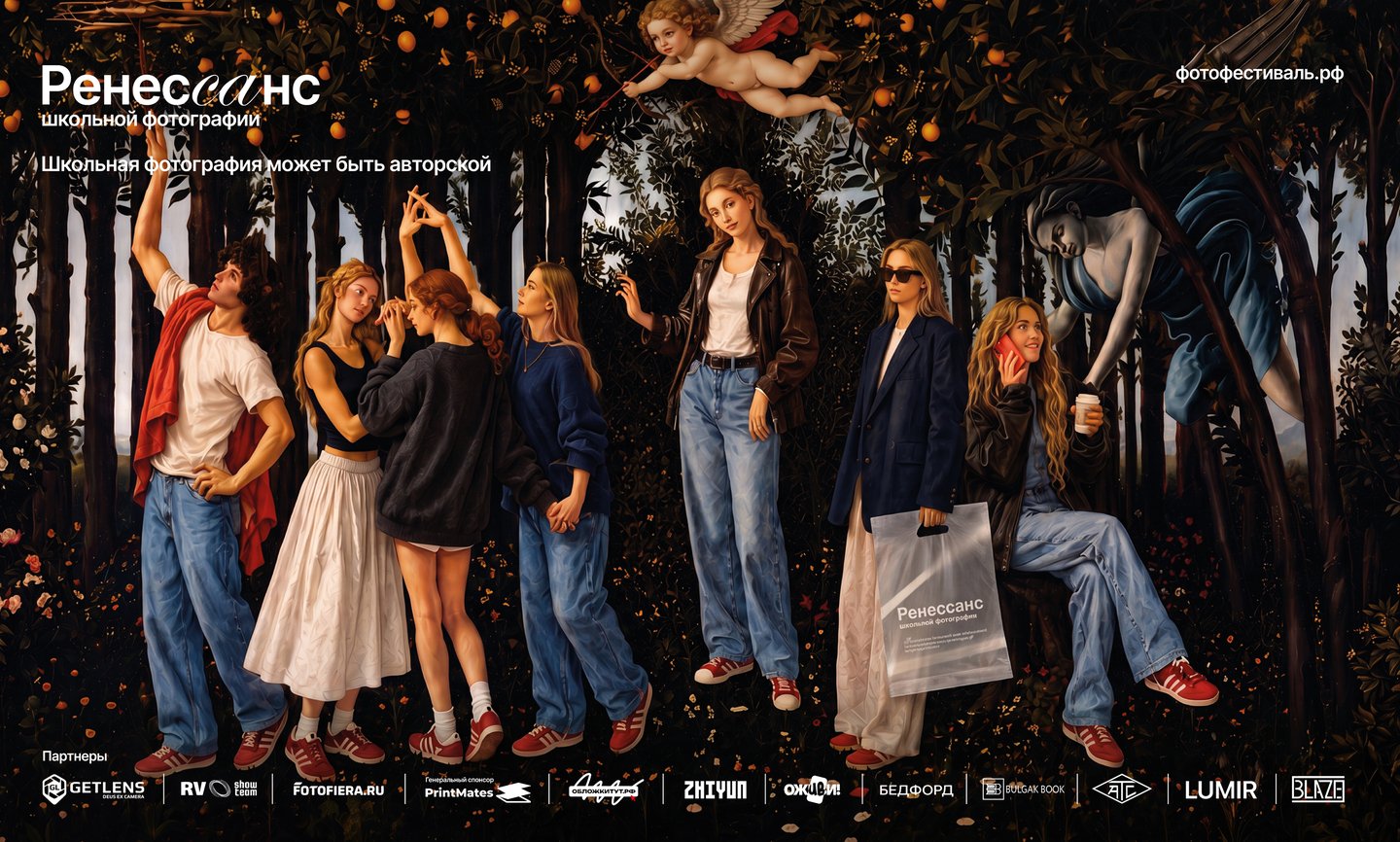
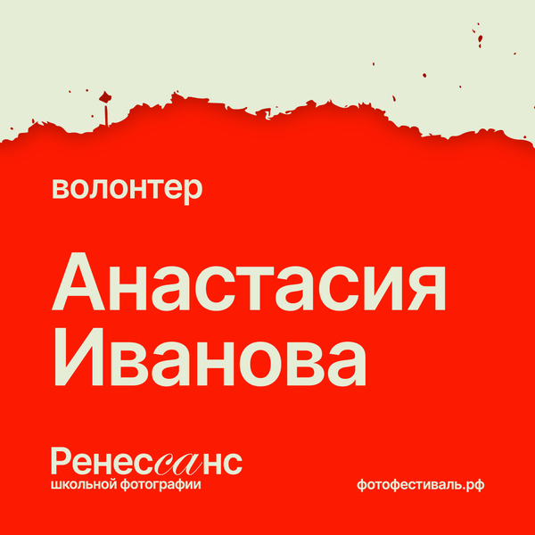
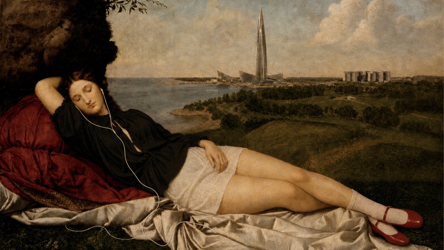
An identity for a one-day festival that turns routine school photography into an art form, from wayfinding to merch and social media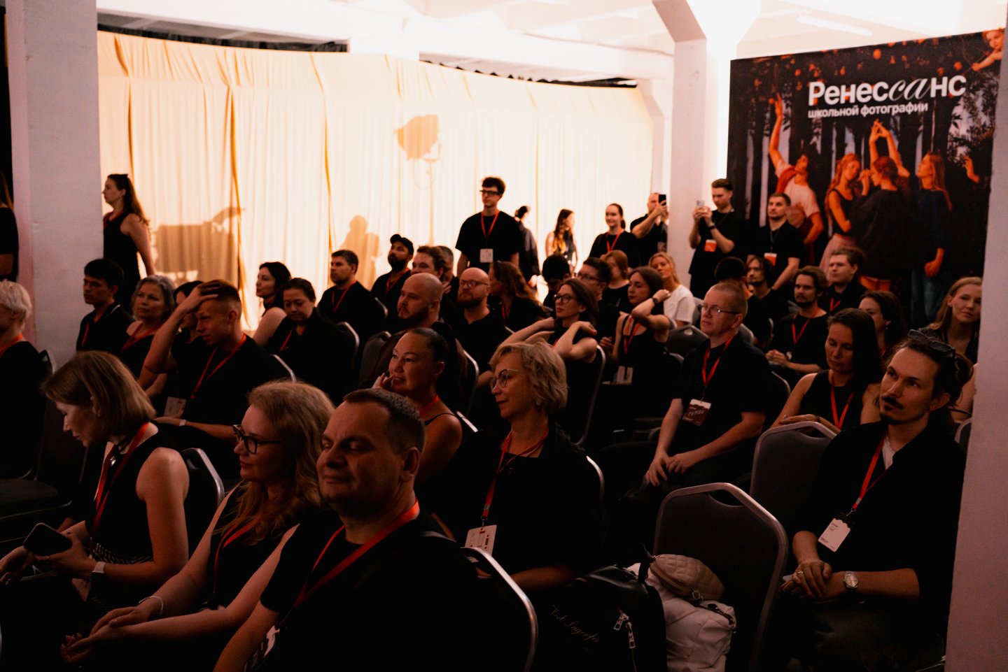
1/2
Brief
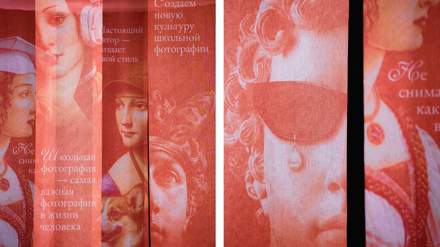
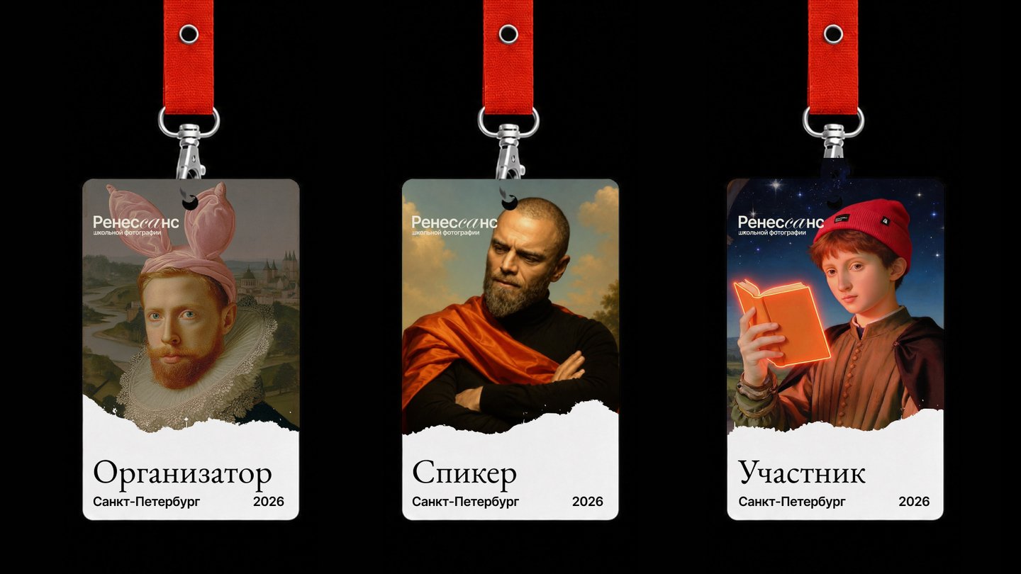
An identity for a festival that brings together school photographers, art directors and producers ready to move beyond conveyor-belt shoots. The goal was to inspire around 100 guests to rethink their craft and transform a faceless industrial loft at ATS Nekrasova into a space worth rememberingDesign tasks:
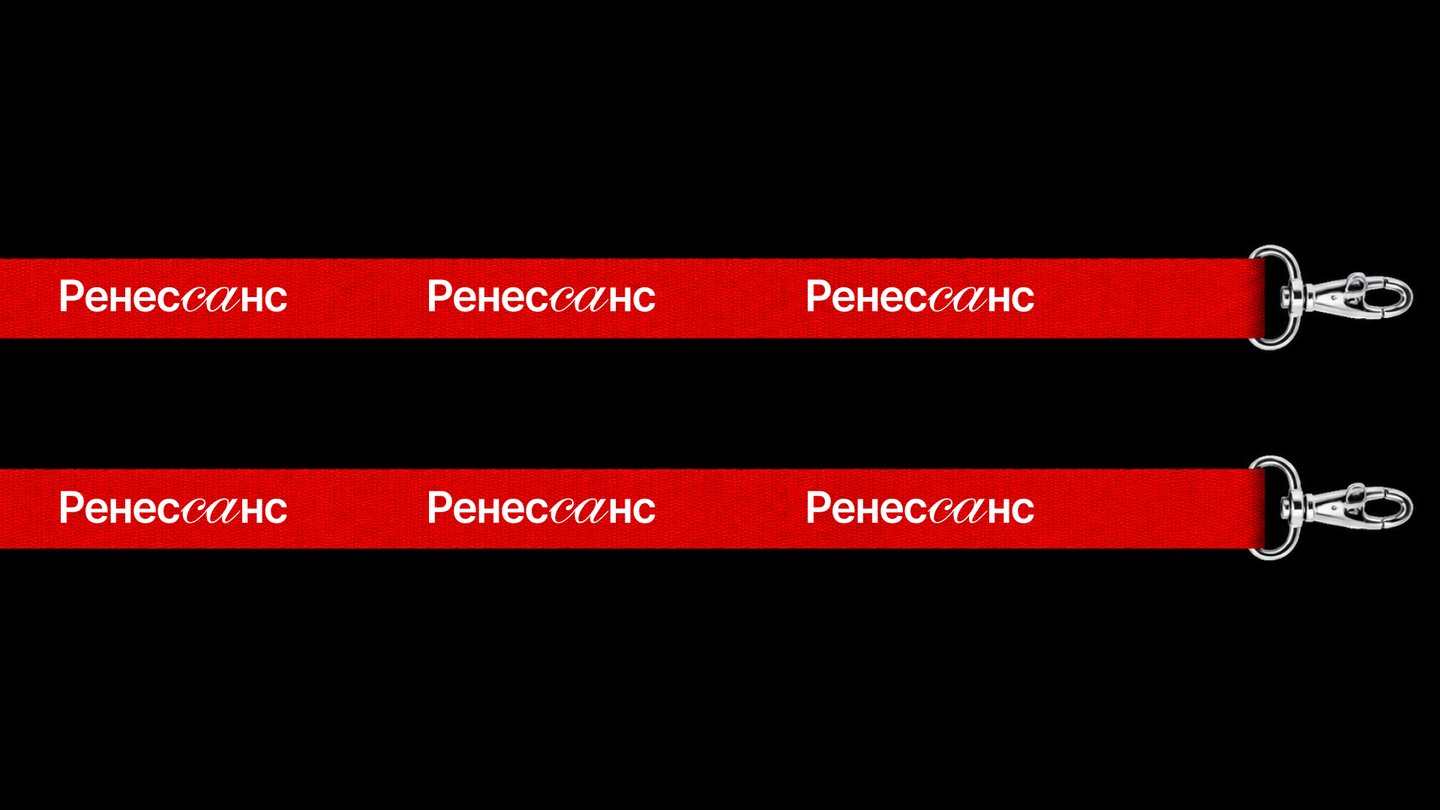
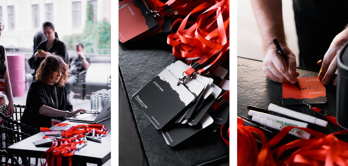
01 / Navigation: venue map, schedule, arrows, partner signs 02 / Entrance banner 03 / Badges 04 / Main photo zone 05 / Postcard and ticket 06 / Social mediaИсходный размер 3673x2450
Approach
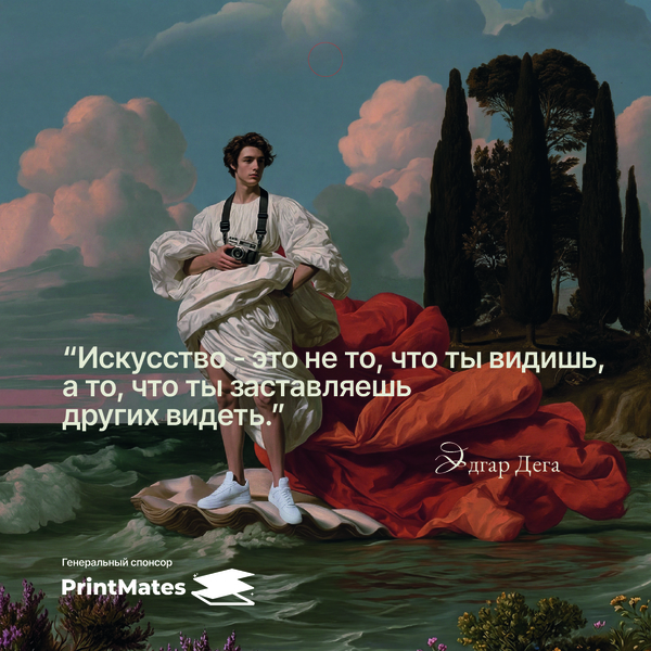
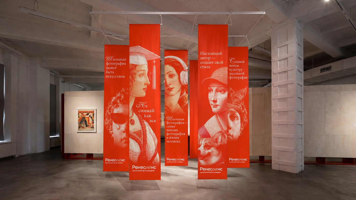
Key words: Photography, Gaze, Image, Authorship, Visual culture. Inspired by the Renaissance seen through a modern lens: light, generative and deliberately unnatural digital imagery. Negative space and voids. Large manifestos, small titles and textSolution
The identity reimagines the Renaissance in a digital age. Generative visuals hint at classical imagery without copying it, mirroring the festival’s idea of photography as authorship. Generous negative space and large manifesto statements give the event a confident voice, while small typography keeps it refined. The system brings character to the raw concrete loft and works consistently across every touchpoint, from the entrance to the ticket in a guest’s pocket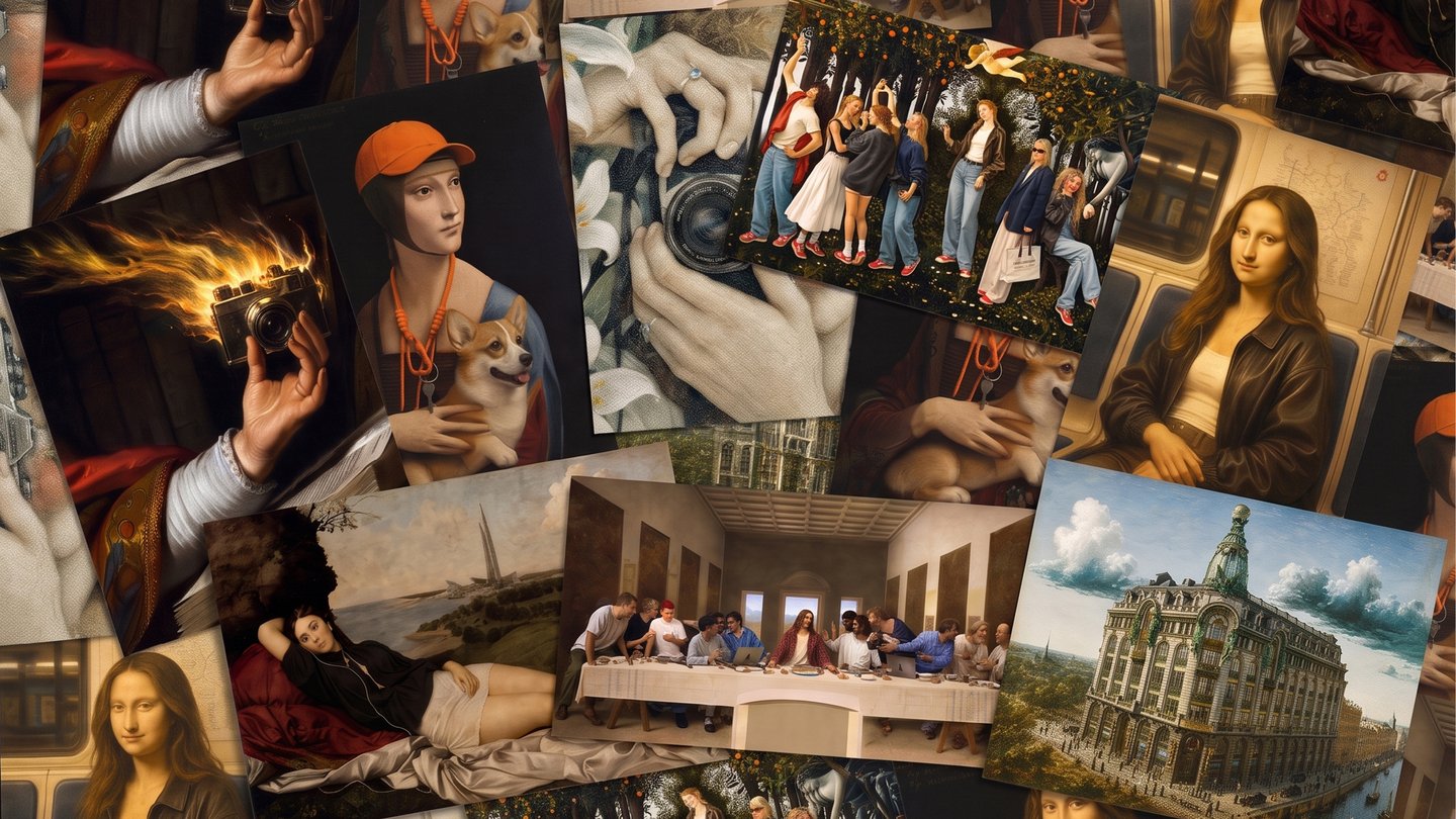
1/2
1/5
Area: Brand identity, Merch design, Graphic design
⟶ Blow Horn
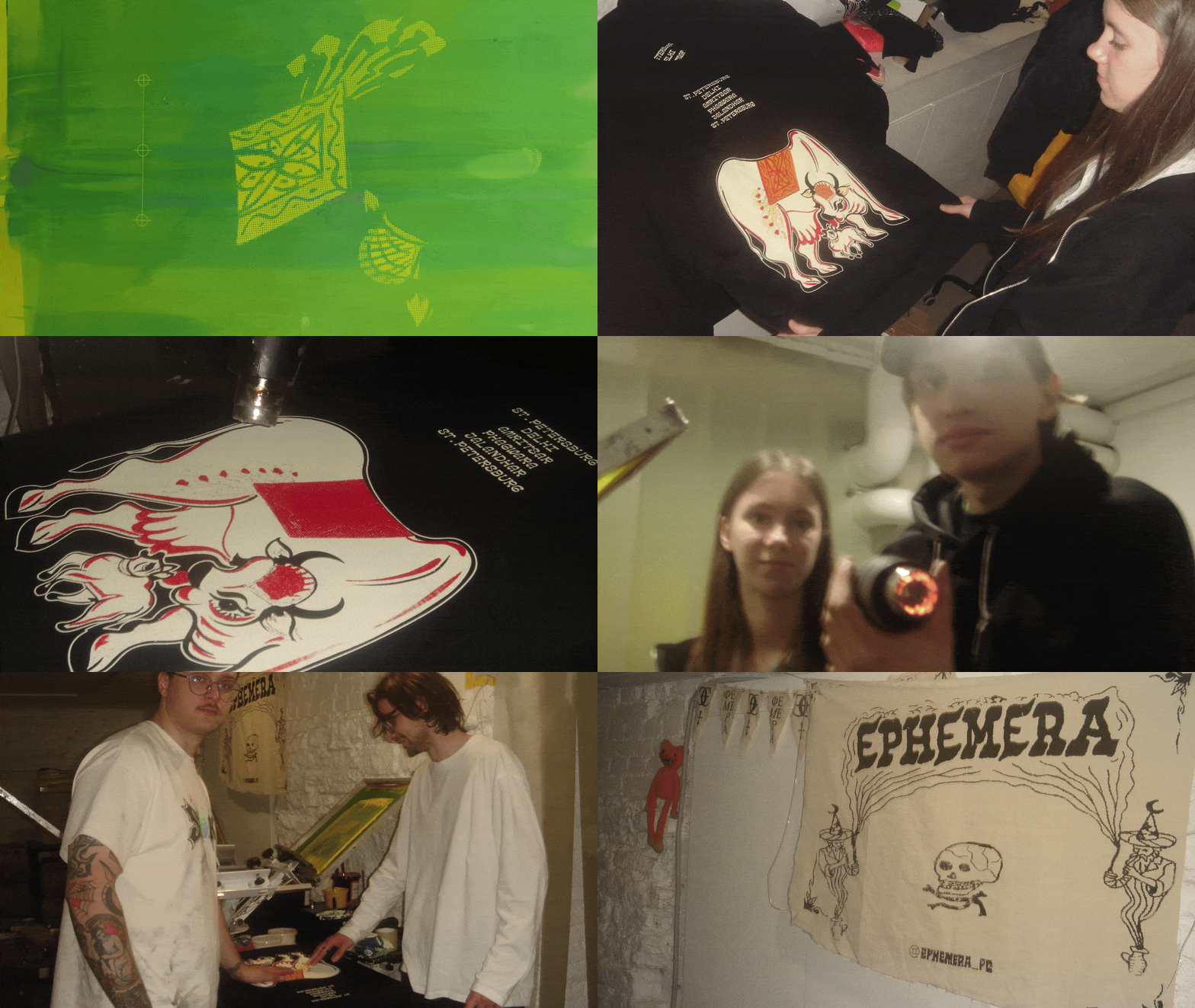
An identity and merch collection inspired by Indian truck art, created after a student research trip to India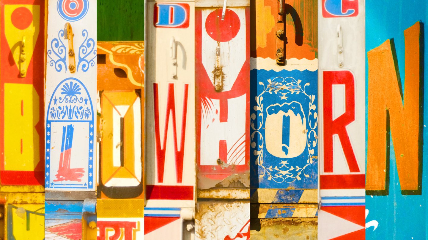
1/2
Team:
Alexandra Sitro Anastasia Arbatova Elizaveta Ostrovskaya Supervised by Mitya KharshakBrief
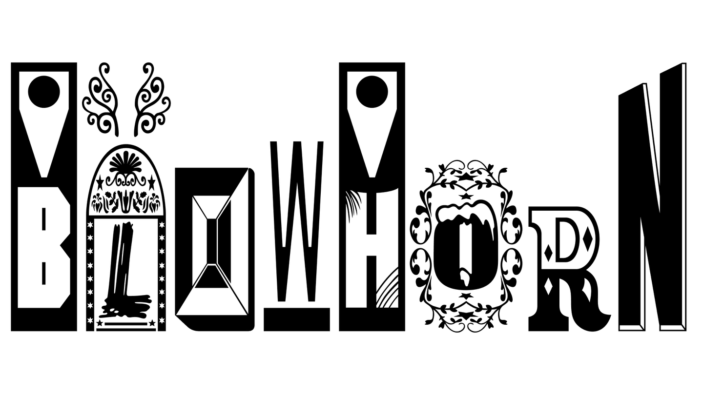
Create an identity based on field research into Indian truck art, a folk tradition that turns trucks into vivid artworks with ornaments, calligraphy and protective symbols. The project name comes from the Blow Horn sign painted on the back of every truck, a vital call to honk when overtaking on chaotic roads.Design tasks:
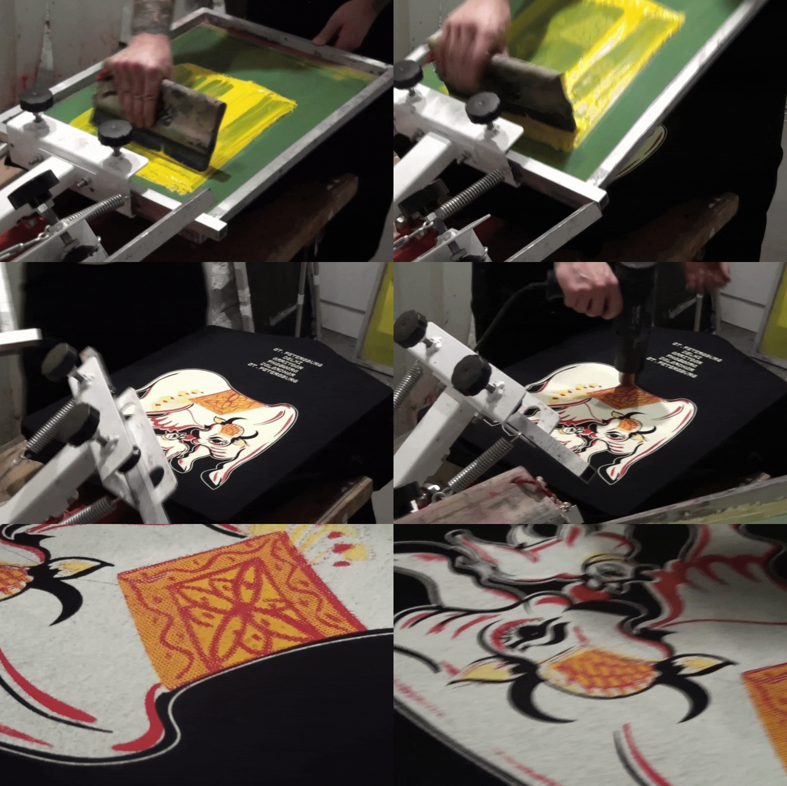
01 / Logo and visual identity 02 / Promo: posters, posts, stories 03 / Apparel: longsleeves, caps, bandanas 04 / Postcards, keychains and stationeryИсходный размер 1366x768
Исходный размер 1920x1080
Исходный размер 1920x1440
Approach
Key words: Trucks, Culture, Hand painting, India, Construction. Inspired by truck decorations we documented in Phagwara: Punjabi lettering, bright colours, ornaments and good-luck wishes painted for the roadSolution
The identity is built from real truck imagery collected during our research, so every graphic element carries authentic Indian character. Bold colours, hand-painted ornaments and calligraphy turn into a playful modular system, and the «Blow Horn» phrase becomes a loud, memorable sign of the brand. The style moves easily from posters and social media to apparel and small merch, bringing the energy of Indian roads into everyday objectsИсходный размер 900x445
How a project works
Every project is a little different, but my process uses the same general framework