
Brand strategy note
Ainda Estou Aqui
The original name of the project was saved intentionally.Refusal to translate becomes a gesture of respect and memory towards people who have survived a period of political violence and disappearances in Brazil. The original language fixes the historical and cultural context, not allowing history to be universalized and depersonalized.
Values
Memory over spectacle, silence as evidence, human dignity, time over moment.
Vision
Create a visual language that speaks not about an event, but about the consequence of disappearance — about life that continues in the absence of a response, body and finale. The project seeks to visualize what cannot be documented: rupture, uncertainty and long waiting.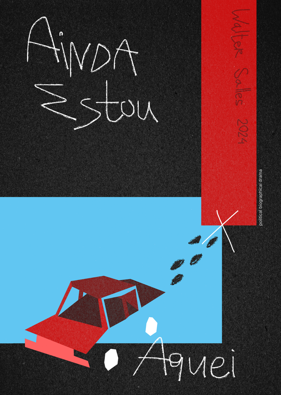
Positioning
The project is positioned as an author’s visual statement based on the film I’m Still Here (2024), but going beyond the film poster. This is not an illustration of the plot, but a graphic translation of collective memory, repressions and disappearances into a universal visual language.
Target audience:
— Cultural institutions — Film festivals and art platforms — Audience sensitive to social and historical topics — Viewers of author’s and political cinemaVisual language
The logo is a handwritten name Ainda Estou Aqui, deliberately imperfect, as if recorded in a hurry. It is not a branding sign in the classical sense, but works as a trace of presence, a gesture of memory
Typography
Main: handwriting / imitating handwriting Auxiliary: simple grotesque for official signatures Typography works as a personal record, not as an information medium.Color palette
Black — emptiness, unknown, absence Red — violence, blood, line of power and repression Light blue — the past, everyday reality, «normality» before the break White — trace, residue, attempt to fix the fact. Colors are used in contrast, without gradients — as rigid states, not emotions.Key visual
The car is the last visually recorded moment. Traces stretch from it, leading to the symbol X — the place of the unknown.The red vertical stripe crosses the composition as a line of violence and memory. The poster does not give an answer and does not explain the plot — it stops the gaze at the point of disappearance.
Social media posts
Merchandising
Merch within the project can take various forms — from print to three-dimensional and spatial objects — while remaining strict and restrained. A limited palette and precise visual gestures allow it to function not as decoration, but as a carrier of memory and meaning.


