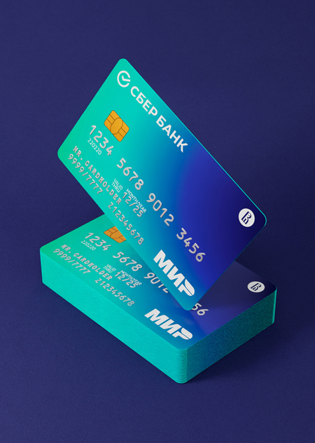
Команда Лаборатории дизайна НИУ ВШЭ разработала для Сбербанка дизайн банковской карты МИР предназначенной для сотрудников НИУ ВШЭ. За основную визуальную единицу был взят цвет, и потому в дизайне используются корпоративные цвета Сбера и Вышки. Лаконичный язык, на котором говорят эти цвета, повествует об эмоциях, взаимопонимании и взаимодействии.
Исходный размер 3000x2000
Loading...
Стыковка метавселенных Сбера и Вышки взаимодействует с конечным потребителем простым, но ярким визуальным языком, с помощью градиента, где сливаются два фирменных цвета. Также нами было предложено окрасить торцы банковской карты в флуоресцентный зелёный для оптического эффекта свечения.
Исходный размер 3000x1593
Loading...
Исходный размер 1920x1080
Исходный размер 3000x2000
Исходный размер 3000x2000
Исходный размер 3000x2000


