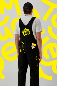
GLITCH brand brand style
The main elements of my variation of the GLITCH coffee shop brand style have become pathers. In my opinion, they reflect the ideas and values of the coffee shop more than anyone else. They are bright and visible, and at the expense of the main colours of the brand, they have become even more expressive and attractive. My signature reflects the creative beginning and character of GLITCH.


Pathers are also a great idea for brand style, as they are easily scaled to a specific task. It’s easy to fit into a picture or a coffee cup. If necessary, it can be made more brighter by adding colours, or more dim, by removing inappropriate elements.

The shape of the cap on which the logo is placed is formed from the shape of the letter G in the logo itself.
The firm’s style was strong and bogged down, visible and easily reminiscent. A coffee cup like this will definitely want to be photographed against the background of gray buildings or a single-ton blue sky!

![Strix [Safe Objects] Strix [Safe Objects]](https://files.mediiia.ru/projectimages/1938/c66a4860d5724c42be05b58e761f1fc0/14f9df4a19f84695b6f0d4fbc514a4c9220x309.jpg)

