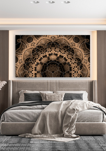
Due to MONOCHROME’s printing pedigree, branding plays an important role and has a distinctive and distinct identity that covers everything: things, bags and boxes, even cake, candles and bedspreads are covered with a recognizable identity.

However, now the identity has ceased to be a shell, the identity has acquired a physical embodiment and has become a real thing.

big
Original size 3508x1977
big
Original size 3508x1977
big
Original size 3508x1977

The corporate pattern of the brand is a complex element created from 4 «petals» connected together.

Original size 3508x1977

«Petals» can exist both together and separately, adjusting to the necessary tasks.

Original size 3508x1977

Photo 1 of 2. If you found 3 differences — put a like.

Original size 3508x1977

Photo 2 of 2. If you found 3 differences — put a like.

Original size 3508x1977

Photo 1 of 2. If you found 3 differences — put a like.

Original size 3508x1977

Photo 2 of 2. If you found 3 differences — put a like.

While studying the corporate identity, I was interested in how the pattern can visually turn into an endless wave of MONOCHROME.

Original size 3508x1977

While exploring the elements of the pattern, I got carried away with the idea that 2 «petals» combined together could become a custom chair, with an intriguing play of light and shadow at the junction of the «petals».
Original size 3508x1977
MONOCHROME HOME
Владислав Хегай создал концептуальный проект мебели MONOCHROME HOME, объединяющий графический стиль и функциональные элементы в жилых и общественных пространствах. Фирменный паттерн бренда состоит из четырёх «лепестков», которые могут использоваться как отдельно, так и в комбинации для создания визуальных и объемных решений.
Project description created with AI
6879
Project created at 31.10.2022
More projects in object design
Кристина Грушко разработала городской инфраструктурный артефакт для «Ростелекома» в рамках совместной номинации ST. PETERSBURG YOUNG DESIGN и ШКОЛЫ ДИЗАЙНА НИУ ВШЭ - САНКТ-ПЕТЕРБУРГ. Проект был создан в рамках конкурса, направленного на формирование нового имиджа компании и привлечение внимания россиян к её деятельности.
Анна Куликова создала светильники с гжельской росписью, адаптированной под современный дизайн. Проект использует геометрические узоры вместо традиционных птиц и цветов на керамике и цветном стекле.
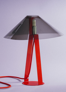
Екатерина Коновалова создала настольную лампу The Dude, вдохновлённую персонажем из фильма "Большой Лебовски". Лампа имеет прочное металлическое основание и позволяет использовать бесконечное количество абажуров, накидываемых на платформу.
creativecity.academy
A joint project of the HSE ART AND DESIGN SCHOOL and the Institute for the Development of Creative Industries, focused on working with Russian regions. The Creative City digital platform is a media outlet that aggregates projects related to territorial branding, a community of professionals, and a service that allows you to create local websites, work with the local identity and popularity of cities and places. Study the map of the Creative City. Get acquainted with the projects that have already been implemented. Add your... Show more
events
travelling
history
art and design
We use cookies to improve the operation of the HSE website and to enhance its usability. More detailed information on the use of cookies can be fou...
Show more