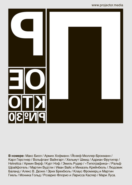
«Projector» magazine. Issue #30
In this issue, I am giving the floor to the invited editor and my dearest colleague Fyodor Geyko. This is he who has written a good half of the texts: in fact, he’s the author of every article on Swiss design history in this issue. We couldn’t do without Fyodor!I just want to mention this month’s cover, which turned out to be a kind of a“friend or foe» visual code. Those in profession will recognize it at a glance. This is the homage of one of the most significant books about typography and graphic design ever published in XX century — «Typography» by Emil Ruder. Over dozens of years, it has been a guide for several generations of designers. This month’s Projector contains publications on both Emil Ruder and the book.
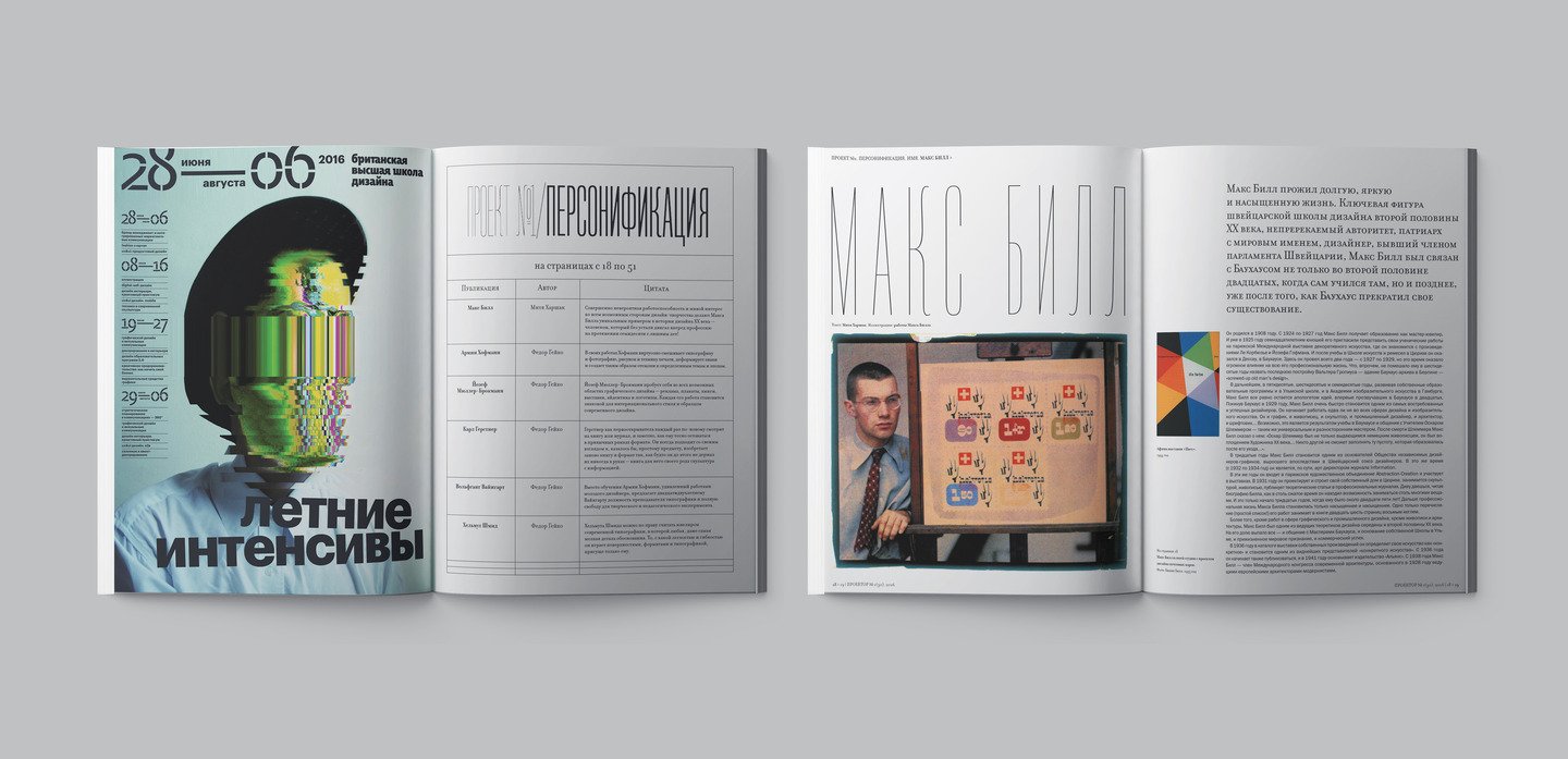
The only publication I wrote for the historical chapter is the text dedicated to great Max Bill, a designer, who started at Bauhaus as a student. His incredible efficiency and true interest in any side of design make him a unique exponent of XX century design history — he was the one who untiringly developed the job of a designer for over seventy years!At the same time, his projects never remained on paper. His furniture, clocks, lamps, dishes were widely manufactured. He created houses and exhibition pavillions; identities, catalogues, newspapers and magazines he designed have taken on lives of their own.
Armin Hofmann. Between the 1950s and 1980s Hofmann actively cooperated with Theater Basel and the city museums, designing for them lots of logos, posters, book covers and catalogues. The posters he created for the institutions of Basel are considered classics in the world of graphic design. Hofmann had a vast number of methods to integrate an eye-catching but never flashy poster into surrounding space. His works give enough food for thought: each of them is an intellectual act both for the artist and the viewers. A lot of Hofmann’s posters seem confusing at first glance, as their concept only comes clear after attentive form and content analysis.
Müller-Brockmann is the brightest exponent of design scene in Zurich, called nothing but «Zurich mafia», which also included such recognized gurus as Hans Neuburg, Carlo Vivarelli, Siegfried Odermatt, Richard Paul Lohse and many more. Compared to Basel, the exponents of Zurich follow strict art dogmas and believe that freedom of art is a relic of the past, so contemporary designers should only follow the criteria of international typography style.
Each time Gerstner, in the manner of a pioneer, looks at a book or a magazine at a different angle, and it’s obvious that the framework of conventional format is too tight to him. Gerstner always has an unusual approach to a seemingly trivial object, he re-invents a book and its format as if he’s never seen it before, considering the book as a kind of information sculpture.
In 1963 Wolfgang went to Basel to show his trial works to the teachers at Basel School of Applied Arts in order to study there under Emil Ruder and Armin Hofmann, who’d already become very famous typography experts beyond Switzerland. Instead of making 22-year-old Weingart a student, Armin Hofmann, astonished by his works, offered him a position of a typography professor, and gave him total freedom to experiment in art and teaching.
Since the early 1980s Helmut Schmid has been an unquestioned authority in the field of modern typography. This is when he started teaching not only in Japan, but also in South Korea, India, and China. Among his students and associates, there are recognized designers from South-East Asia. All over the world, Schmid teaches lectures on his view of design and composition principles in typography. He may be rightly considered a jeweller of modern typography, where every single little detail is reasonable.
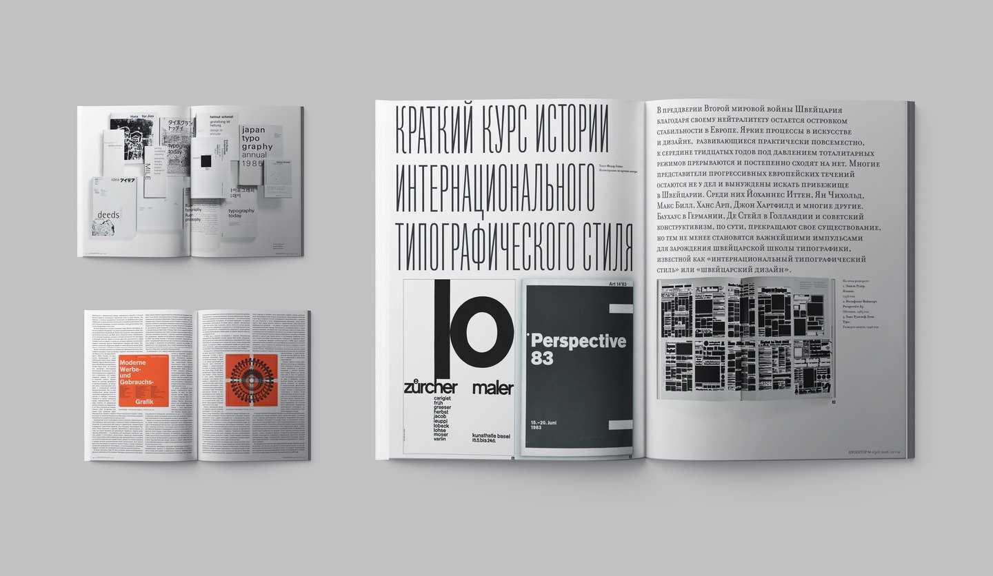
The chapter «Lettering» starts with a publication about one of the most outstanding exponents of 20-century typeface design Adrian Frutiger. He passed away a short time ago — in 2015. His name will forever remain in the history of international design: contemporary typeface design is barely conceivable without his method of system approach to creating types and typefaces, which influences both type artists, and entire generations of designers, dealing with types and typography.
Surely, a Swiss-issued Lettering can’t do without a publication on Helvetica — the main modernist type in the 20 century. Here’s the selection of the most interesting quotations about Helvetica from the same-name film by Gary Hustwit. Massimo Vignelli: «Back in the 1970s, the youth fancied psychedelic and all that junk, and in the 1980s their minds were bewildered at this disease called „postmodernism“. People were rushing around as beheaded chicks looking for any „non-modernist“ type. They had no idea what they were fighting for, they only knew what they couldn’t stand, and that was Helvetica».
Next, Projector moves on to the Swiss wizard Kurt Naef, who designs most amazing toys ever! «Naef’s toys are useful in a lot of ways: kids immediately fall in love with them, understanding them at first glance. These toys develop spatial intelligence and stimulate creativity!A kid comes up with a lot of gaming solutions, even when unwittingly manipulating them. It’s also worth saying that adults fall in love with Naef’s toys probably even more than kids».
The story about the works of Emil Ruder is preceded by a dating back to 2008 interview with Maxim Zhukov, the author of the Russian edition of Typography book. By many, Ruder is equated with such exponents of Swiss style as Josef Müller-Brockmann, Karl Gerstner, Richard Paul Lohse, Carlo Vivarelli and Max Bill. At the same time, Ruder didn’t approve of following any styles or trends, and believed design should be free of dogmas. He would openly say trends just limit designers’ ways of self-expression and narrow down their horizonts. This is one of the main differences between how Basel and Zurich schools see modern typography, which predetermined a creative conflict these two educational systems had.
And, of course, Typography!This is what the cover of this month’s issue is dedicated to. From the interview with Maxim Zhukov: «Ruder’s book isn’t about „how-to“, it’s about love. It’s the Song of songs. And it’s core still hasn’t become outdated at all, because today, same as yesterday, and the day before yesterday — „All you need is love’.
The second part of the magazine is a detailed catalogue of the works by the participants of «Swiss Made», the exhibition we opened in Novy Museum in St.Petersburg right on the day when this issue was published. I managed to interview some of the participants, and someone didn’t have time to talk to me, but from the visual point of view, this chapter is a miracle of miracles. It shares the works by the main exponents of contemporary Swiss design: Ralph Schraivogel, Martin Woodtli, Ivan Weiss and Michael Kryenbühl, Ludovic Balland, Alex W. Dujet, Erich Brechbühl, Klaus Fromherz and Martin Geel, Monica Gold, Rozario Florio, Larissa Casper and Marie Lusa.


