This issue of Projector is dedicated to Japanese poster, and features Mitsuo Katsui, the legend of Japanese graphic design. See him interviewed by the chief editor Mitya Kharshak.
Also see: the publications about the works by Tadanori Yokoo, Shigeo Fukuda, Kenya Hara, Ikko Tanaka, Kazumasa Nagai, Kohei Sugiura, Helmut Schmidt.
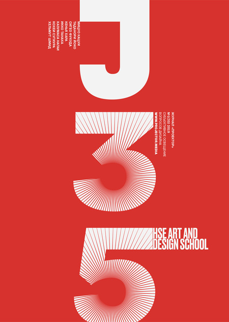
Thank you Fyodor Geiko and Sergei Serov — this issue couldn’t do without you!
Serge Serov: «This is the Shintoism heritage that Japanese aesthetics is based on: nothing is stable; naturally, everything is to die sooner or later. Existence and non-existence continuously change round. Unshaped eternity is the true entity. If a designer gives it some shape, they just shortly manifest the true essence of non-existence. This is where the crucial for graphic design understanding of minimalism, emptiness, and white space stems from. Emptiness is meaningful; we consider the profuseness of shape rather than its absense. White isn’t the way to achieve a smooth tone of the text, as in book typography, and not the construction material for sharpening the contrast with black, but the self-sufficient eternity of still unshaped existence».
Mitsuo Katsui (exclusively for Mitya Kharshak and Projector): «We can say that Japanese design considers such notions as simplicity and abstraction. For example, haiku postulates by its prime numbers the idea of conveying the essence as concisely as possible. A prime number is „a whole number whose only factors are 1 and itself“, and every prime number of a haiku is a whole umber at the same time. The conciseness of classical Japanese poetry like haiku gave Japanese mentality the special demand to use imagination in order to make up for the absent forms. This is also a great way to expand the semantic field, initially given in quite a short form. I would say, Japanese design could be inspired by such essentials as understatement, allusion and transfer of meaning».
Serge Serov: «Tadanori Yokoo achieves his freedom and open-mindedness, brutalism and multilayerness, picturesqueness and special expression by breeding sublime and low-grade, unique and trite, high-end and mass scale, American pop-art and classical Japanese engravings, highly professional and folkloric. „I wish you knew the kind of garbage heap wild verses grow on, paying shame no heed…“ Speaking of Tadanori Yokoo, he turns the spotlight on the garbage of mass culture, graphic mess, visual noise, absurd and khaos of nowadays — this is what the audience is offered».
Serge Serov: «Teaching his workshop at Golden Bee, Fukuda admitted using haiku as prototypes for his posters in striving for conciseness and simplicity, which is so close to the nature of graphic design itself. However, your heart needs to hear people’s moods if you want to create anything valuable. A graphic designer can’t avoid reading newspapers or watching news, they must absorb everything happening around them, said the master, the symbol of inventiveness and wittiness, philosophical depth and perfect plastique, the iconic figure to connect visual cultures of the East and West».
Nikolai Shtok: «Considering what could best promote Japanese goods abroad, Kenya Hara offered the four notions: sophistication, precision, attention to details and simplicity. The designer believes it’s necessary to leave the fast, furious and superficial Europeanisation for traditional values, so appealing for the export of Japanese culture all over the world».
Serge Serov: «Theatre posters by Ikko Tanaka are his sartorial statement. Designing them, he reconsiders and restructures traditional Japanese images, elements and attributes, calligraphy and block printing, kabuki theatre masks and costumes, as if interpreting these into the visual language of international design. Unique is interpreted as universal. At the same time, he preserves spatial harmony as a chord tuning, as a prayer and symbolic sacrifice for the higher forces».
Sergei Serov: «Ecology has been Kazumasa Nagai’s cross-cutting issue since the 1990's. His posters tackle it gently and quietly, in a very intimate way. The endless series Nature, Save me, I’m here create their own space which is beyond words. It’s full of magic flowers, animals, birds and fish. These inhabitants of Kazumasas' nature reserves, oceanariums and bestiariums have human expressions which silently convey even not messages but the status of sympathy with all creation, which brings love, joy for the soul, and food for thought. The messages of Nagais' posters seem to come from the higher spheres and look exactly like the nature spirits worshiped by the Japanese».
Fyodor Geiko: «Sugiura says he equates designing a book and creating an entire Universe of feelings and senses. A designer should listen to his mind and heart when working on a book, poster or logo. This is where Sugiura sees the civilization gap between the European and Asian approaches to art. Ma aesthetics, which is a doctrine concerning emptiness, makes no sense to the western world, but is crucial for eastern people and Sugiura in particular. He believes a designer becomes coldhearted and loses their connection with the Universe if not paying enough attention to the idea of ma. According to Sugiura, everything is interconnected, so even a single page of a book is an essential part of the Universe».
Fyodor Geiko: «Schmidt is a cosmopolitan who’s too wide to fit national categories. He’s been freely travelling around the world since his adulthood, managing to work worldwide, but Japan is where he feels most at peace. The way Ryoanji Temple Rock Garden in Kyoto is organised matches Schmidt’s style exactly, so it’s not surprising that one of his most famous typography compositions is dedicated to it. Schmidt is modest, unintrusive, and never showing-down. Despite the seeming simplicity of his designs, Shmidt goes against trivial messages and any simplifyings in typography. His design projects are always intangible and understated: like a sculptor, he cuts off every unnecessary agglomerate, remaining true to his principles and seeking for music in any of his typography works».


