Kamchatka State University Identity
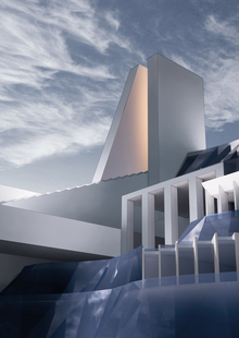
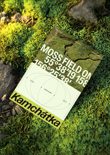
The HSE Art & Design School students and the Design Laboratory employees in the framework of the HSE expedition project ‘Opening Russia again’ visited Petropavlovsk-Kamchatsky following the invitation of the region’s governance and the University’s management. As a result of the trip the project of the university’s rebranding and the design project of the main building were prepared. The identity was developed by the Design Laboratory.
The concept was formed on the basic constants of the Kamchatka State University existing identity but was performed in a renewed modern visual interpretation. The continuity is tracked in the presence of Vitus Bering image but within this concept the designers developed a portrait in profile at the basis of the existing images of Vitus Bering and the symbols of the time when the great explorer lived. The two main elements of the Kamchatka region coat of arms — three volcanos and three waves washing Kamchatka peninsula (Okhotsk Sea, Bering Sea and The Pacific Ocean) were also used. In the future these symbols will be presented in the developed system — at the coat of arms of each faculty.
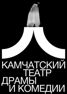
For the logotype the typographic spelling of the University’s name was specially created in the form of firm modern grotesque combining both strictness and a certain tone of softness coming from humanistic grotesques.
The shield with the waves depicted on it symbolizes the ‘seaside’ position of the university: Kamchatka is washed by the Okhotsk Sea from the west, by the Bering Sea from the east and by the Pacific Ocean.
Graphic images of the volcanoes is a link to the main sights of Kamchatka peninsula. The images of the volcanoes are presented on the flag and coat of arms of Kamchatka region and Petropavlovsk-Kamchatsky city.
The main element of the shield is the graphic image of Vitus Jonassen Bering’s profile, also known as Ivan Ivanovich Bering: the Russian sailor, navy officer, captain-commander, a Danish by origin, serving in the Russian Empire Army.
The two basic colors in the palette symbolize: deep blue — the color of the water washing the peninsula and bright orange — the color of sun, the color of crab.
Also the additional graphic elements for four university’s faculties were developed.
The system also includes additional graphic elements in the form of patterns developed on the basis of the photo image of a historic iron hammered fence found next to the university. This creates an additional mood for the classics, for the tradition based on the past but in a modern vision and this mood makes a contrast with the strict system of the university’s logo.
A broad line of merch oriented at the university’ s students and not only them was created.
The interior design team prepared the concepts of the university’s interiors layout in which the elements of the identity developed in the design laboratory were used.
Thank you for your attention! All sales to the wind!
