Original size 1140x1600

Shadow Stoke sunscreen line.

Longread translated automatically
Finalist of the competition
big
Original size 4000x2250

Shadow Stoke — is a line of sunscreen. Each cream is a symbolic <laqua; ten&racuo; which provides reliable protection against `nbsp; harmful UV rays and  solar burns. Shadow Stoke’s package design reflects this metaphor: the higher the protection factor against  the sun (SPF), the bigger the space on  the package is occupied by ' laco; ten». This graphical solution allows consumers to clearly assess the level of protection provided by each specific cream. The Shadow Stoke line offers a choice of products with different SPF levels ranging from SPF 15  and  to SPF 50. This allows everyone to pick up the cream with the  the required level of protection in  the dependency on  their individual needs and  the skin type.

big
Original size 4000x2250
big
Original size 4000x2250
Original size 1920x1080
Original size 4000x2250

Shadow Stoke sunscreen line.
Анна Головина создала линейку солнцезащитных кремов «Shadow Stroke» с символической «тенью» на упаковке, отражающей уровень защиты SPF. Дизайн упаковки наглядно показывает, что чем выше SPF, тем больше занимает место «тень» на коробке.
Project description created with AI
Project created at 04.06.2023
More projects in packaging design
Автор Milena Krestovnikova создала проект DR.DIESEL: Раскрой свой потенциал, представляющий слабоалкогольный напиток для молодежи. Проект включает три разработанные концепции, из которых была выбрана третья, акцентирующая внимание на раскрытии потенциала в общении.
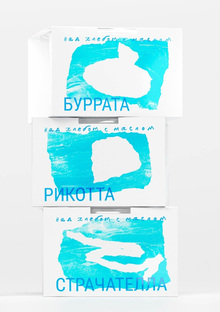
Автор Виктория Трубицина создала дизайн для сыроварни «Над хлебом с маслом» из Омска. Проект включает метафору, изображающую сыр как облако над омской степью.
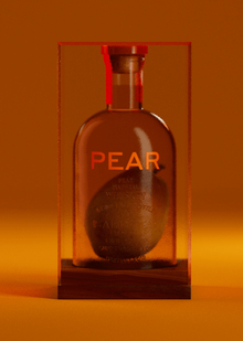
Григорий Хромов создал упаковку для калифорнийского яблочного бренди Pear, в которой ключевым элементом является спелая груша внутри бутылки. Проект включает в себя описание метода выращивания груши в прозрачном сосуде и ароматических ноток бренди, выдержанного в американских дубовых бочках.
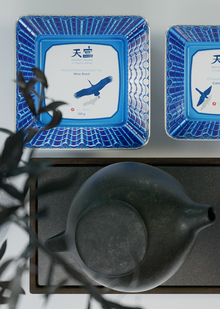
Григорий Хромов разработал упаковку для линейки китайского чая, состоящей из трёх видов с разным весом и сортами чая. Дизайн вдохновлён китайскими чайными домами и бело-голубой керамикой, что отражено в детализированных иллюстрациях на упаковке.
creativecity.academy
A joint project of the HSE ART AND DESIGN SCHOOL and the Institute for the Development of Creative Industries, focused on working with Russian regions. The Creative City digital platform is a media outlet that aggregates projects related to territorial branding, a community of professionals, and a service that allows you to create local websites, work with the local identity and popularity of cities and places. Study the map of the Creative City. Get acquainted with the projects that have already been implemented. Add your... Show more
events
travelling
history
art and design
We use cookies to improve the operation of the HSE website and to enhance its usability. More detailed information on the use of cookies can be fou...
Show more